
Customer.io | More Care, More Craft
Drove a culture of shipping small craft improvements to make the product more approachable.
I wanted to establish a culture where little details make the difference. I presented a call-to-action for more care, more craft at an engineering, product, and design (EPD) all-hands meeting. When the project wasn’t prioritized, I took advantage of AI tooling that empowered us to ship code. I established the habit of improving the product little by little. These little details often don’t show up in metrics or support tickets. Yet, even one small change prompted a notable customer to reach out to praise the “quality of life improvement.”
All hands presentation
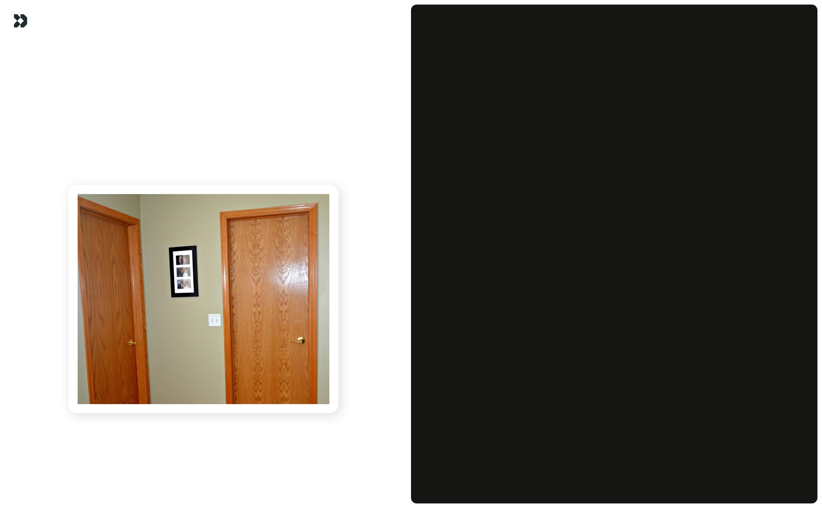
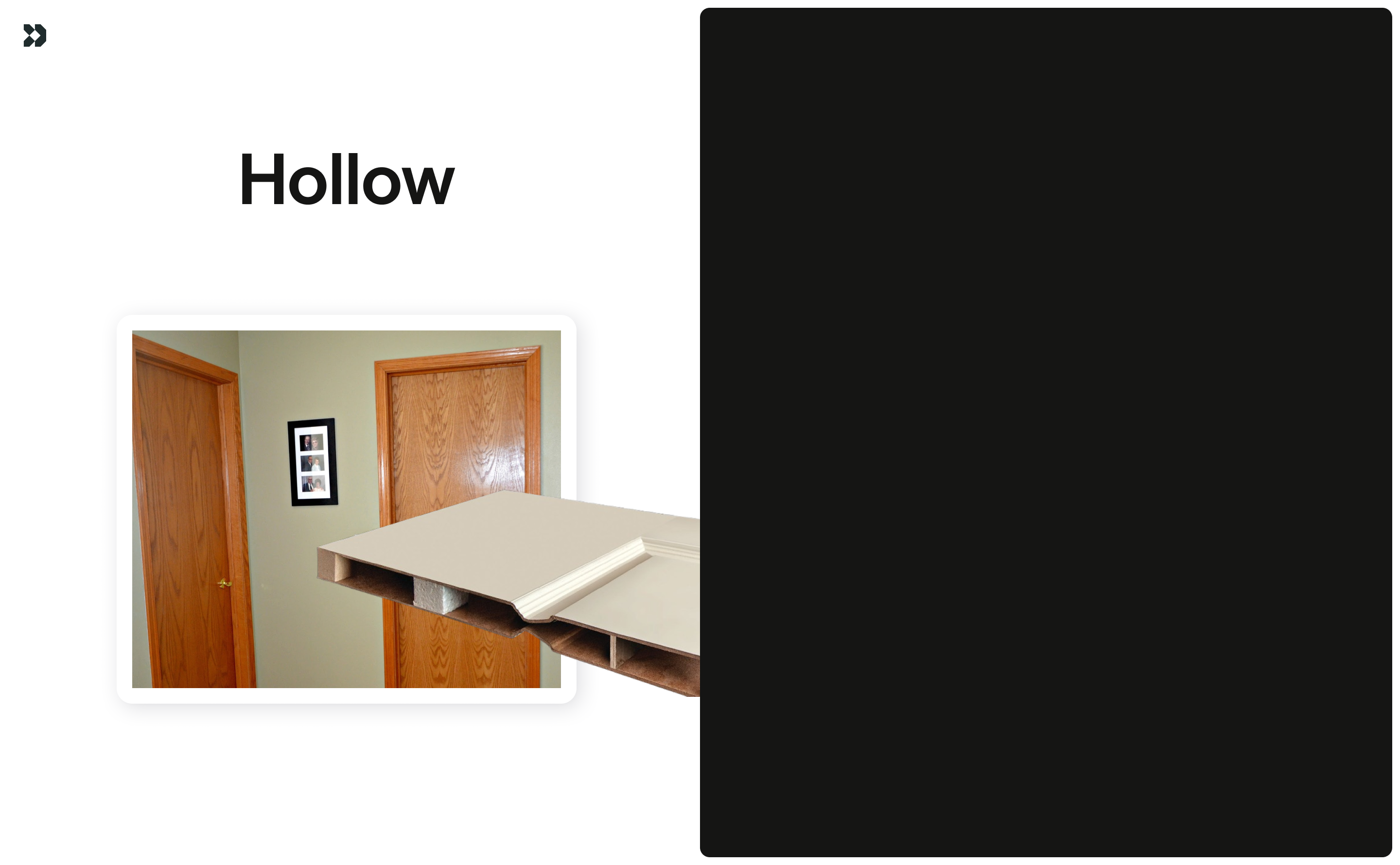
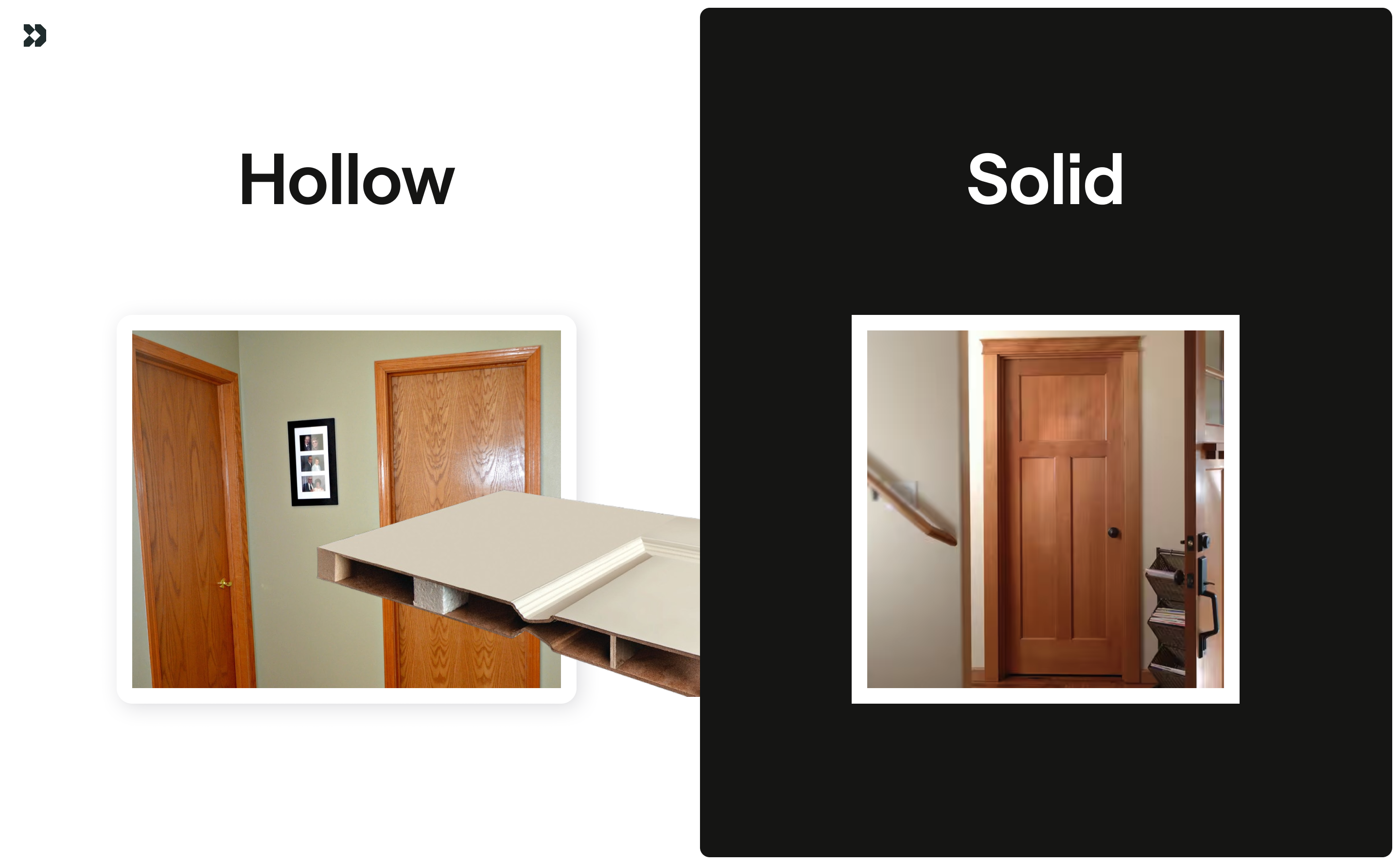
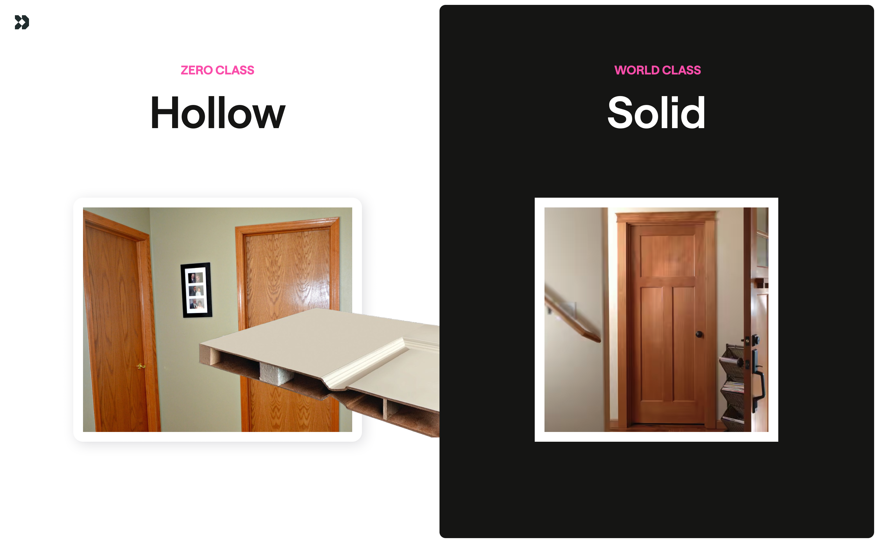
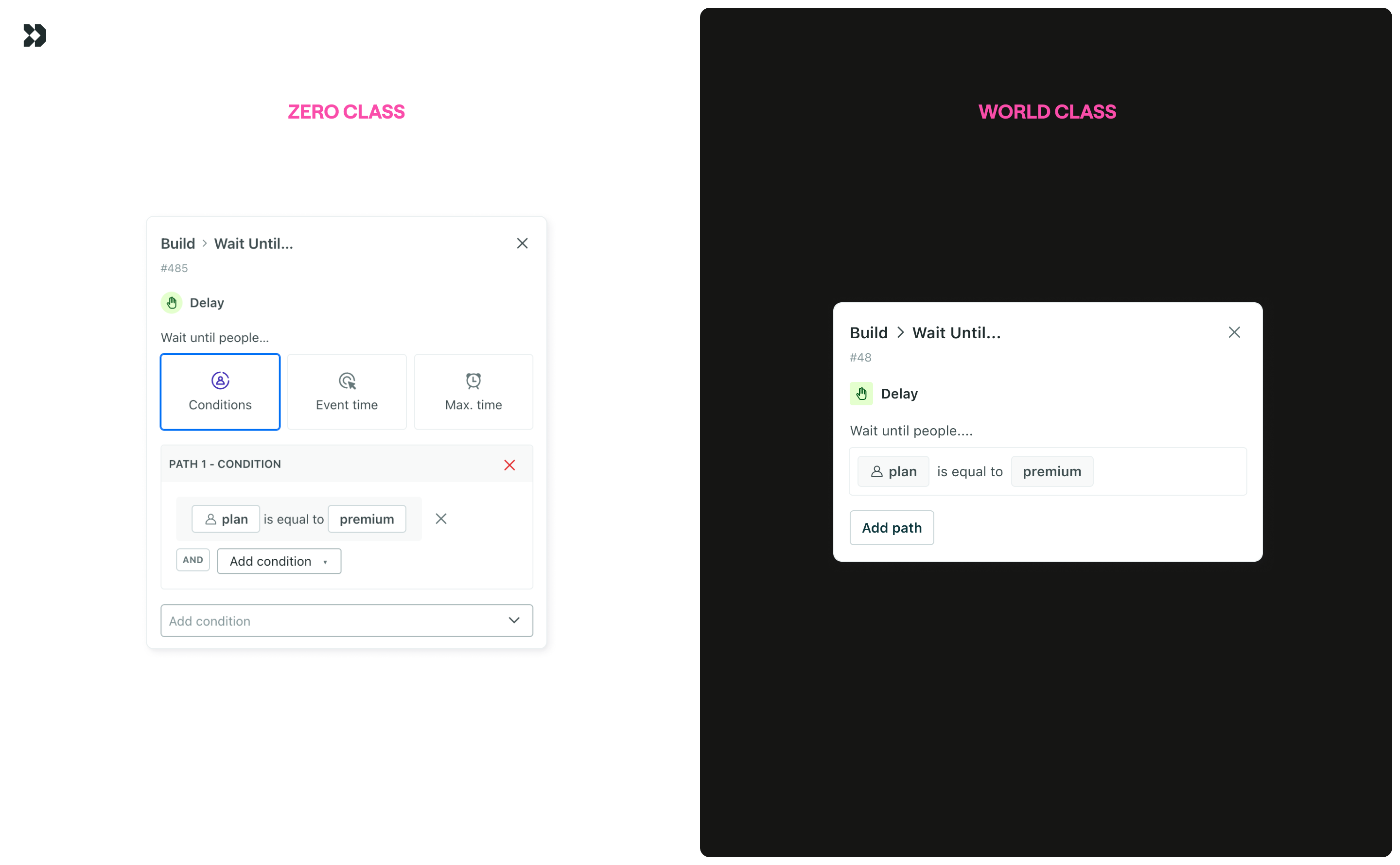
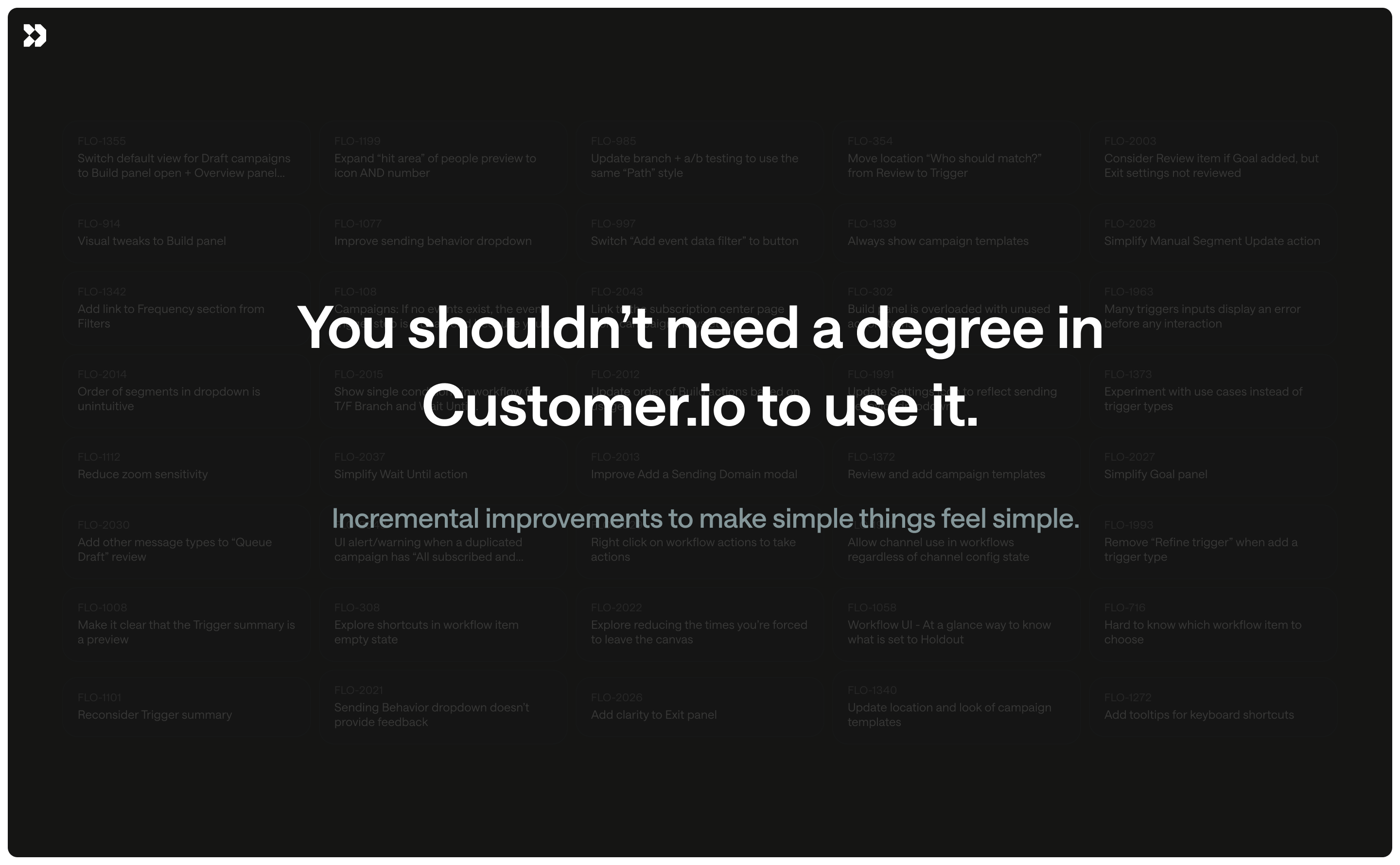
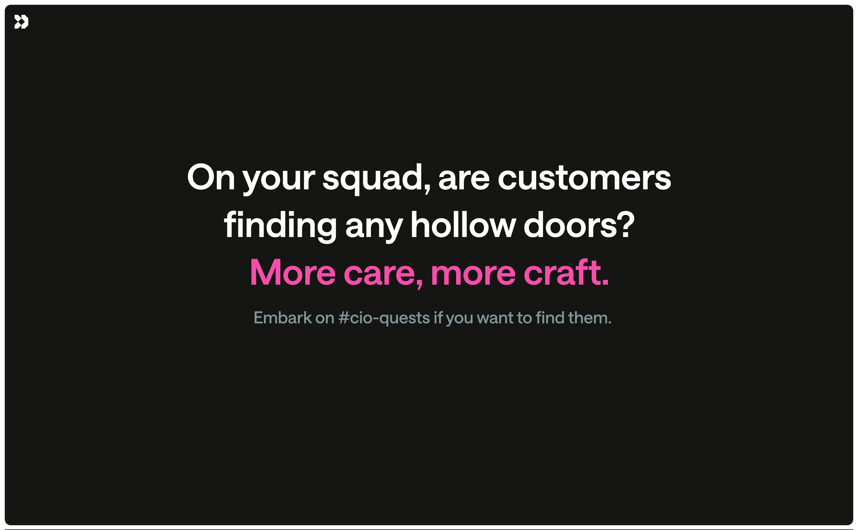
A principal product designer and I gave a presentation on “more care, more craft” in an effort to build a culture of craft. I leaned on an unexpected metaphor of “hollow-core” and “solid-core” doors (my dad built both houses I’ve lived in). Both types of doors do the same job and can even look identical, but you immediately feel the difference. A small decision on doors speaks volumes about the integrity of the entire house. We invited people to join a dog-fooding channel and to run an exercise that put themselves in our customers’ shoes. By the end of 2025, we were empowered to take action ourselves.
Sending behavior
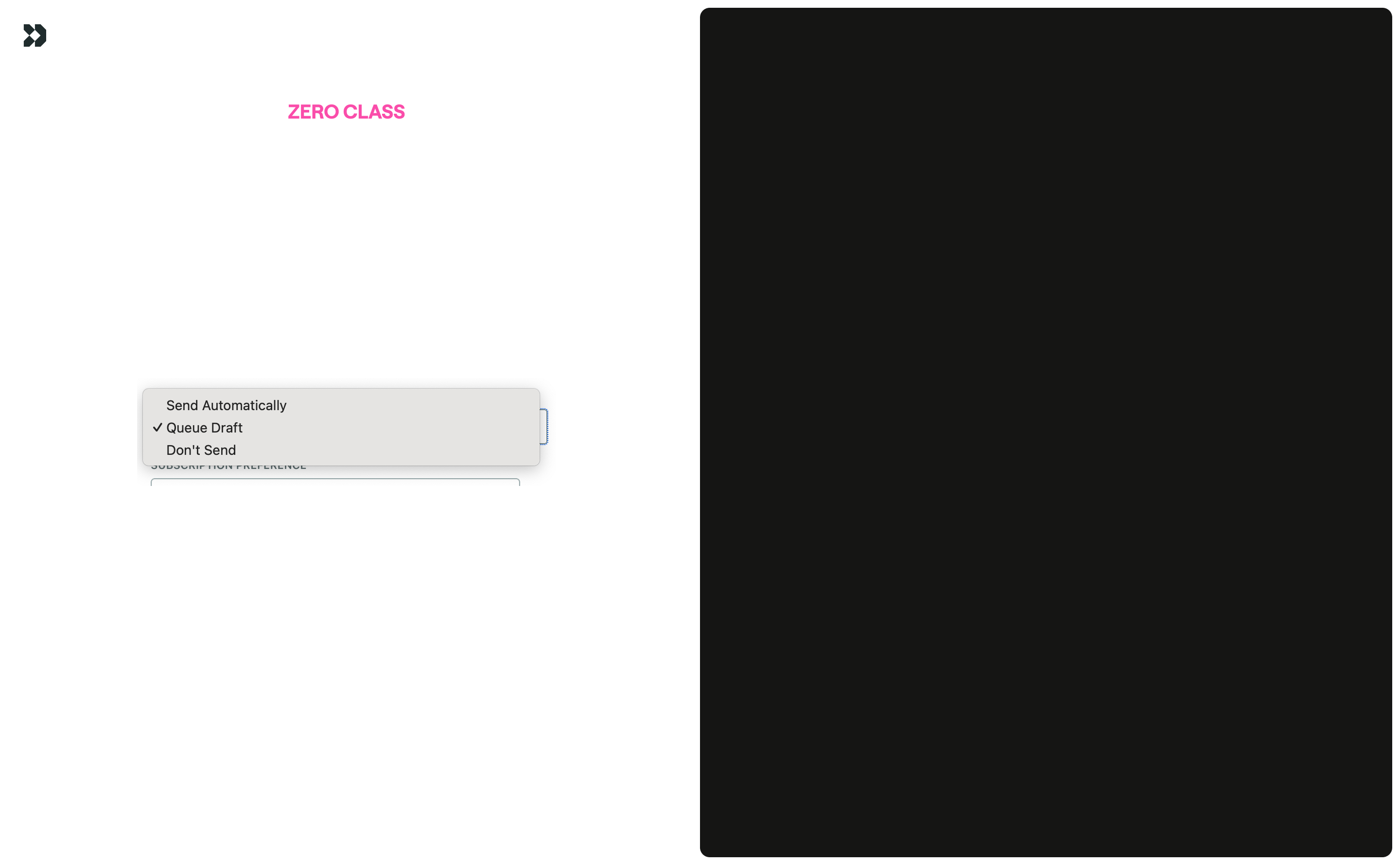
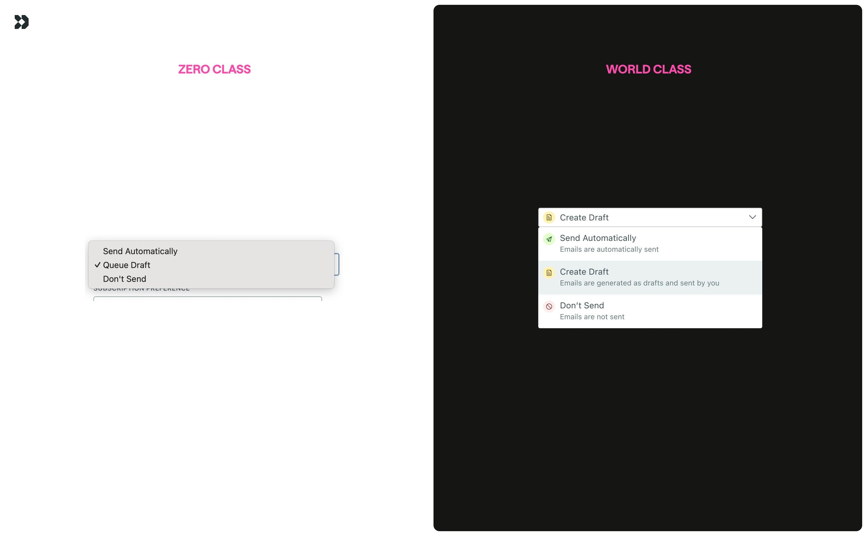
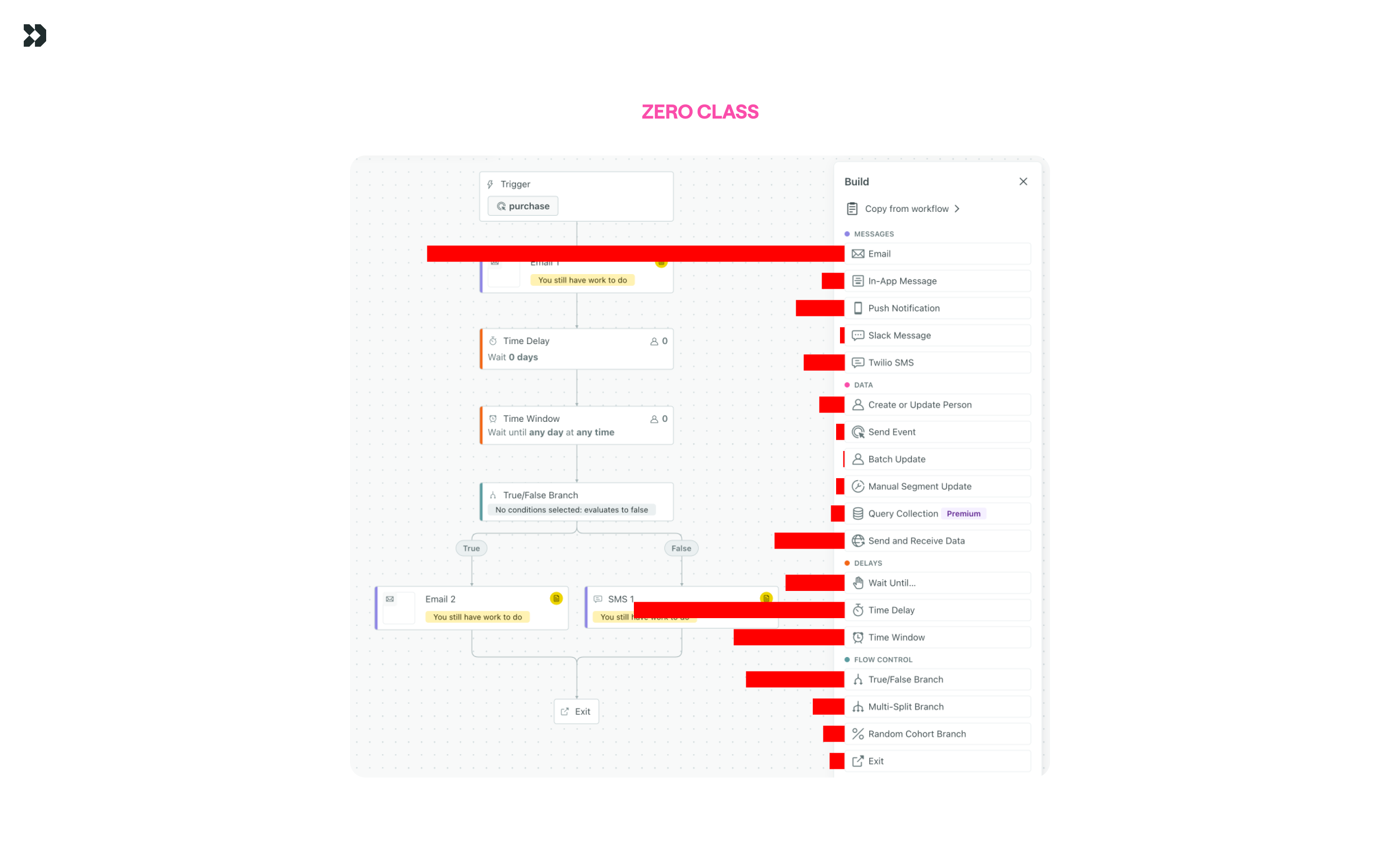
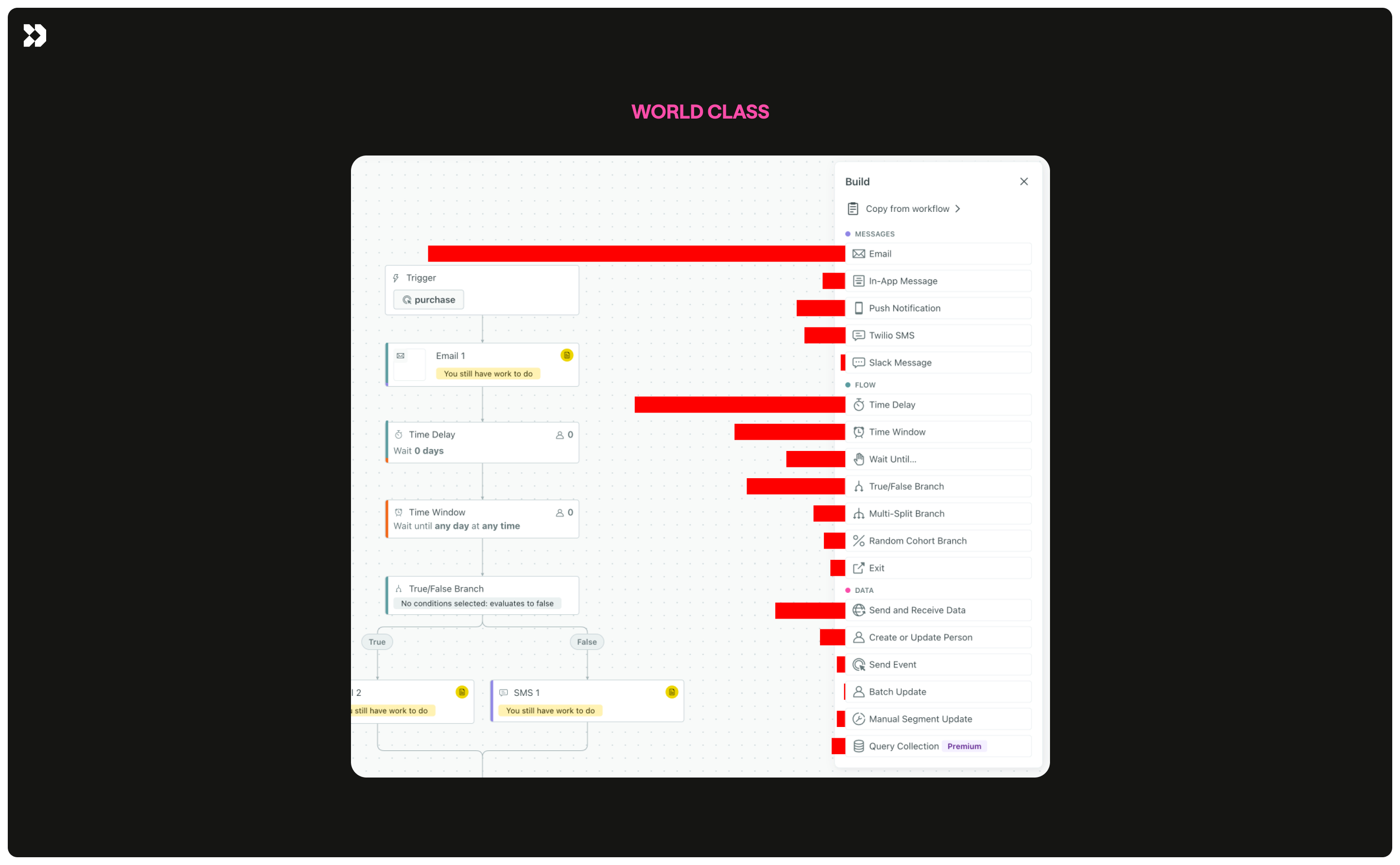
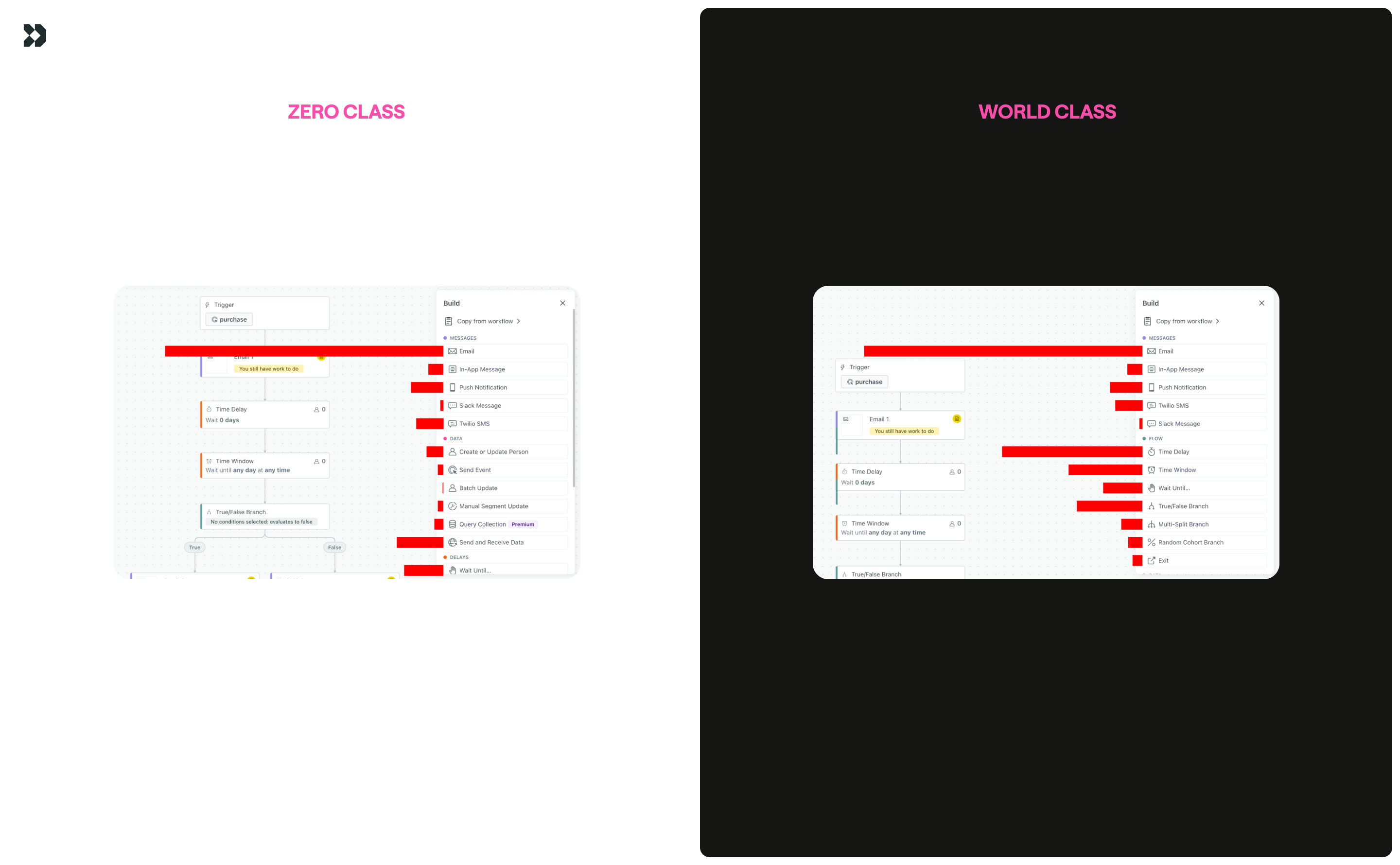
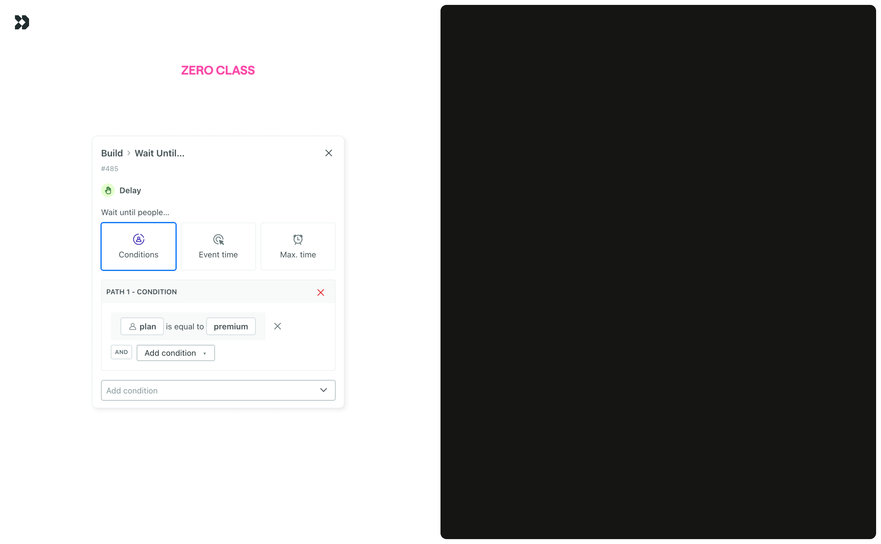
This was the first example shown in the all hands presentation. A basic dropdown in the automation workflow builder always confused customers as they learned our product. It controlled the sending behavior for an action with three options: send automatically, create a draft, and do not send. A few simple changes added clarity. I added an icon to indicate the current state, a plain-language description, and a tooltip explaining why an option is disabled.
Context menu
Right-clicking on an item to get a specific set of actions you can take is becoming table stakes in modern products. It was something our product lacked. The alternative was to click on an action, move your cursor to the panel, and then take an action. Those mouse movements add up to a feeling of “too clicky” when a simple right-click and edit content is sufficient. In the context menu, I included actions relevant to the action type, considered states (add/edit content), and accounted for how the menu interacted with the workflow canvas. The menu auto-closes if you pan more than 55px away (roughly the gap between workflow actions). This context menu would later become a location for agent actions (see Agent in the Workflow). I prototyped this in production code which changed the conversation from “should we do this?” to “oh, let’s get this shipped”.
Journey attributes
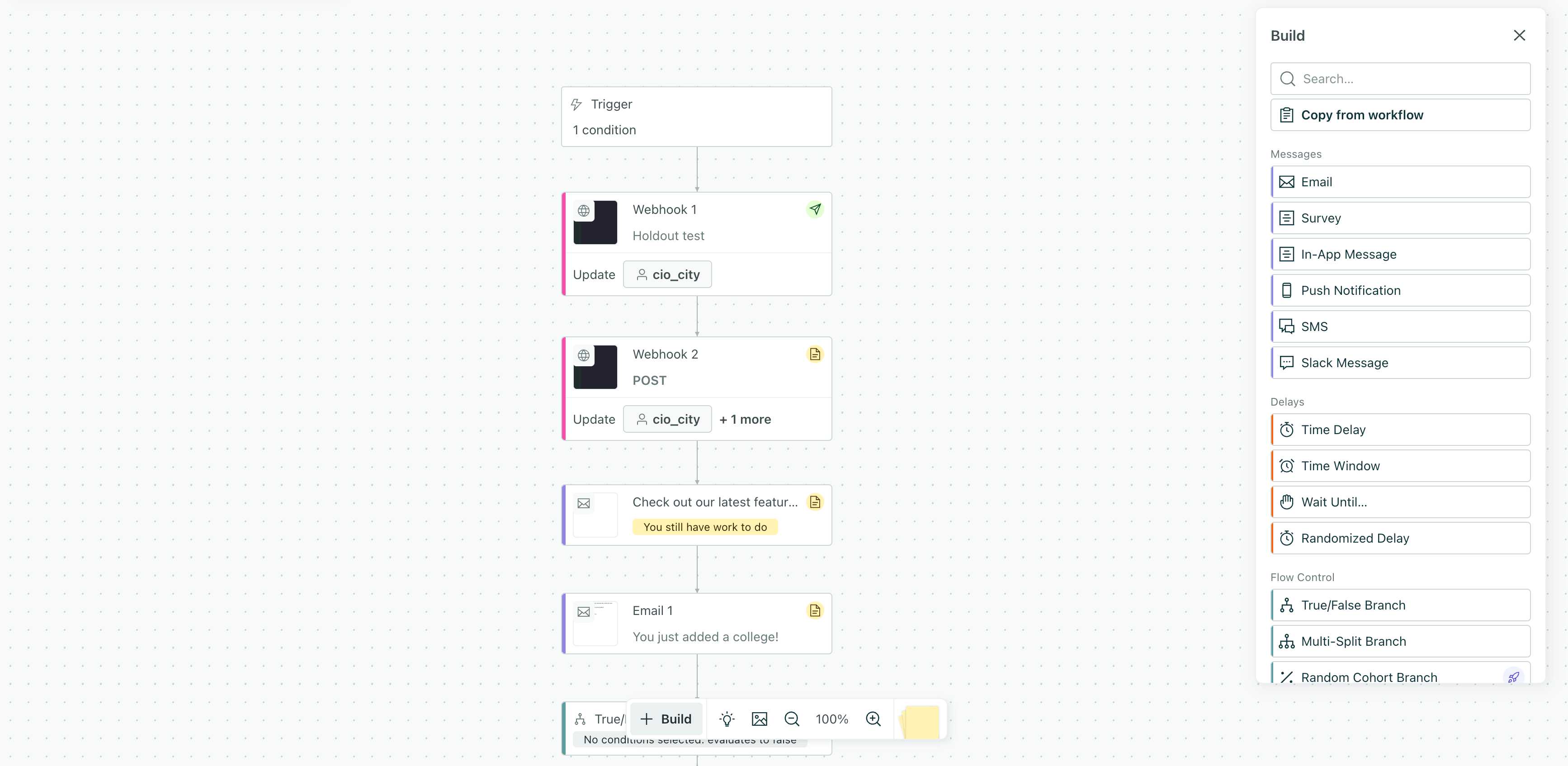
A rule of thumb I had is that you should be able to tell what an action does without having to click on it. That wasn’t the case when journey attributes were first introduced. It wasn’t clear that a webhook action was setting journey attributes to reuse throughout the workflow. I designed a solution to surface that information on the workflow canvas by adding a footer to the action. A marketer at one of our largest customers immediately noticed: “This UI change is a nice quality of life improvement!!”
Favorite actions
Like the context menu, this was another one I prototyped in production code to pitch the idea. I shared this with our team of internal marketers to validate the idea that marketers reuse few of the many actions we offer. This allowed people to pin favorite actions and hide the rest. For customers who only used a few actions, this reduced the height of the panel and freed up more screen real estate for the workflow canvas. I handed off the branch as a polished prototype and let an engineer execute the implementation.
Smaller wins
Expanded hit area. Previously, we showed a popover when you hovered over only the icon of a segment. Now, hovering over the name shows the popover as well. An important consideration was that you can have condition lists with multiple segments, so moving the cursor around the screen could create a jarring effect of popovers. I implemented a hover delay to ensure the popover only shows if a user intends to stop their cursor on that segment.
Holdout tests icon. Previously, the only indicator was placeholder text that disappeared when a subject line was added. Now, a persistent icon indicates the settings.
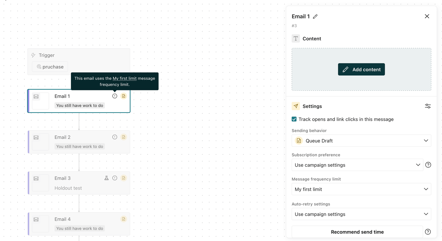
Message frequency limits icon. Previously, you had to click into a workflow action to see if a message frequency limit was applied. Now, an icon indicates the setting and links to the exact limit.
Logo-shaped confetti. A customer starting an automation is a moment worth celebrating. Previously, we just showed a static checkmark to indicate success. I worked with brand design to replace that with an animated high-five. I then added confetti, mimicking the shapes and colors from our logo, and timed it to the impact of the animation.
Going forward
This is one of the most empowering aspects of AI tooling as a product designer. I have the power to see something, ship something. The backlog of small things doesn’t need to accumulate until you can pitch a “UX debt” project. You can treat triaging issues and shipping solutions like any other customer issue. The output doesn’t have to be a pull request. A screen recording of a local prototype is a powerful tool to communicate the value of an idea.