
Edmit | 0 → 1
Led the design of Edmit’s web app from idea to launch with paid customers in one month.
Edmit helped families make a more informed decision about the cost of college. They educated over 1.5 million families on the true cost and value of colleges, helping them reduce debt and improve financial outcomes. I was the lead product designer building the 0→1 version alongside an engineer. I helped the team take a whiteboard idea to a launched product with paying customers in one month. Then we continuously beat monthly goals by establishing an operating rhythm of customer research and designing in code.
The problem
Few families will pay a college’s sticker price, but most don’t know what they will pay until an acceptance letter arrives. At that point, the decision becomes emotional. Edmit’s goal was to bring financial clarity and transparency to the beginning of the process. We set out to launch a product in one month, learn from families, and iterate based on what we learned.
Launching 0 → 1
I built the product with an engineer and product input from the CEO and COO. We went directly from whiteboard sketches to code to iterate as quickly as possible. I deliberately chose to use Tachyons CSS to give us consistency while preserving the freedom to explore. We launched the product within one month and immediately had paying customers.
Establishing an iteration rhythm
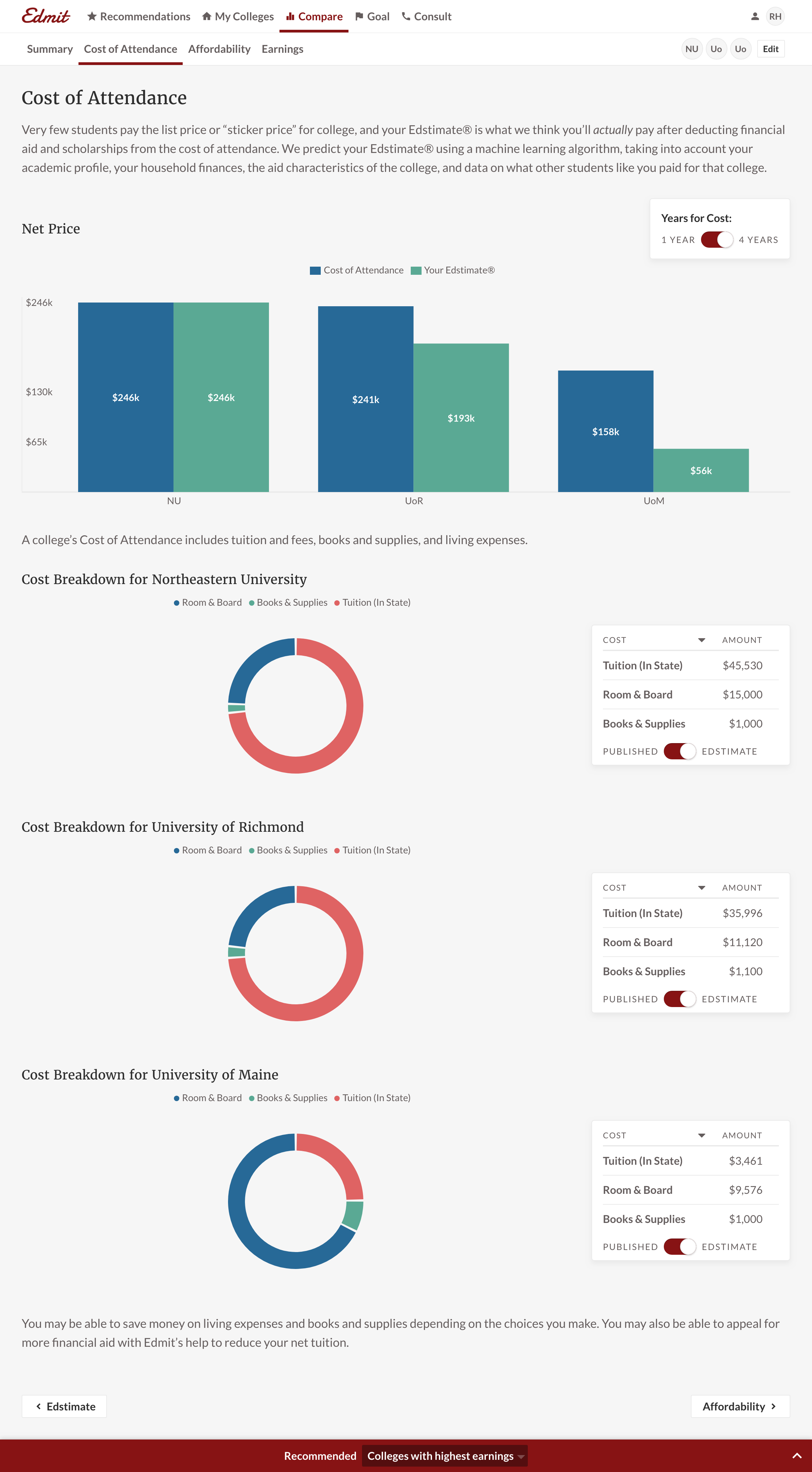
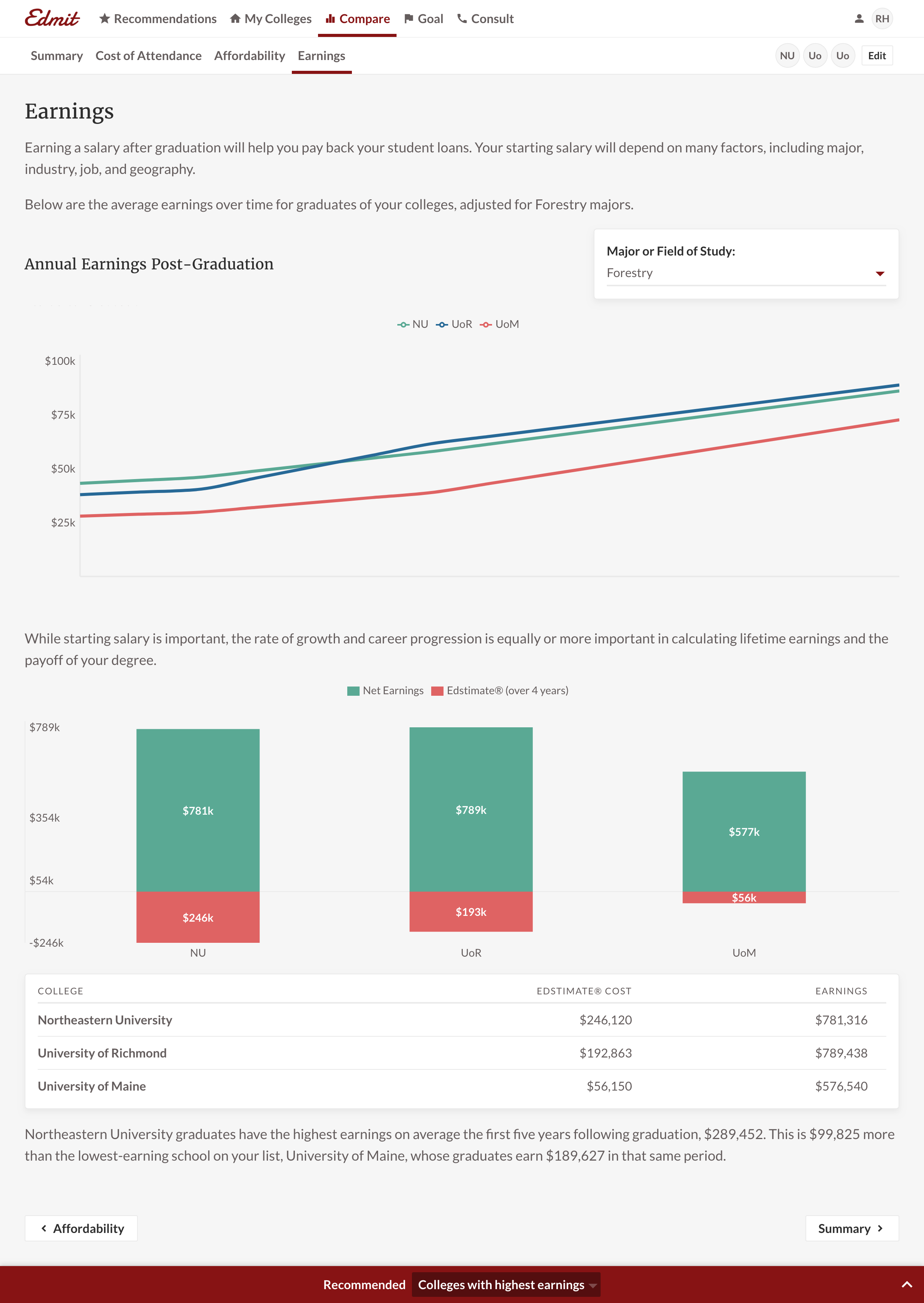
I owned the research rhythm as I reviewed FullStory sessions and conducted parent interviews weekly. The interviews were split into first-timers and those who had already sent a child to college. While they had different levels of comfort with the process, they shared the same two jobs: broaden the list of schools and then narrow it. Broadening the list was driven by the anxiety of “did we miss any schools?” Narrowing the list was centered around “can I afford it?” and “will I get accepted?” Customers were emphatic there was only one list, “my list,” that they would continue to curate. They valued straightforwardness over cleverness, which is why every chart was accompanied by a basic data table. We knew a person was more likely to purchase if they manipulated the chart inputs or removed colleges from their list by analyzing FullStory sessions.
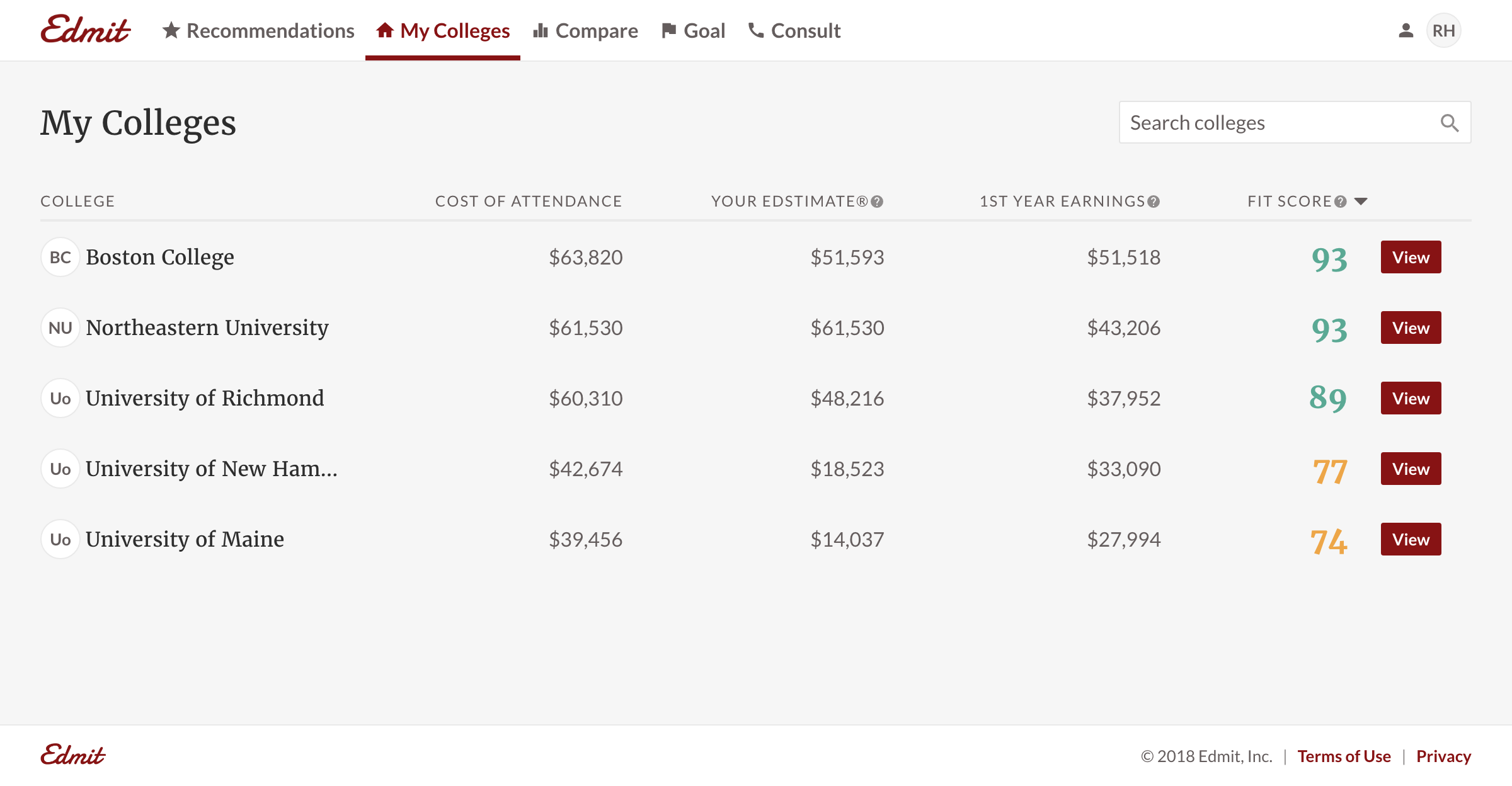
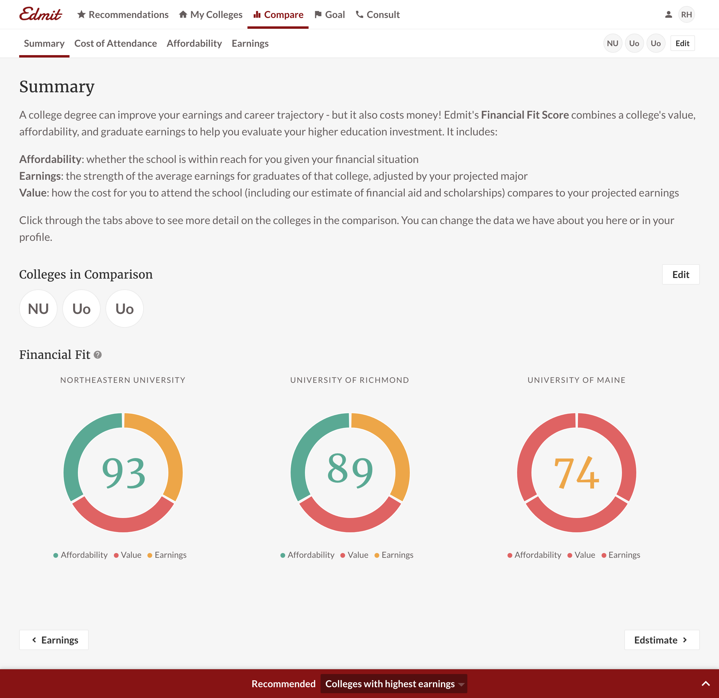
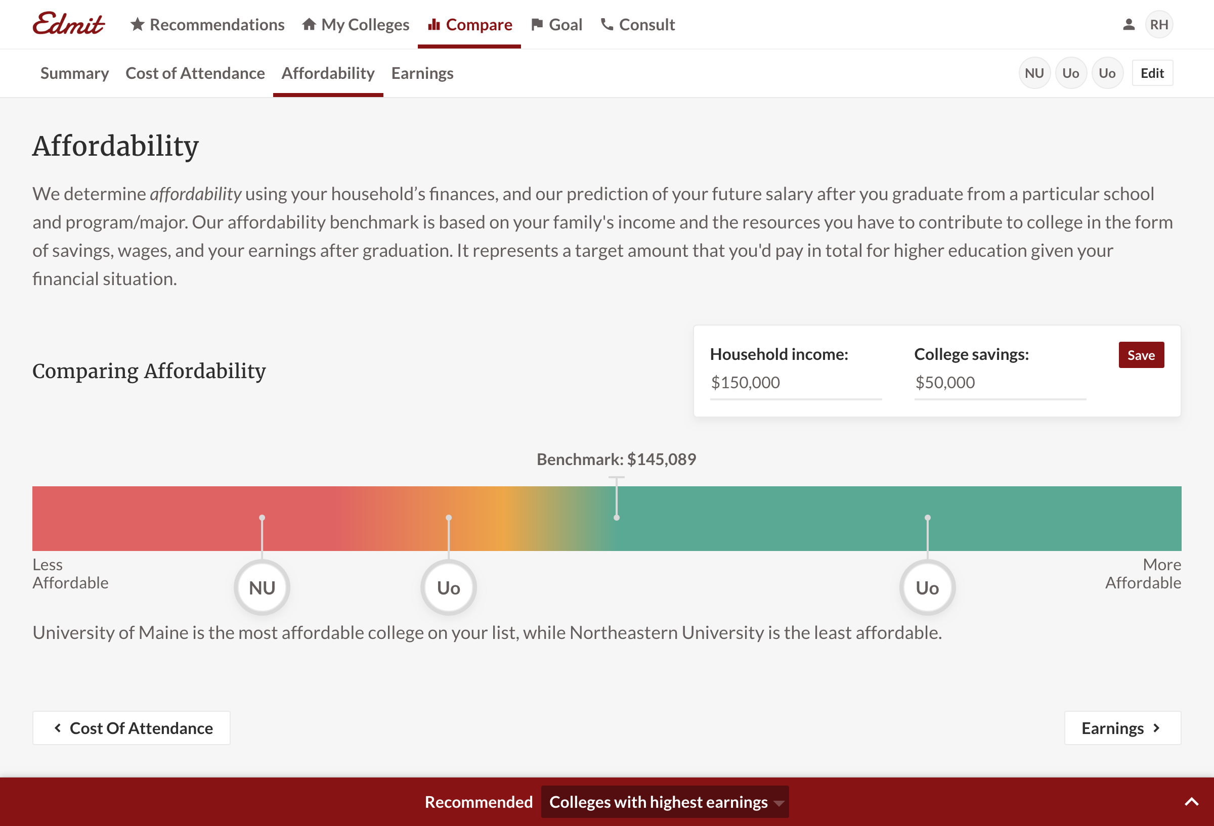
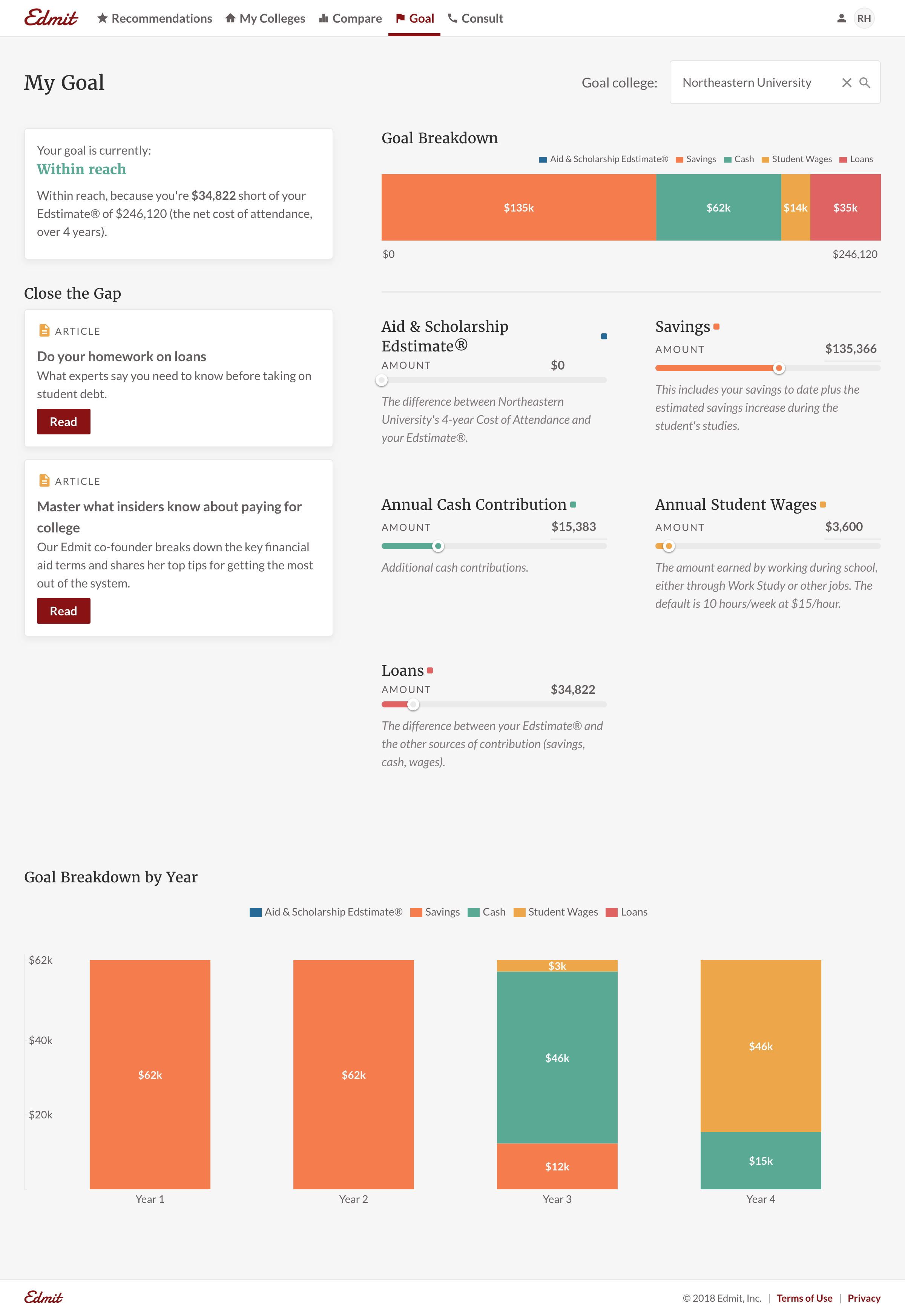
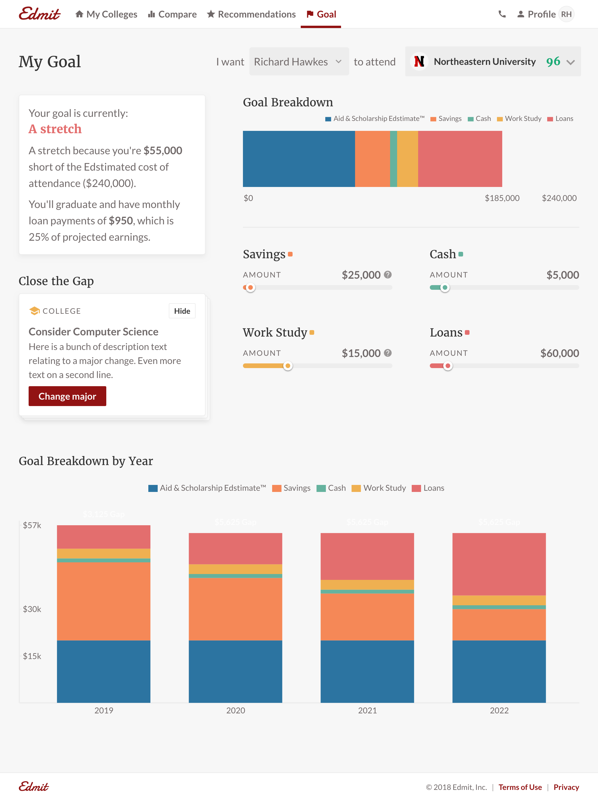
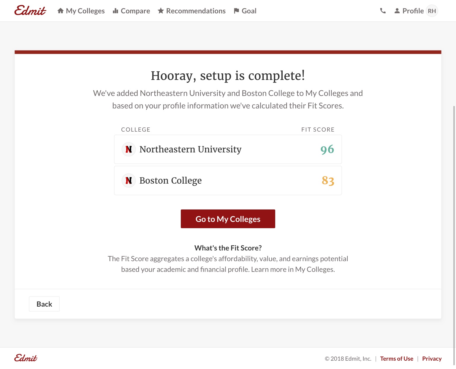
The research led me to make My Colleges the single source of truth. Additional features such as reports or recommendations would all serve the list. We created a Fit Score out of the cost, aid, and earnings. I designed how it surfaced in the product so families could see not which tuition was higher, but which school was a better investment for the family. Recommendations helped solve the anxiety of finding other schools. Families were looking to us as the experts to be prescriptive and surface schools they wouldn’t otherwise consider. This also opened a future revenue path for recommendations. Lastly, Goals helped answer the narrowing question, helping families understand what their finances would look like post-graduation.
The concept that failed
We tried a concept of reports where colleges were organized into more clever categories like “Top Choices” or “Schools Near Me.” We quickly learned that parents didn’t know what reports to make. Instead of trying to educate them, we dug deeper into the behavior. Parents weren’t naming their saved reports and each saved report differed from the last by just one college. They were not creating different types of lists. We pulled away from the concept and went to a single list of colleges. Listen to what customers say, but validate it against what they do. Either source alone can mislead you.
Little details
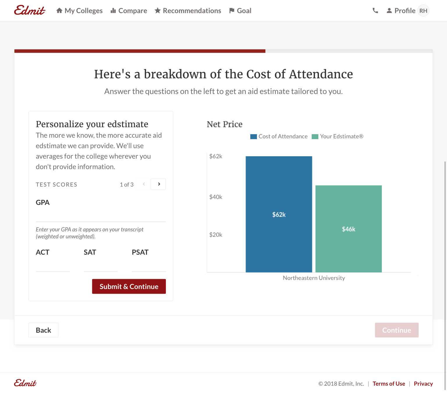
I deliberately did not want the experience to feel like filling out a long form, hitting submit, and waiting for results. It needed to be interactive. I set out to make the product feel like a partner in the customers’ college search. In the product, each new input produced a visible change to the charts and estimates. Building the chart incrementally gave customers a sense of ownership.
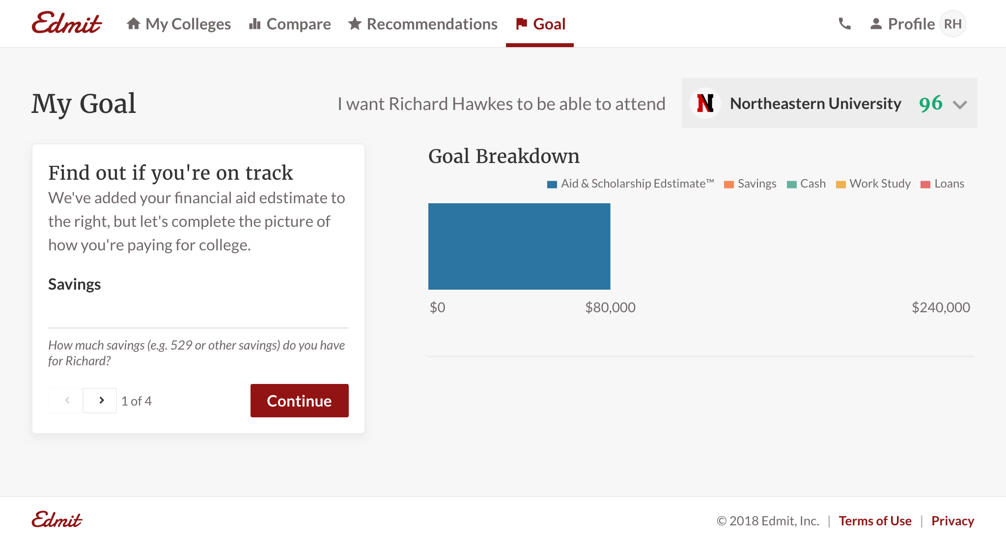
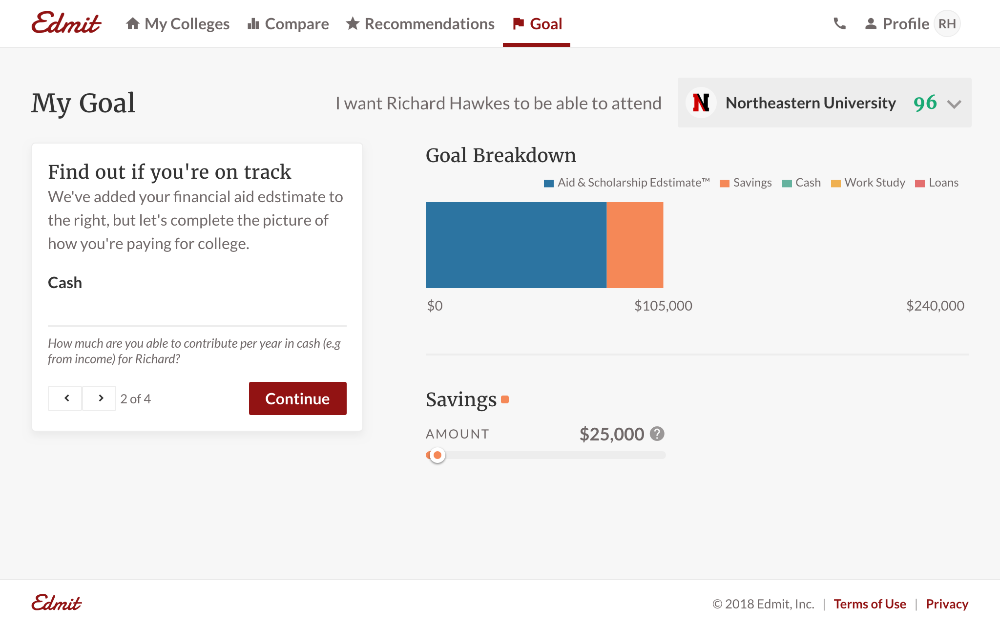
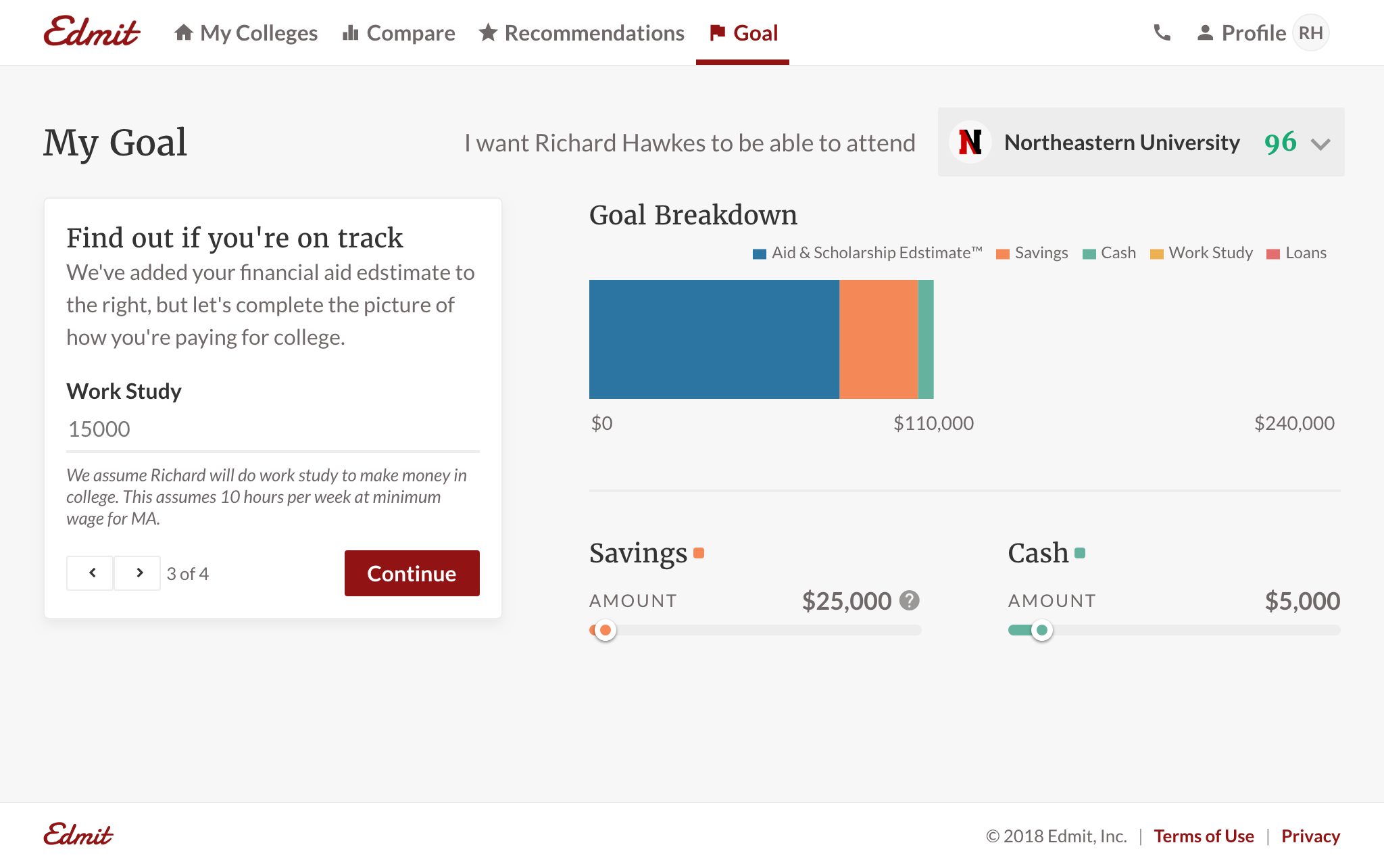
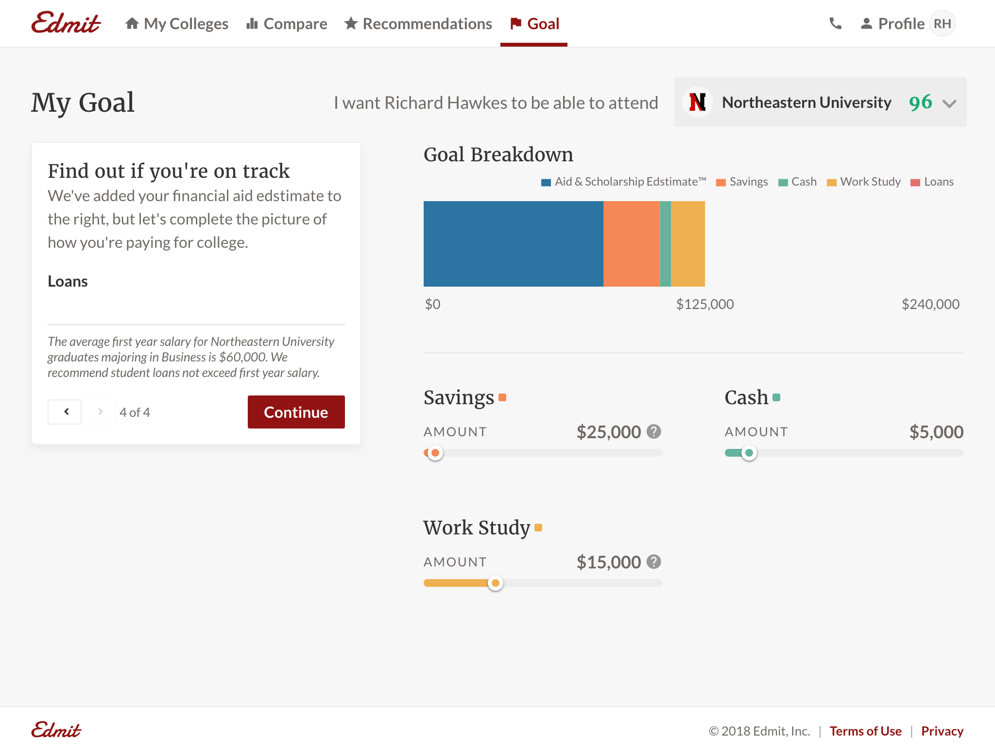
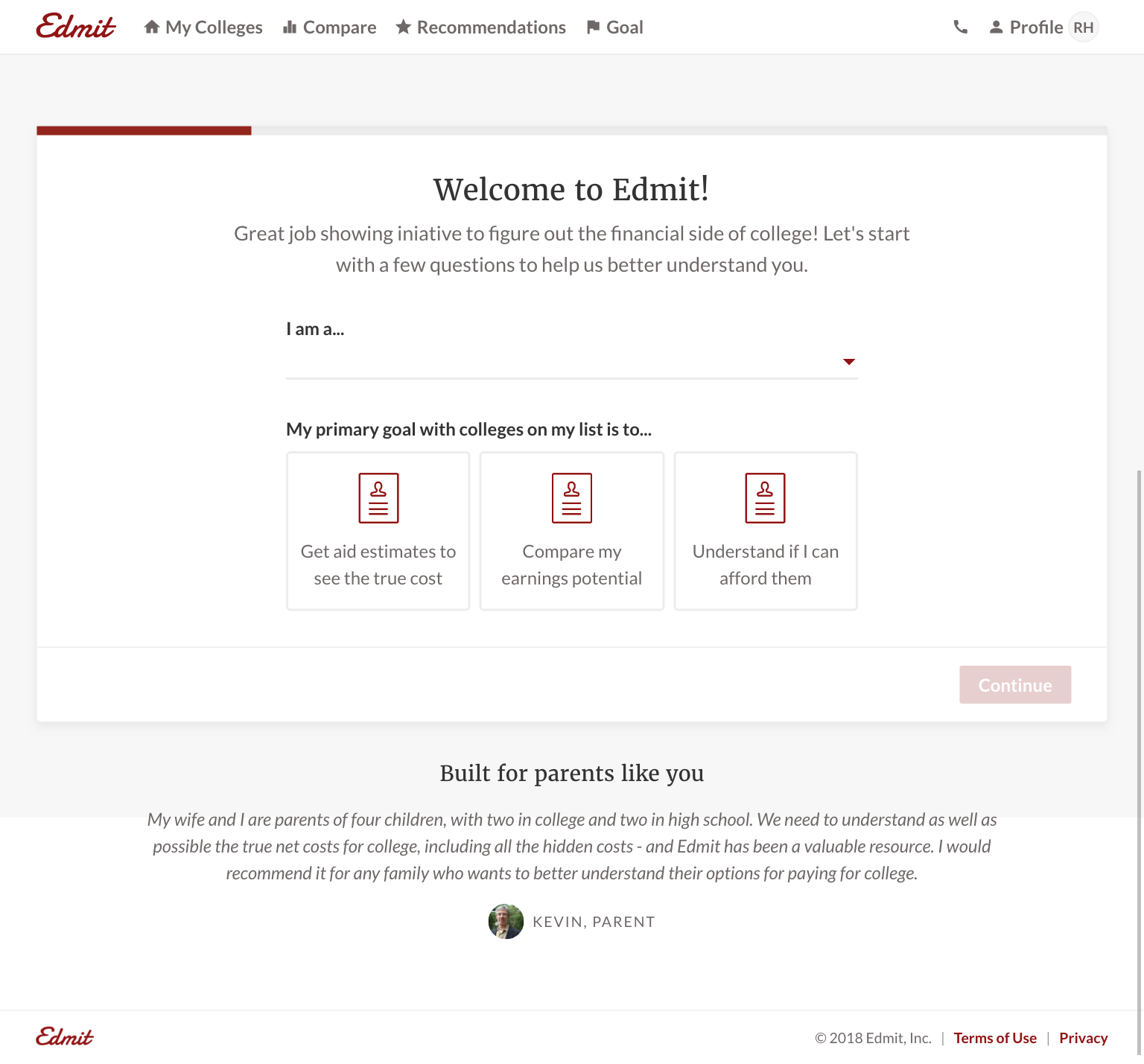
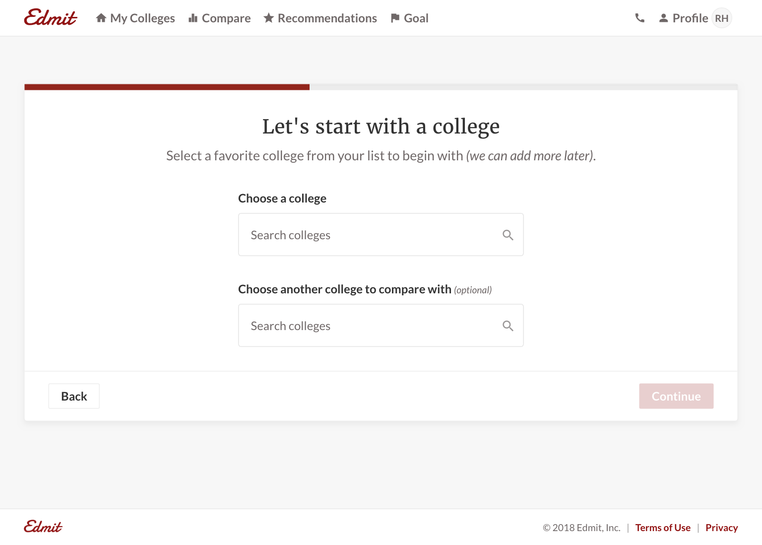
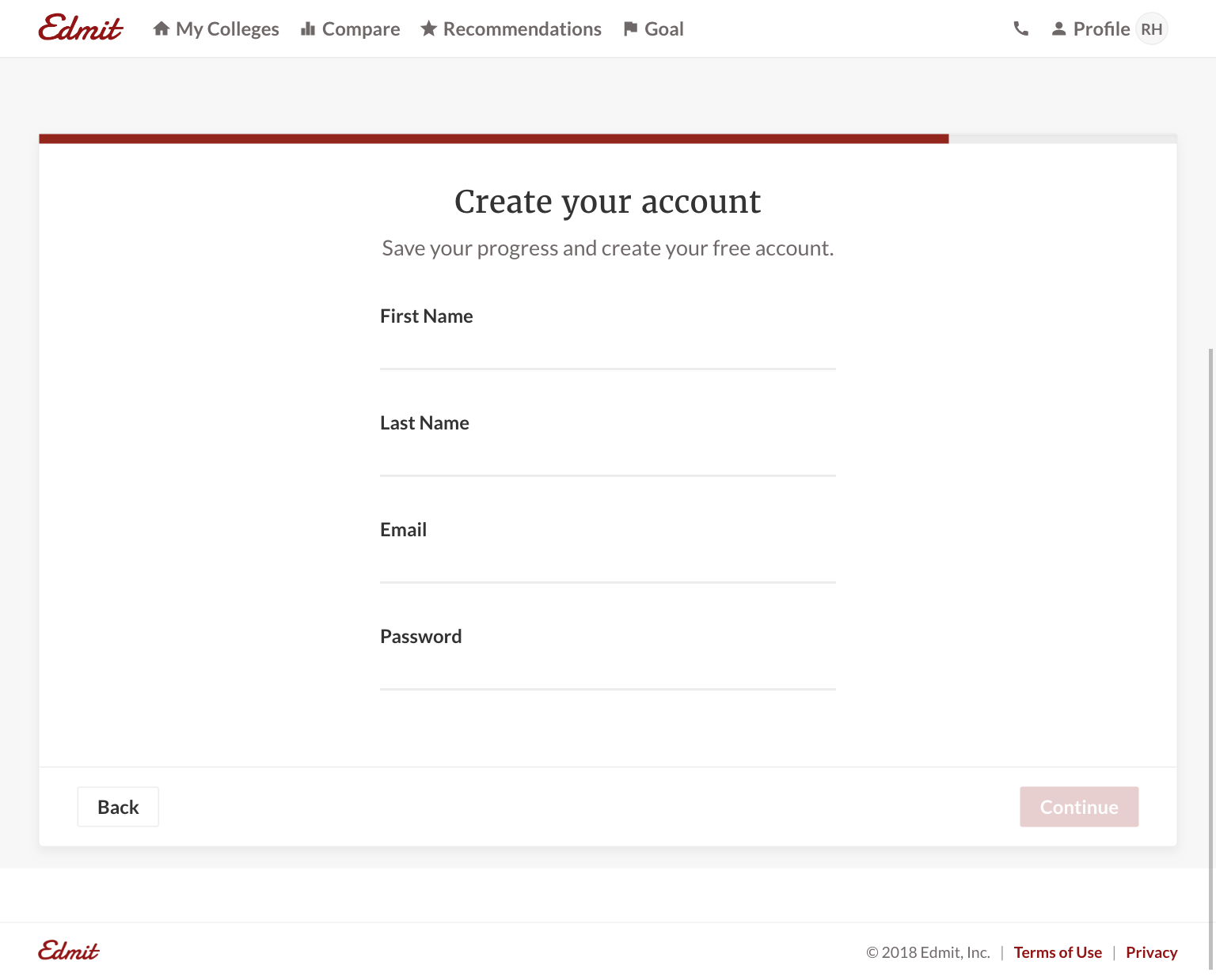
I designed the onboarding flow so customers could quickly see a personalized estimate by choosing a college and providing known inputs like test scores. The product provided value before asking for account details. It also set expectations, since families would naturally wonder what estimates looked like for other colleges.
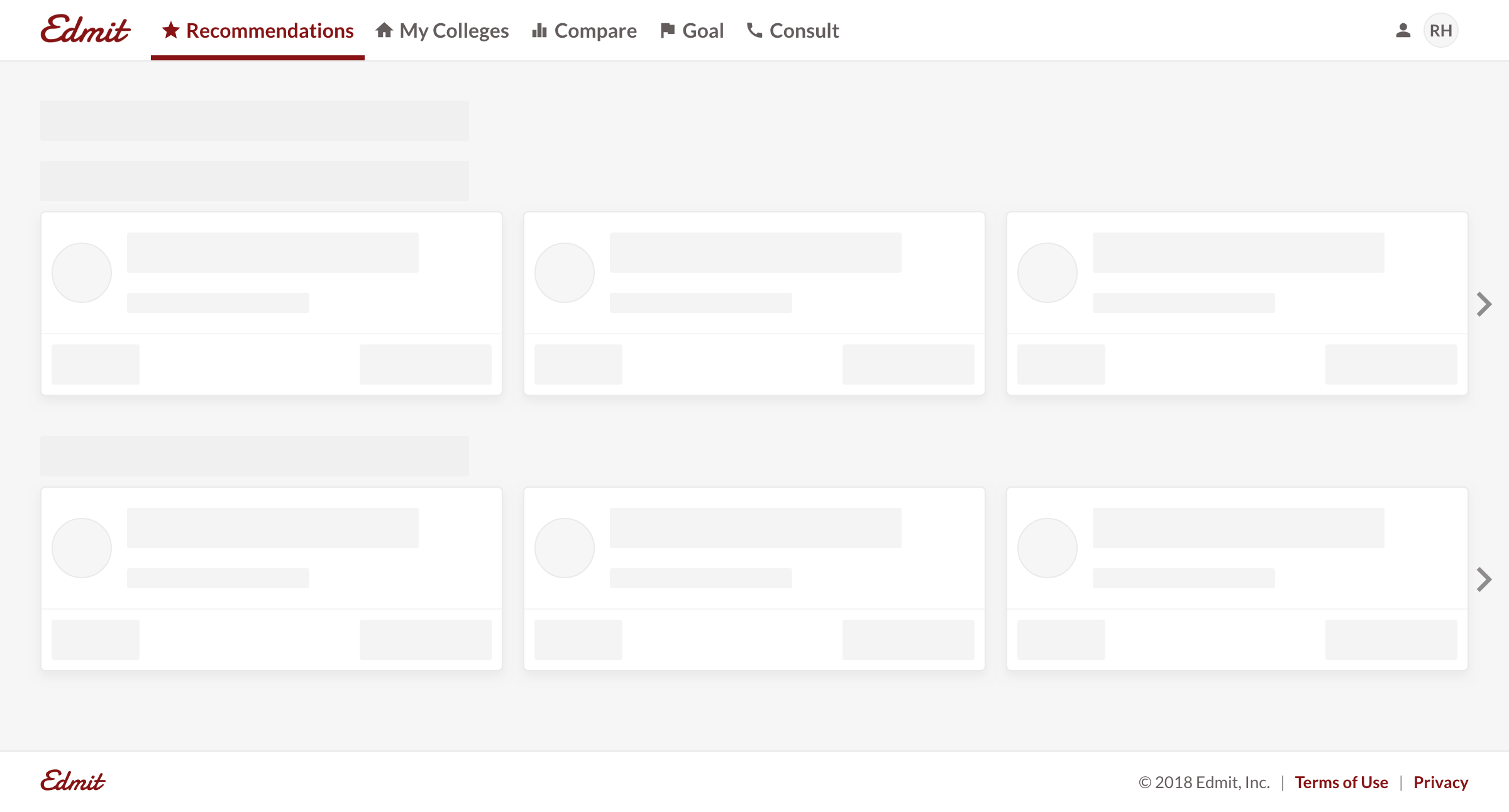
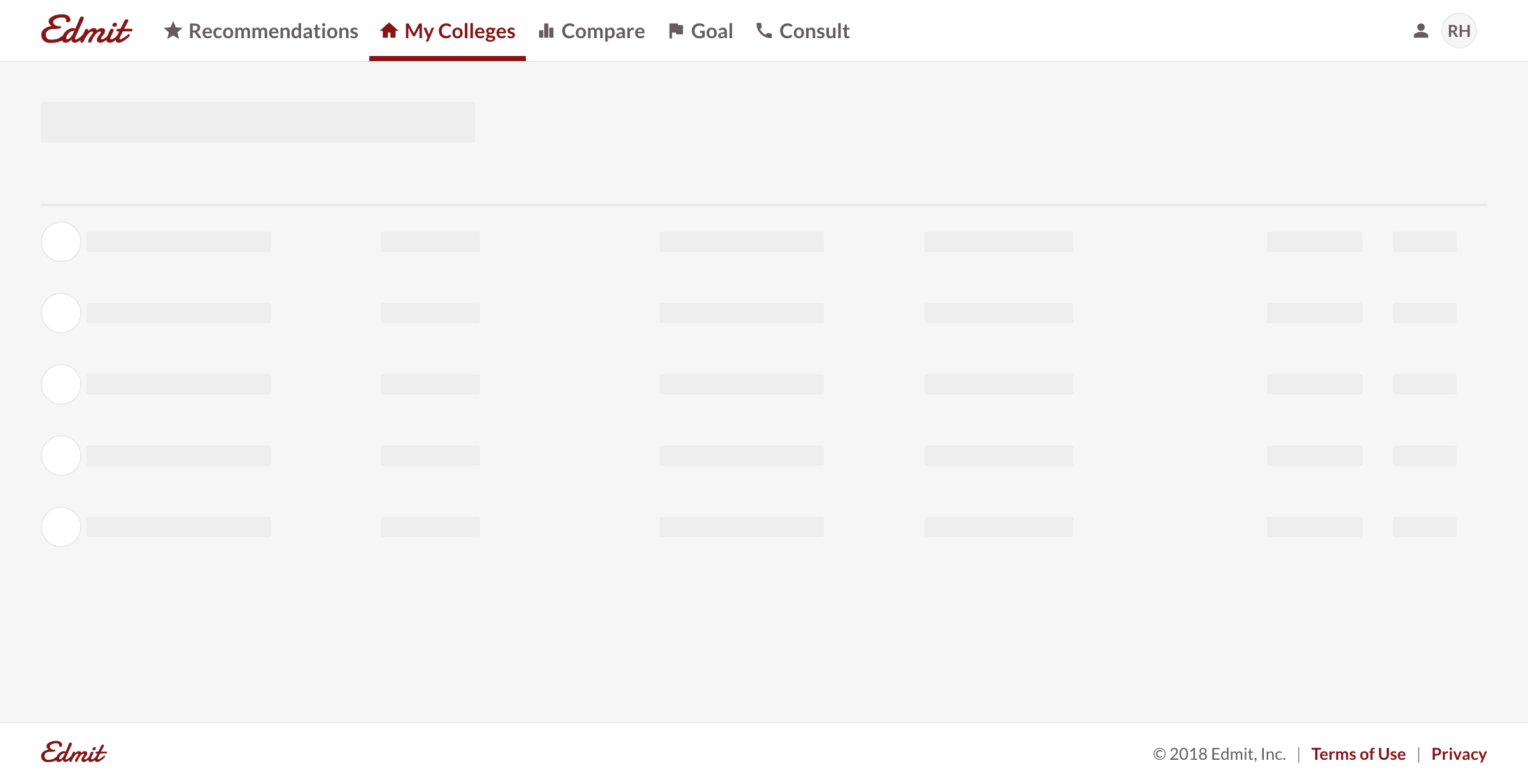
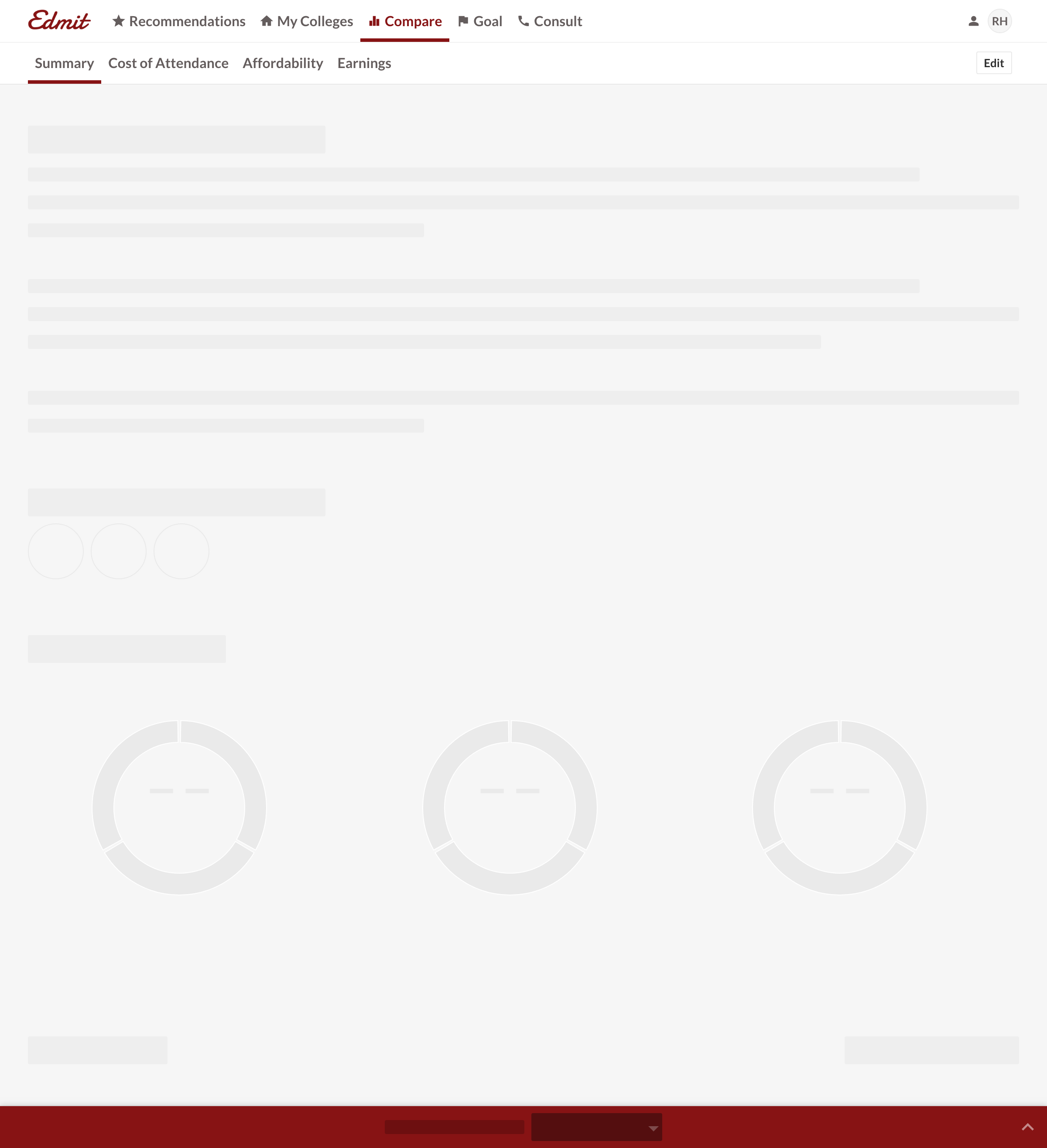
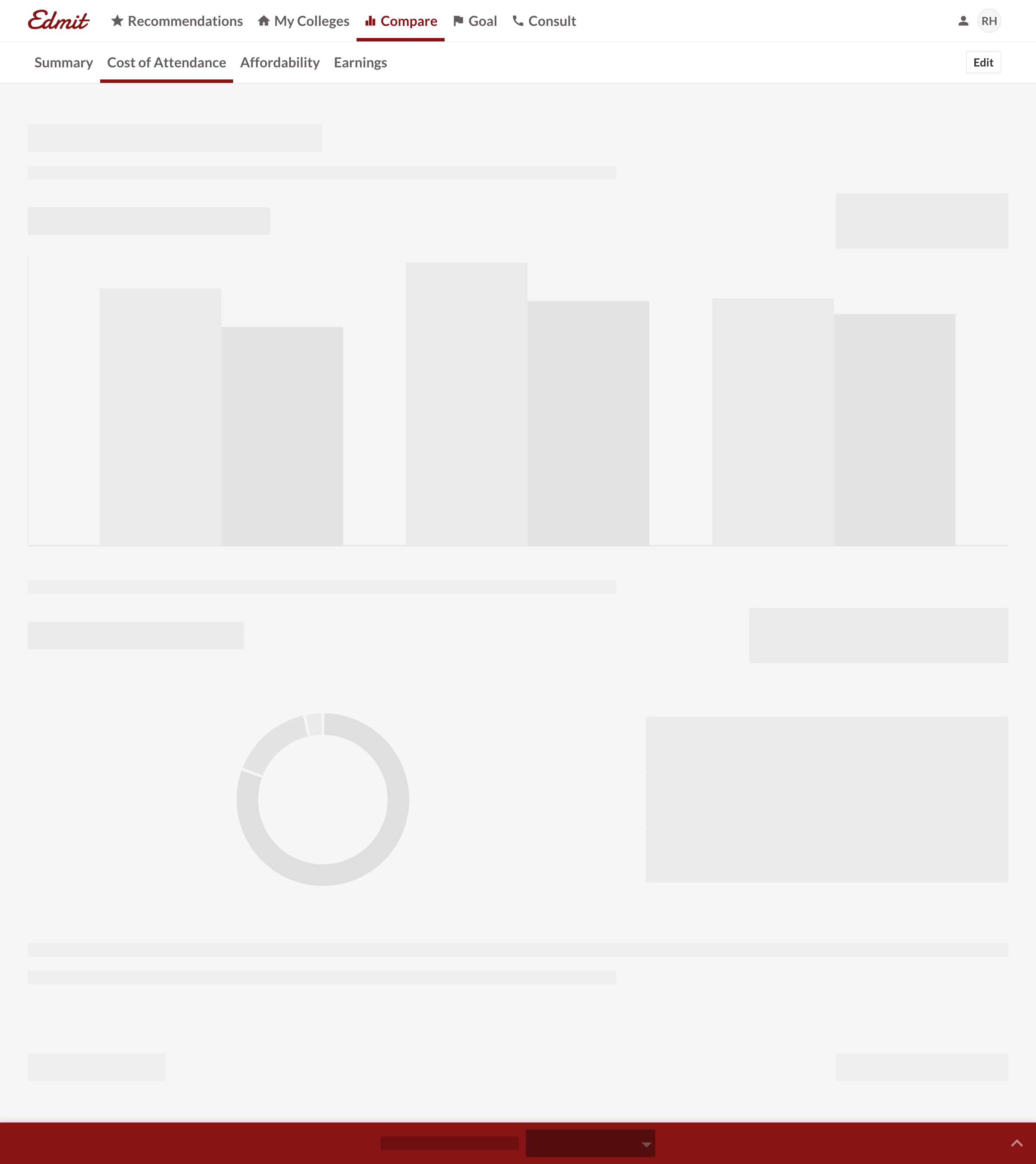
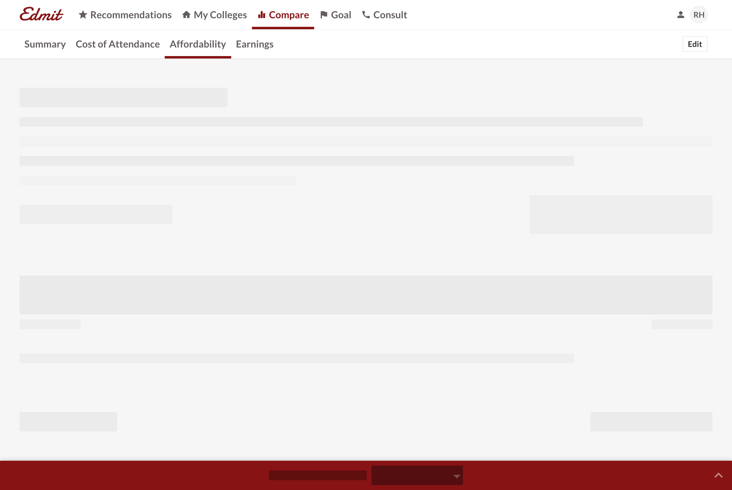
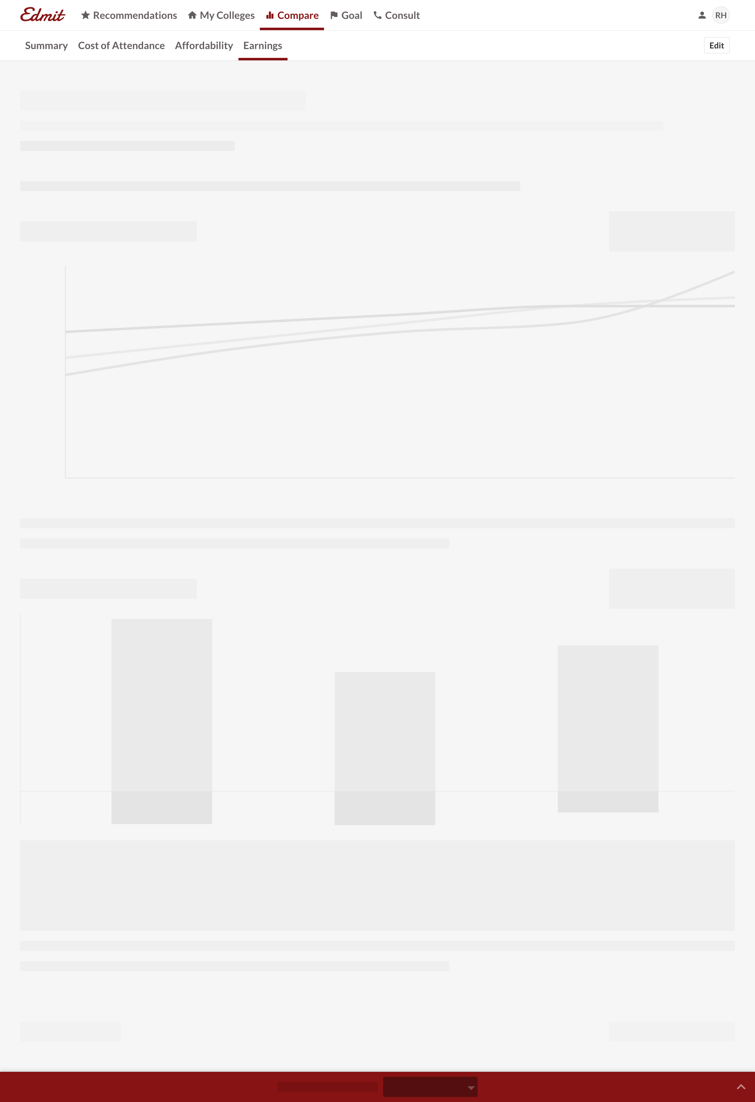
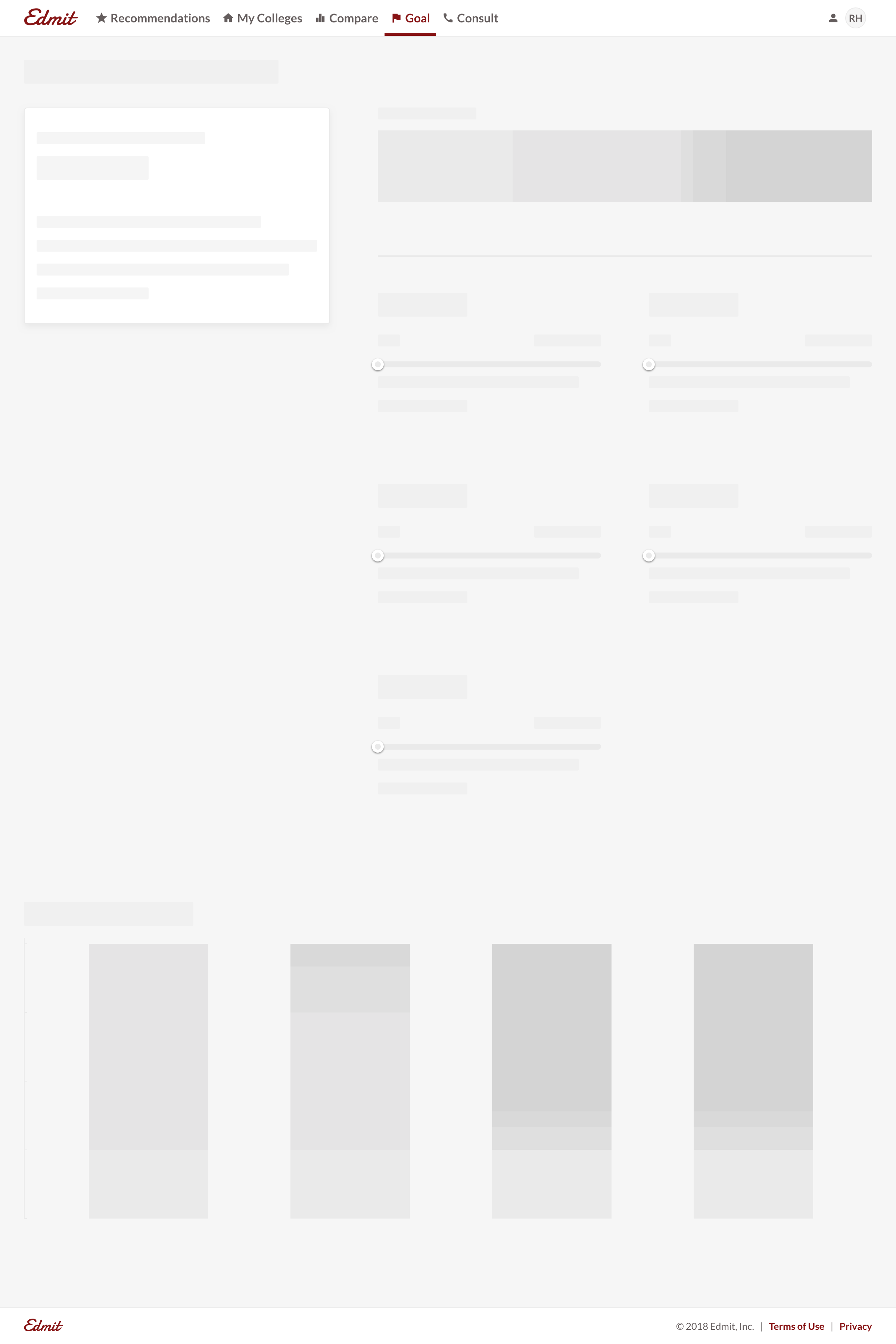
I also took the time to build content-aware skeleton pages. This provided a more accurate preview of each page and feature in the product.
Going forward
It’s impossible to overstate the value of listening to customers. Getting a user on the phone allows you to hear how they value the product in their own words. You can then use those words throughout the product. It’s equally important to validate that with actual usage. Success was driven by designing in code and quickly iterating based on feedback. What mattered most to me was seeing the money parents saved. Edmit was acquired in 2021, having helped over 1.5 million families.
I feel like I have the tools to effectively advocate every year and wait till 4 years from now when it’s my son’s turn...I’ll be an expert!! I’ve already shared your resource for mothers coming behind me.
I am shocked, [Redacted] just awarded $5,000 per year!...I am so happy!
We received $8,000 from our [Redacted] appeal today!!!!!! Thank you, thank you and thank you. Your service was incredible and so helpful.
[Redacted] is offering $4,000 more per year in scholarship...Thanks for your help. You have been awesome!!!