Edmit
Edmit is:
An app that helps families make a more informed financial college decision. Edmit educates families on the true cost and value of different colleges to reduce debt and improve outcomes.
What I’m proud of:
Going from idea to launch in one month and getting paying customers shortly after. I’m also proud of continuously iterating on the product to beat monthly user goals. I’m most proud of combining months of learnings with user research to launch a 2.0 version – this is also the focus of the case study.
The project:
Context
Edmit uses a family’s finances and their student’s academic merit to get personalized financial fit scores for colleges. Families can then manage their college list and compare colleges across many data points. These include: student fit, admissibility, affordability, cost of attendance, earnings potential, and more. Users can use that information to negotiate price for their top colleges.
Role
While working with Edmit, I served as the lead product designer. I owned user research efforts; including weekly Full Story reviews and user interviews. I also contributed as a front-end developer delivering static UI components (React).
For the 1.0 release, we started with an idea and whiteboard sketches. Our goal was to launch a beta in one month. Given the time constraint, we skipped static mockups and designed in code. I used Tachyons CSS to rapidly design in the browser and leverage a built-in design system. For example, Tachyons uses spacing scales by default (pa1, pa2, pa3, pa4, etc.= 0.5rem, 1rem, 2rem, 4rem, etc.). This saved time and allowed us to have consistency by default. This process enabled us to launch the beta on time and quickly get customer feedback. After the launch, I continued to design new features and iterate on the product.
For the 2.0 release, my focus was on designing the user experience. I conducted user interviews to better understand our users. I learned how they used the product and what the value of Edmit was in their own words. Based on our own learnings and ongoing Full Story research, we had some hypotheses for 2.0. I produced wireframes, mockups, and prototypes to test. After user testing iterations, we decided on a design direction. Then I implemented the static UI components along with additional states (loading, empty, etc.).
Goal
For 2.0, we wanted take our learnings from the first 6 months and “pour some concrete.” We set out to refocus our core product to better align with users’ goals. We also had ideas for potential revenue sources and wanted to lay some groundwork for those ideas.
Research
We currently used Full Story to measure critical paths for potential bugs or monitor adoption of new features. For 2.0, we used it to better understand what a successful user looked like. We investigated paid v. free users and new users with multiple sessions. Two examples of small differences we noticed were interacting with a report and managing colleges.
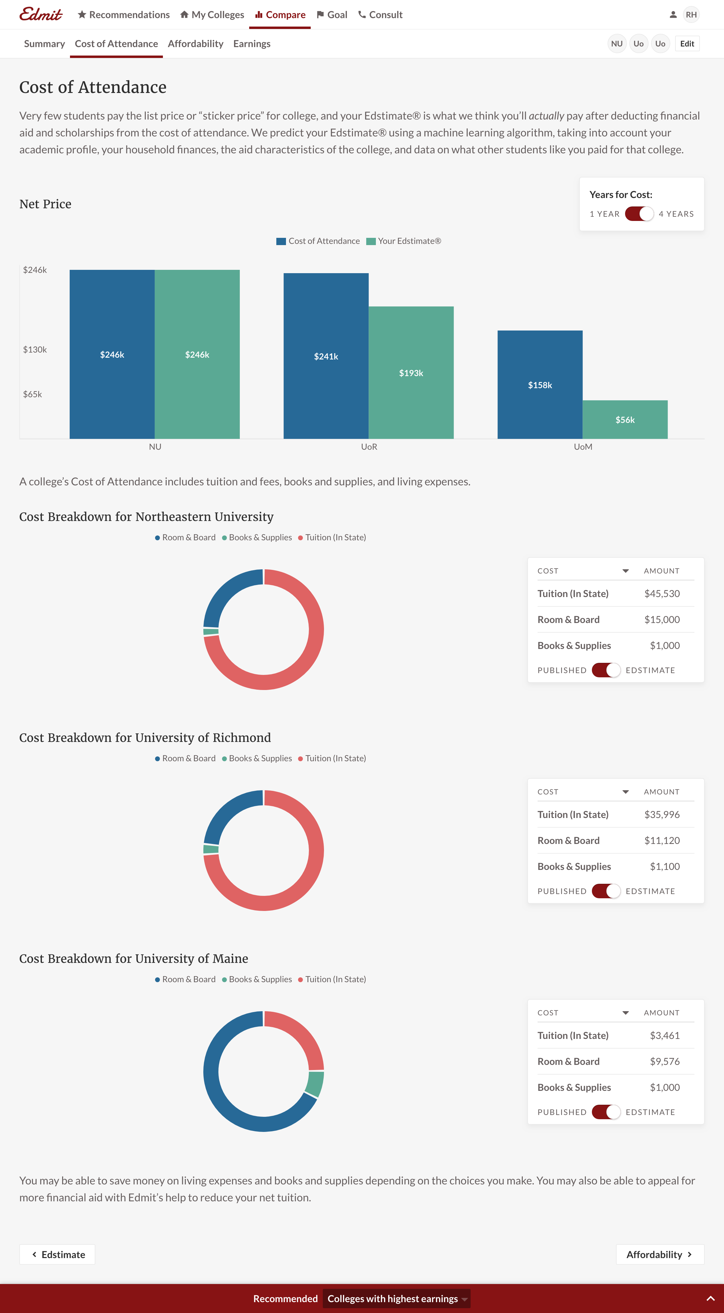
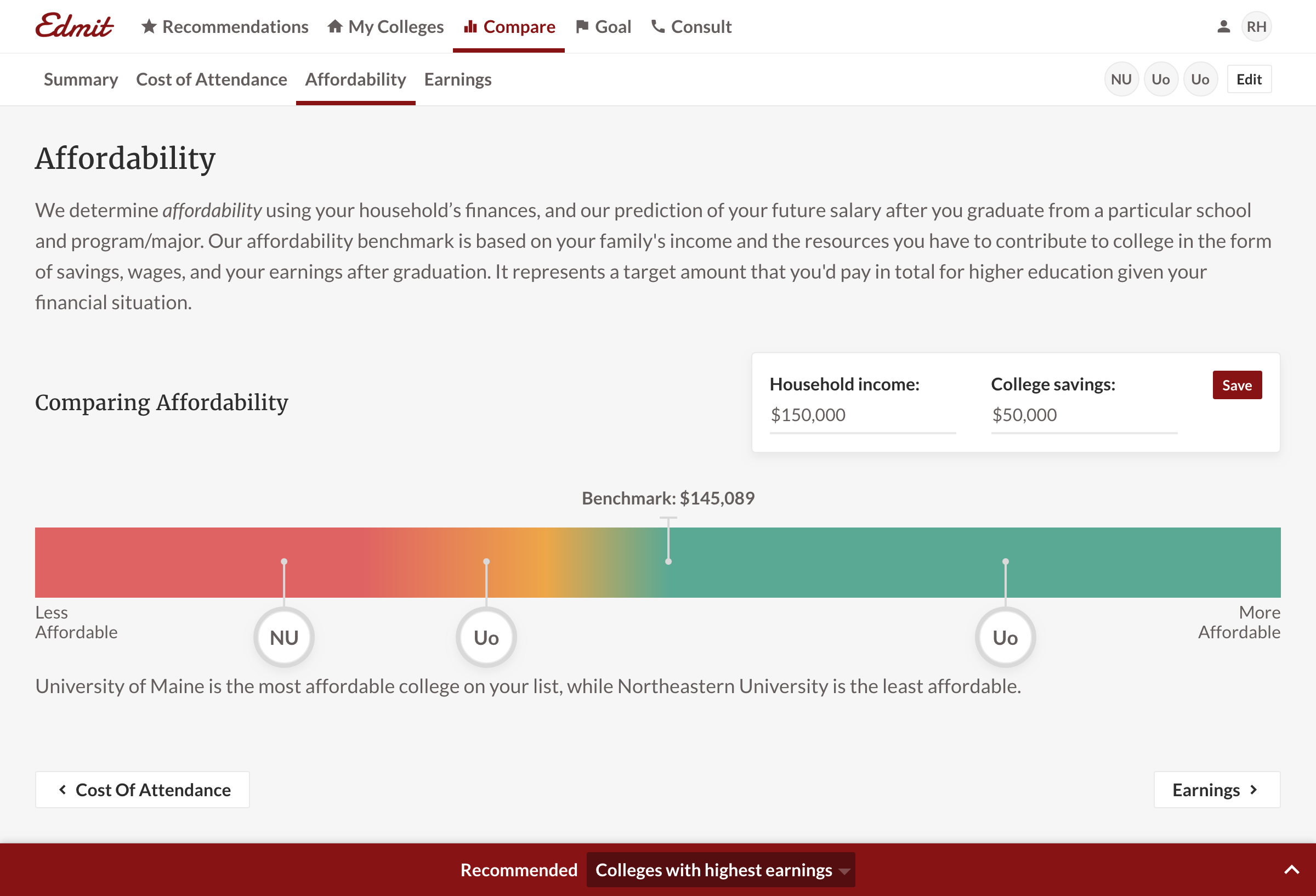
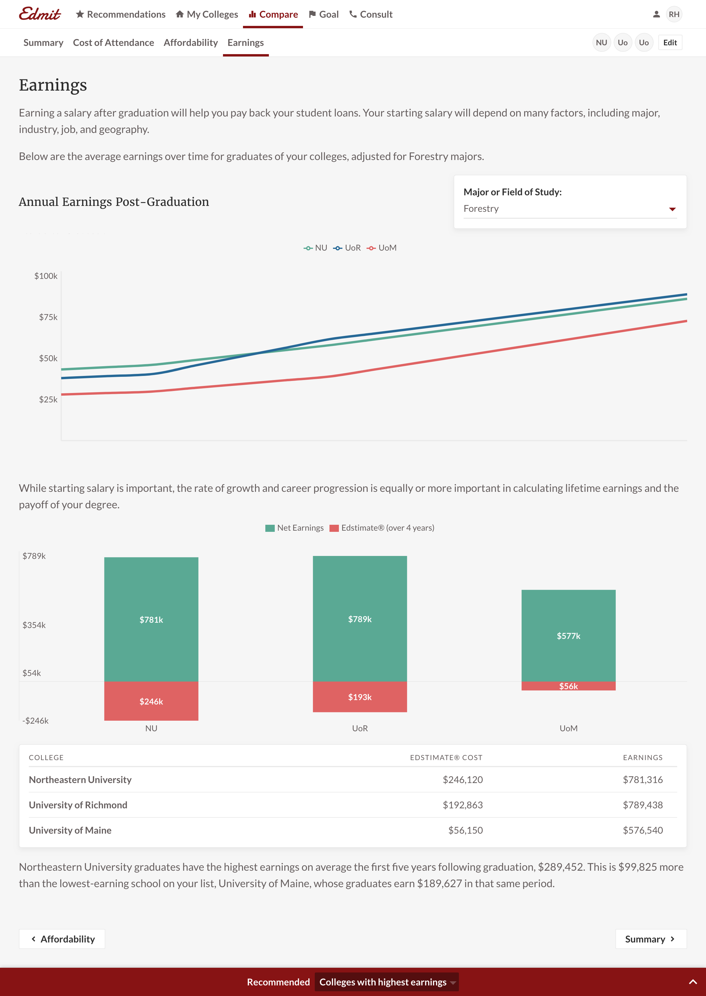
For context, a report consists of multiple tabs and each tab has one or more charts. Some charts have form fields that allow for further customization. For example, on the career earnings chart, a user can change the college major to see the effect on earnings. We observed new users with multiple sessions were using these fields at a higher rate. And for managing colleges, we noticed paid users were adding AND removing. A free user was often fine with having a longer colleges list and not actively grooming it. While these differences are subtle, they were an indicator of commitment to purchase.
You’ll note in 2.0 that each chart now has reserved areas for interactive elements. As a product that requires user inputs, it allows us to have a more contextual location to ask users for data. Additionally, the My Colleges table is more interactive as well. To further reinforce list management, users are only allowed to use their colleges in a report. A Recommendation’s action isn’t to “View College” but to “Add to My List”. We designed the My Colleges list to be a core tie throughout the product.
User interviews
Edmit’s primary users are parents. Among the parents, there are two distinct groups. There are those without any college admissions experience and others that have sent one or more kids to college. After conducting user interviews we learned the two groups share two common goals: broaden the list of colleges, then narrow that list. The concept of list management was very clear from the user research calls. All users said “my list” and reiterated it was only one list: “I would only do one list.”
Users needing help to broadening the list came from an underlying anxiety of “did we miss any schools?”. The parents have known inputs such as interests, GPA, major, weather, size, etc., but struggle finding all relevant schools. Or, there are often too many schools that match and they become overwhelmed. And to narrow their list, users were asking themselves “Is this college a viable choice?”. Viability to them meant “Can I afford it?” and “Will I get accepted?”. We also learned families had a different willingness to invest per school. For a student’s top choice, a family might be willing to take out a larger loan. As a result, we tried to incorporate a way to quantify a colleges’ fit given variable investment.
One thing we learned that applies to the entire product was to be overly clear. Most of the parents aren’t as tech-savvy as their children. And it’s the parents who were driving the college research process for their children. So we tried to prioritize straightforwardness over cleverness throughout the product. One simple example was adding data tables to most charts. Now a user didn’t have to completely rely on interpreting a chart to digest the information.
Failed concept
One failure I want to highlight: Instead of having a ‘boring’ table to manage colleges, we though of solely using reports. For example, a user might have a “Top Choices” or “Schools Near Me” report. We quickly learned that parents “didn’t know what reports to make.” Product data confirmed this. We found users didn’t name reports when they saved them. And the saved reports were typically one college different. I.e. their behavior was a more fluid adding or replacing of colleges. This is a great reminder to listen to your users, but also validate what you hear with another data source.
2.0
Note: College avatars are intended to have school logos/crests but it was pushed for launch.
The following are a couple of key changes and additions based on user research:
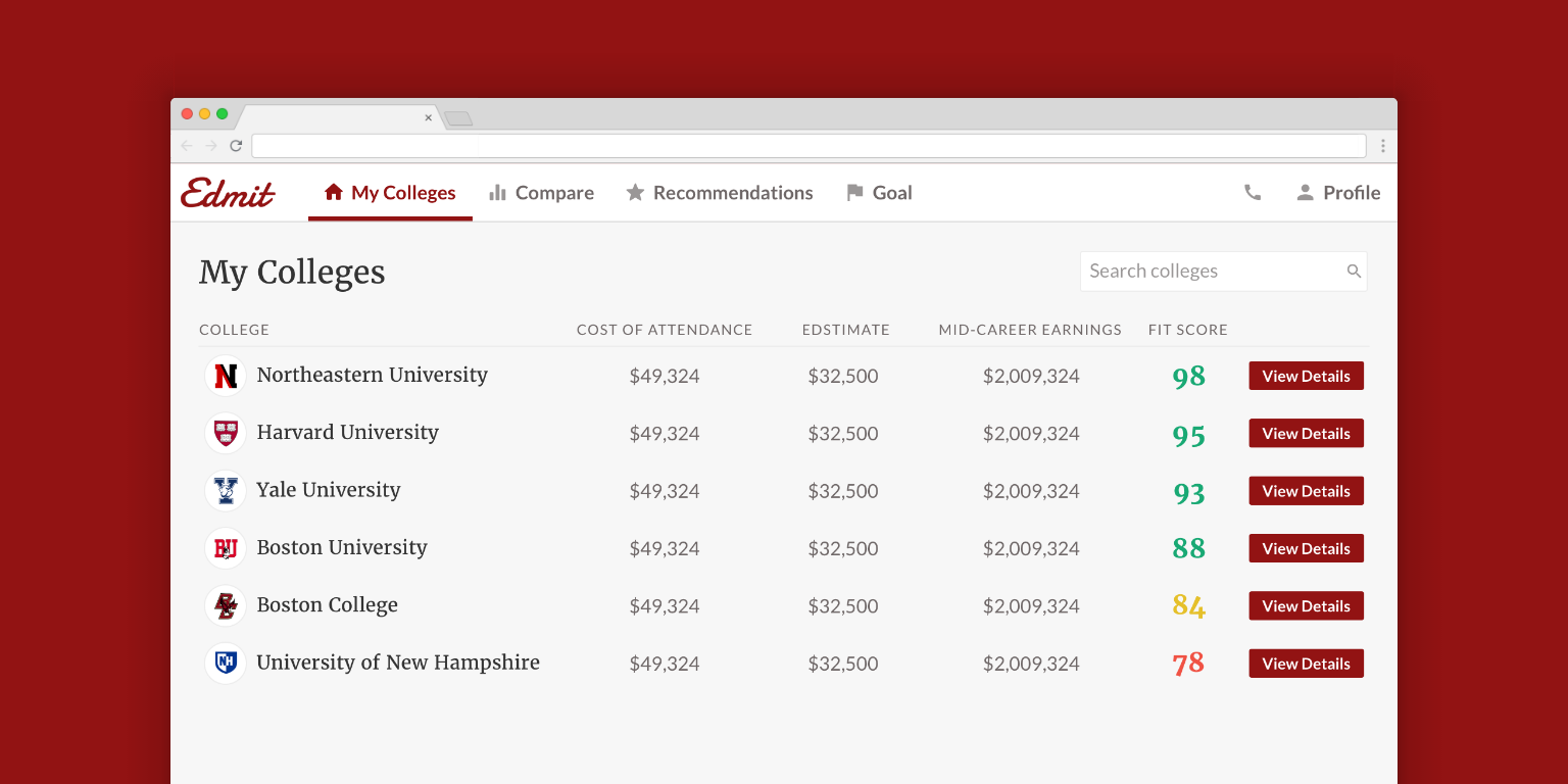
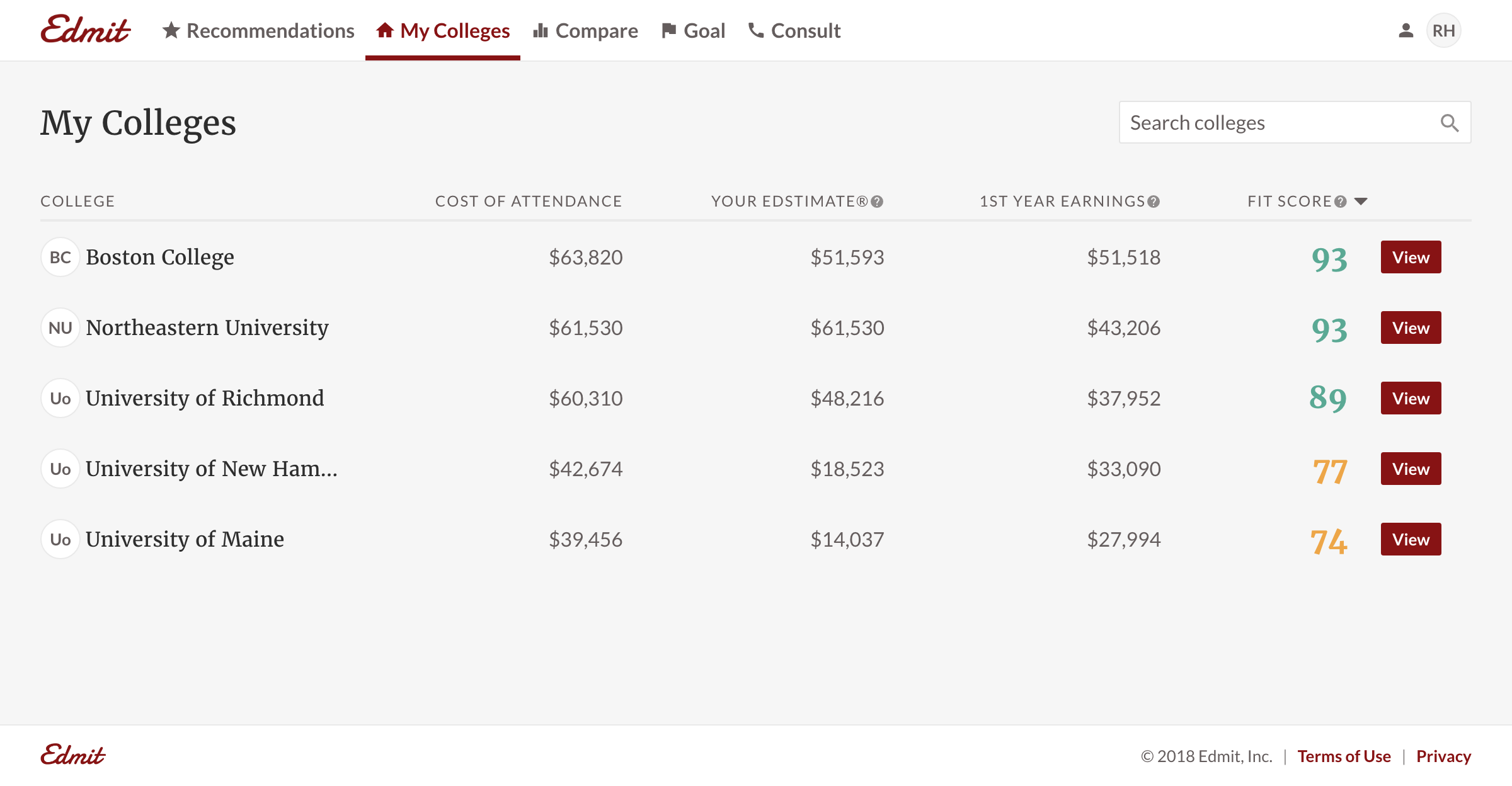
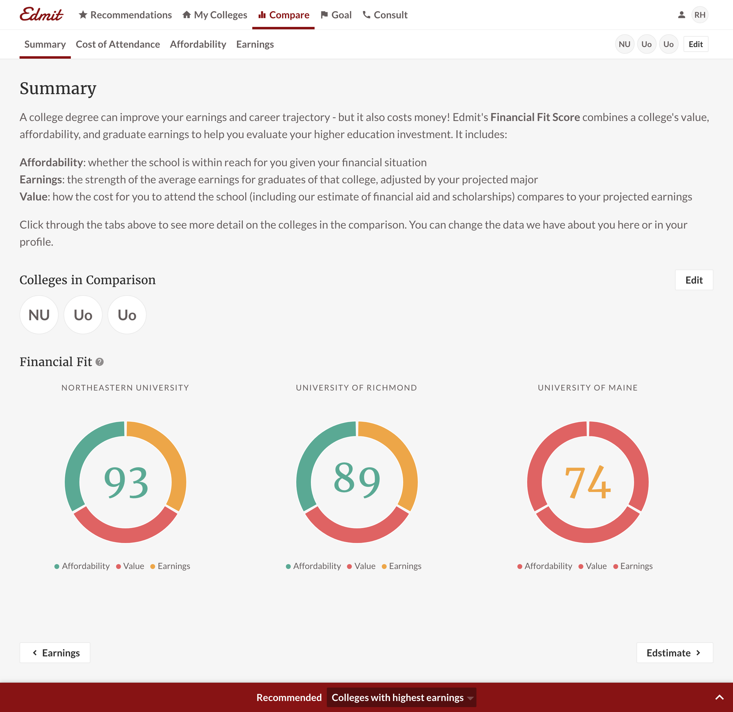
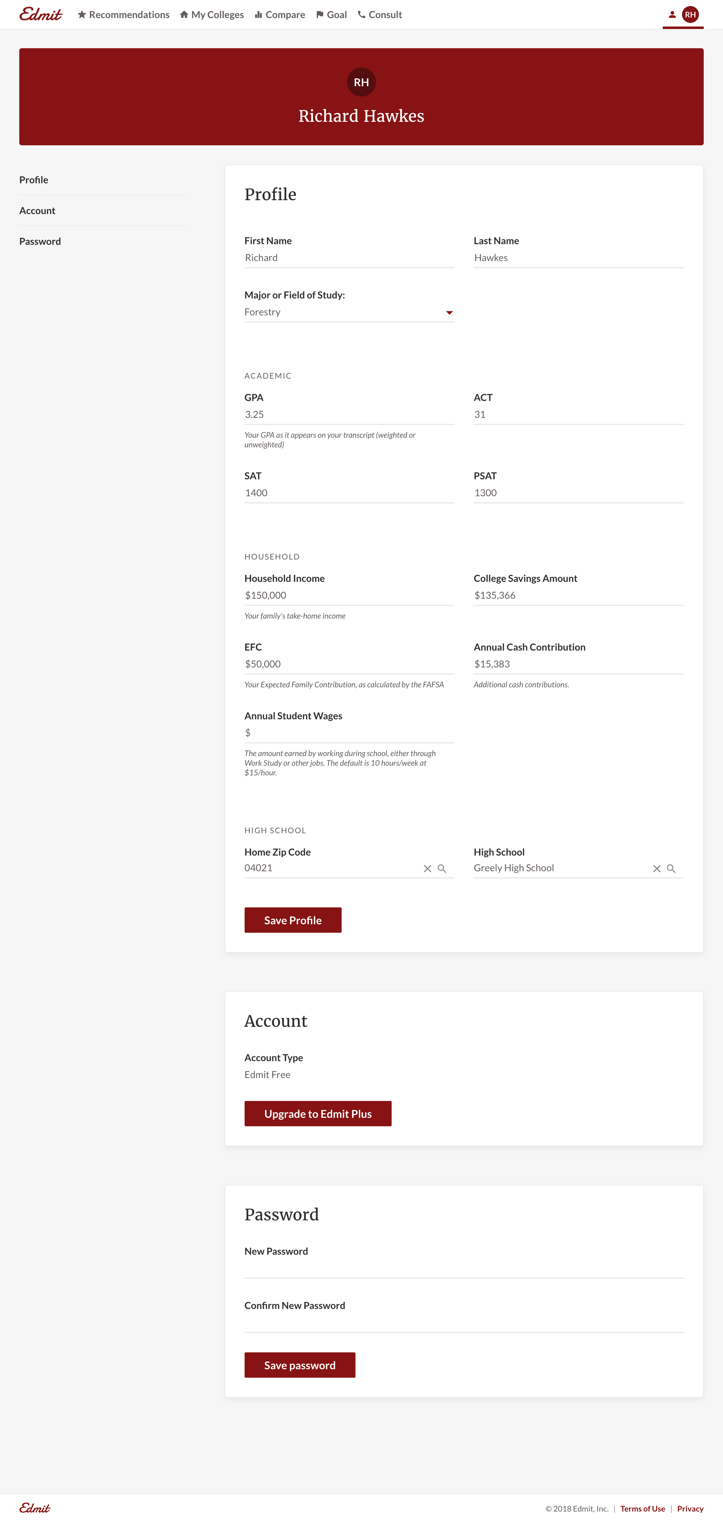
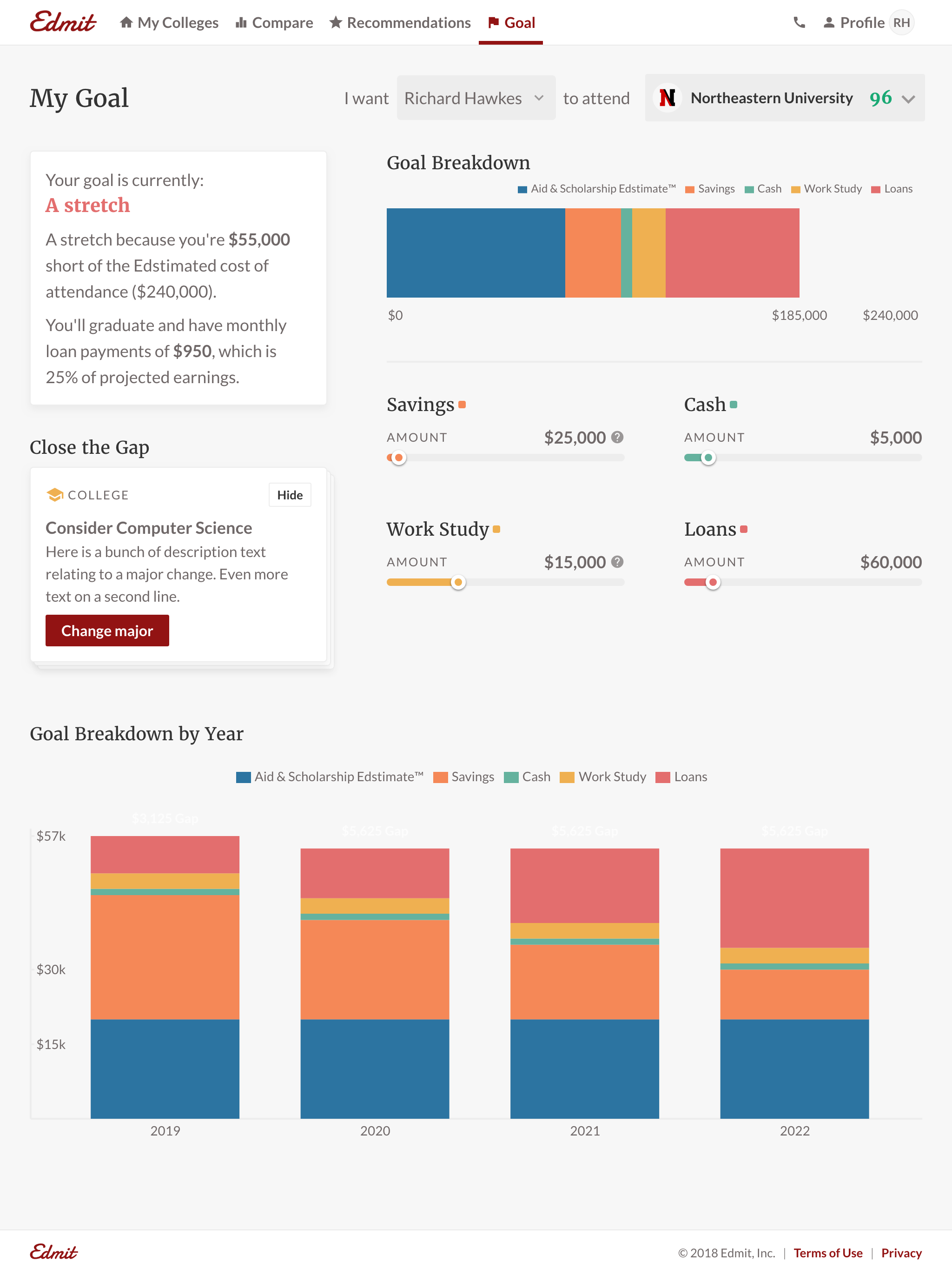
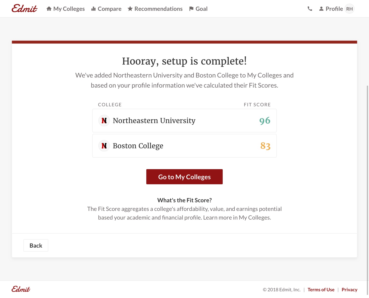
My Colleges. We made the My Colleges table a single source of truth for a users’ college list. It now drives the list of colleges available in reports and is the foundation of Recommendations. We also introduced the “Fit Score” to help quantify affordability and admissibility. For the user, it reinforced the Edmit value proposition and helped users easily identify outliers. Edmit knows the decision isn’t as binary as what college has a higher published tuition. Instead, it’s understanding the quality of financial fit for the family. It enabled Edmit to incorporate cost, aid, earnings, and more in one metric.
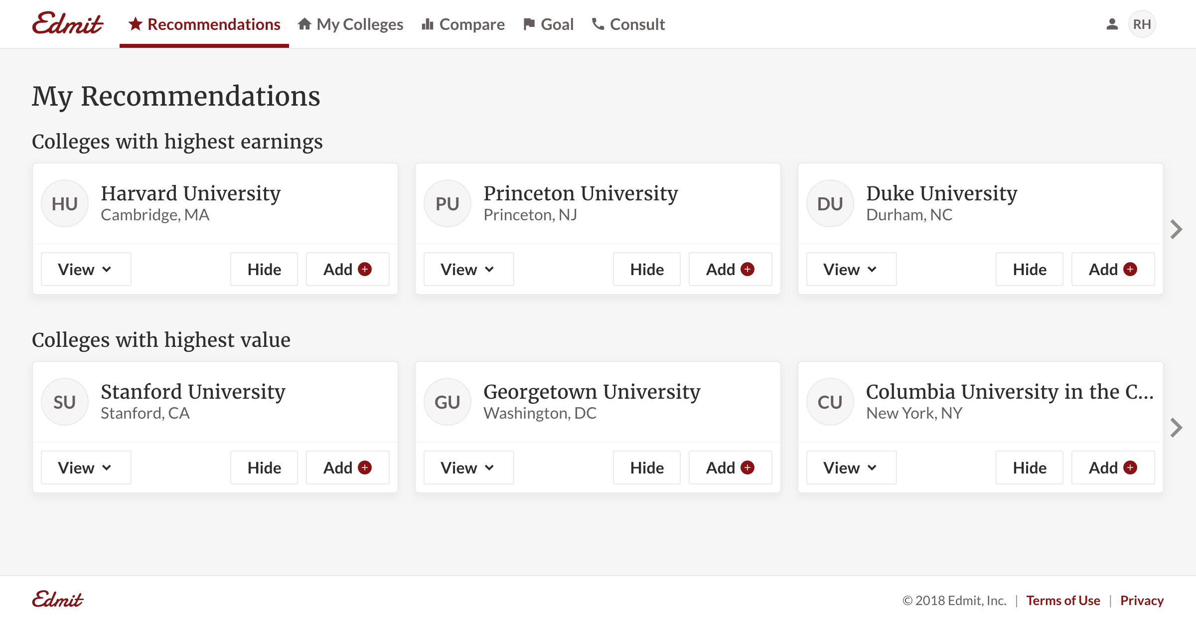
Recommendations. Recommendations were a perfectly aligned way to help users broaden their list. Users wanted us to be more prescriptive and to leverage the user inputs to surface colleges. Edmit could use their expertise to provide recommendations users never thought of. For example, “Colleges near me” is obvious to families, but a “Colleges popular at my high school” was adding new value. Users trusted Edmit’s expertise to surface new colleges which reduced their anxiety of missing schools for consideration. This functionality also opened the door for another revenue source: promoted recommendations.
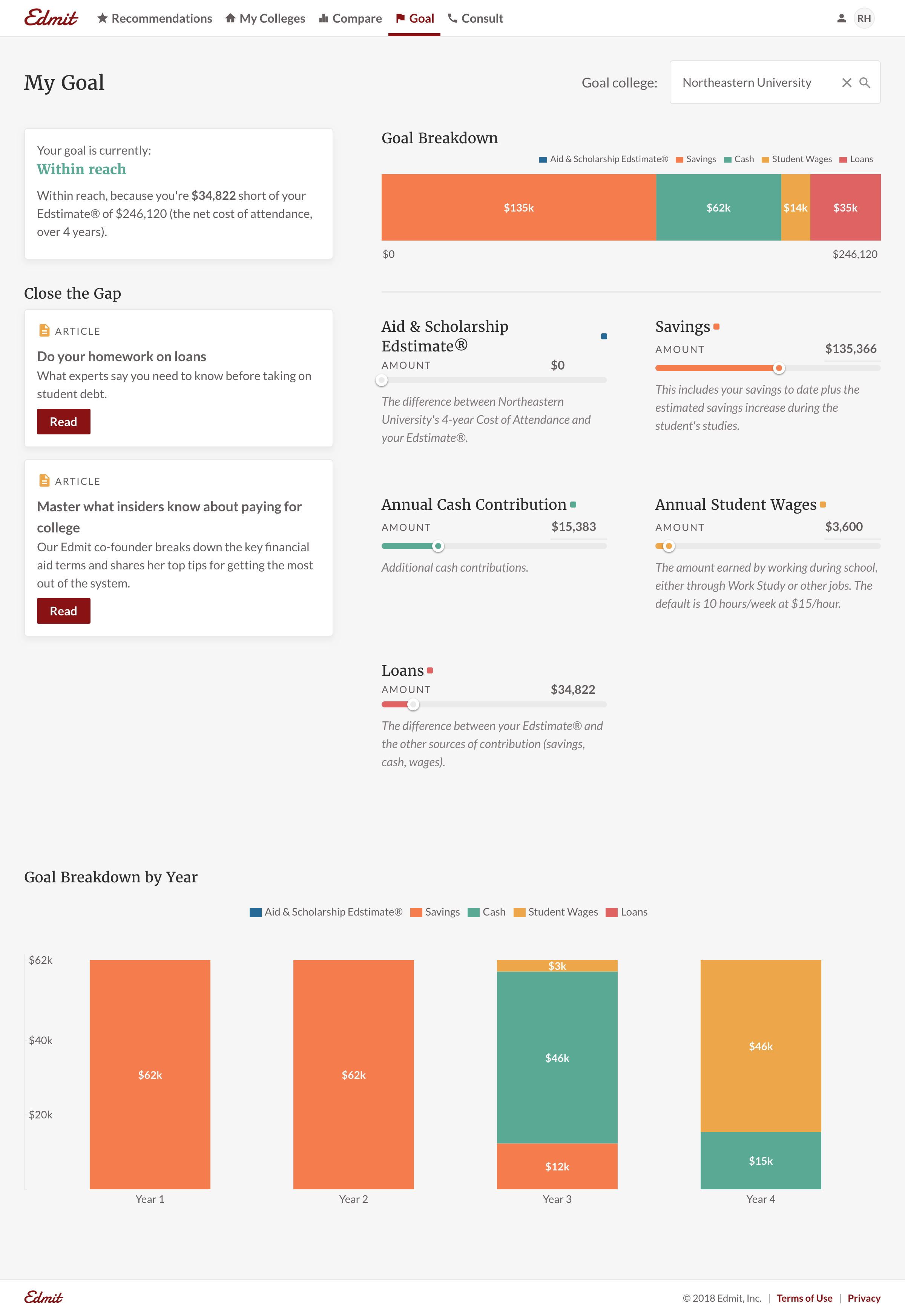
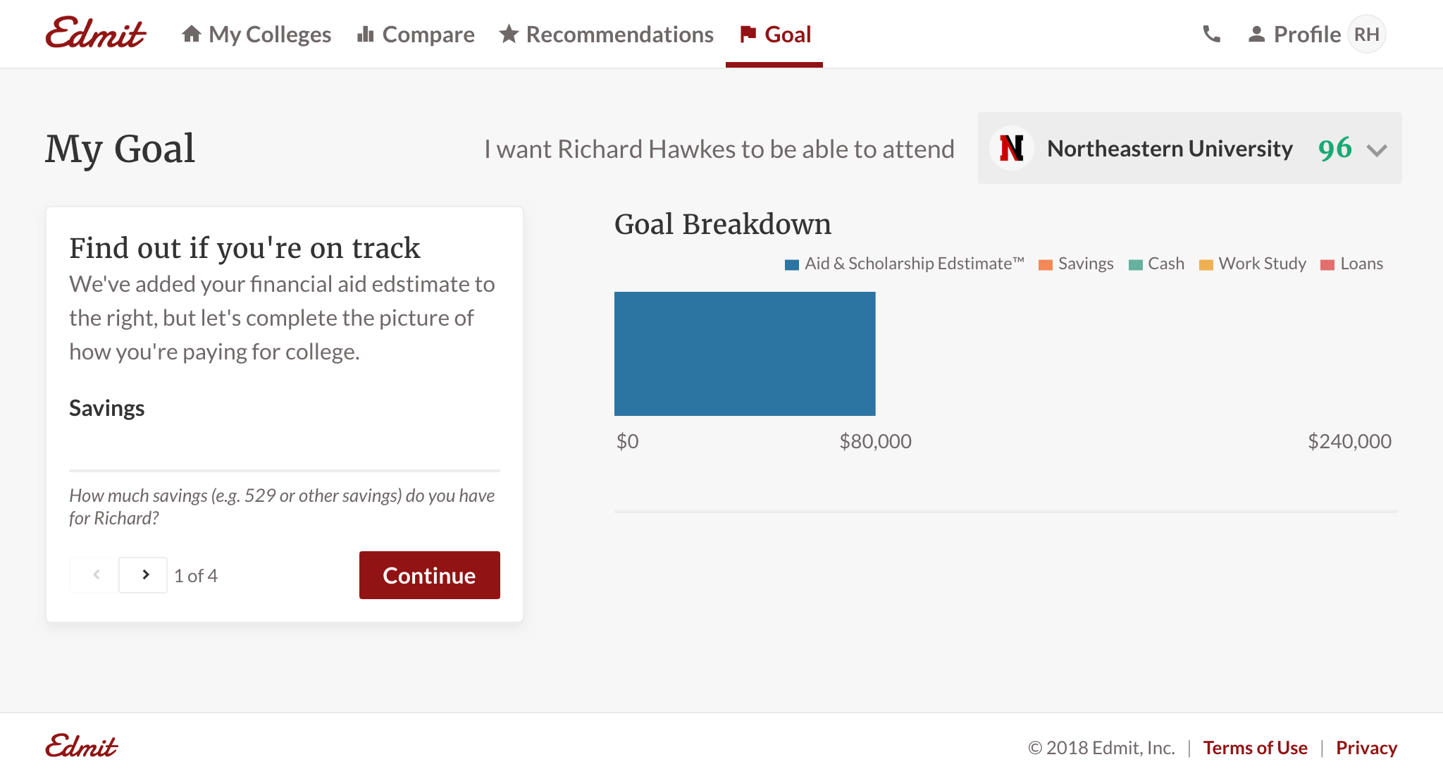
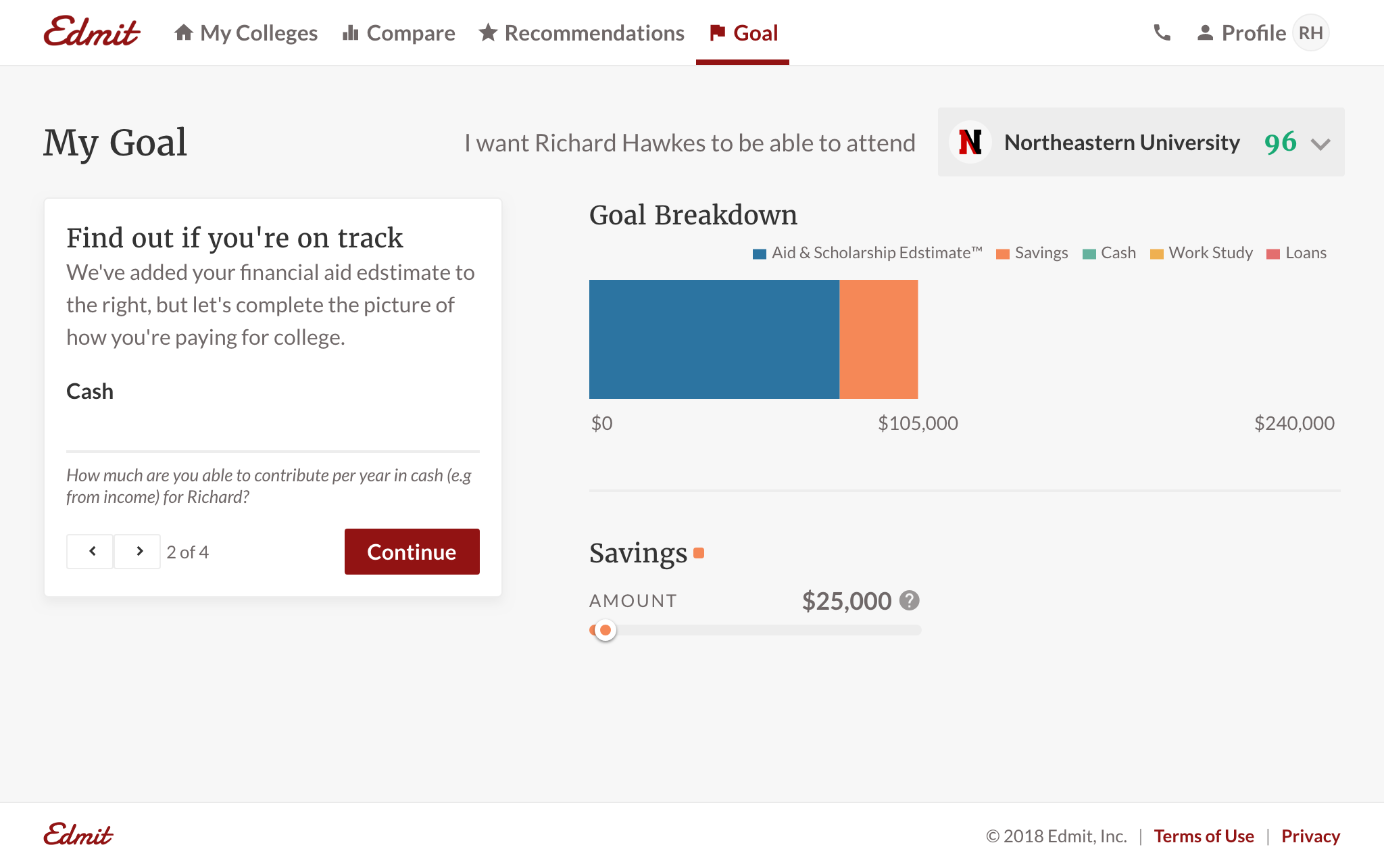
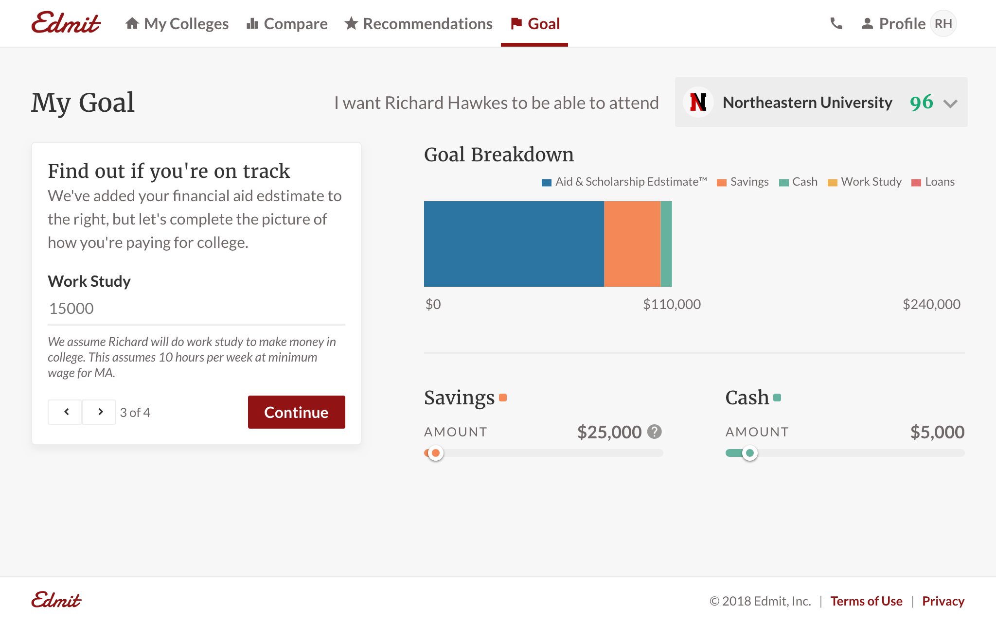
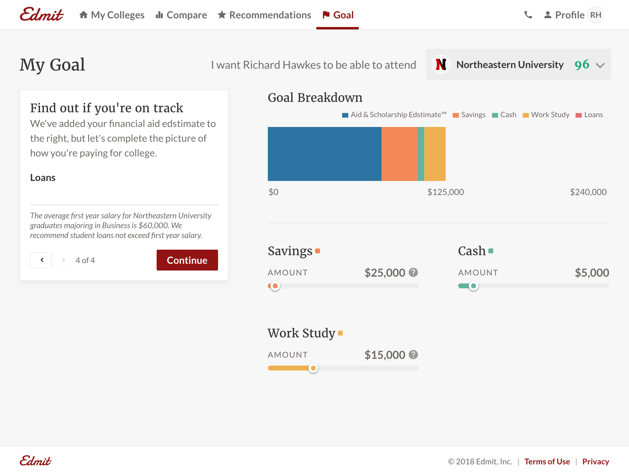
Goal. We wanted to give users a tool to self-assess the financial feasibility of colleges. The goal feature allows them to answer “Can I pay for this?”. It also allowed Edmit to provide education to increase a users' confidence in their investment. For example, educating users on what percentage loans should be relative to earnings. And for parents new to college admissions, they were adamant in interviews that more information is better. We could now provide additional value by surfacing insights; like how a different major affects loan payback payment. It’s also another spot for potential promoted recommendations, e.g. sponsored 529 plans.
Little details
I was thrilled to take the time to deliver small details like loading states and empty states. These can often be overlooked, but can add value and quality to a product.
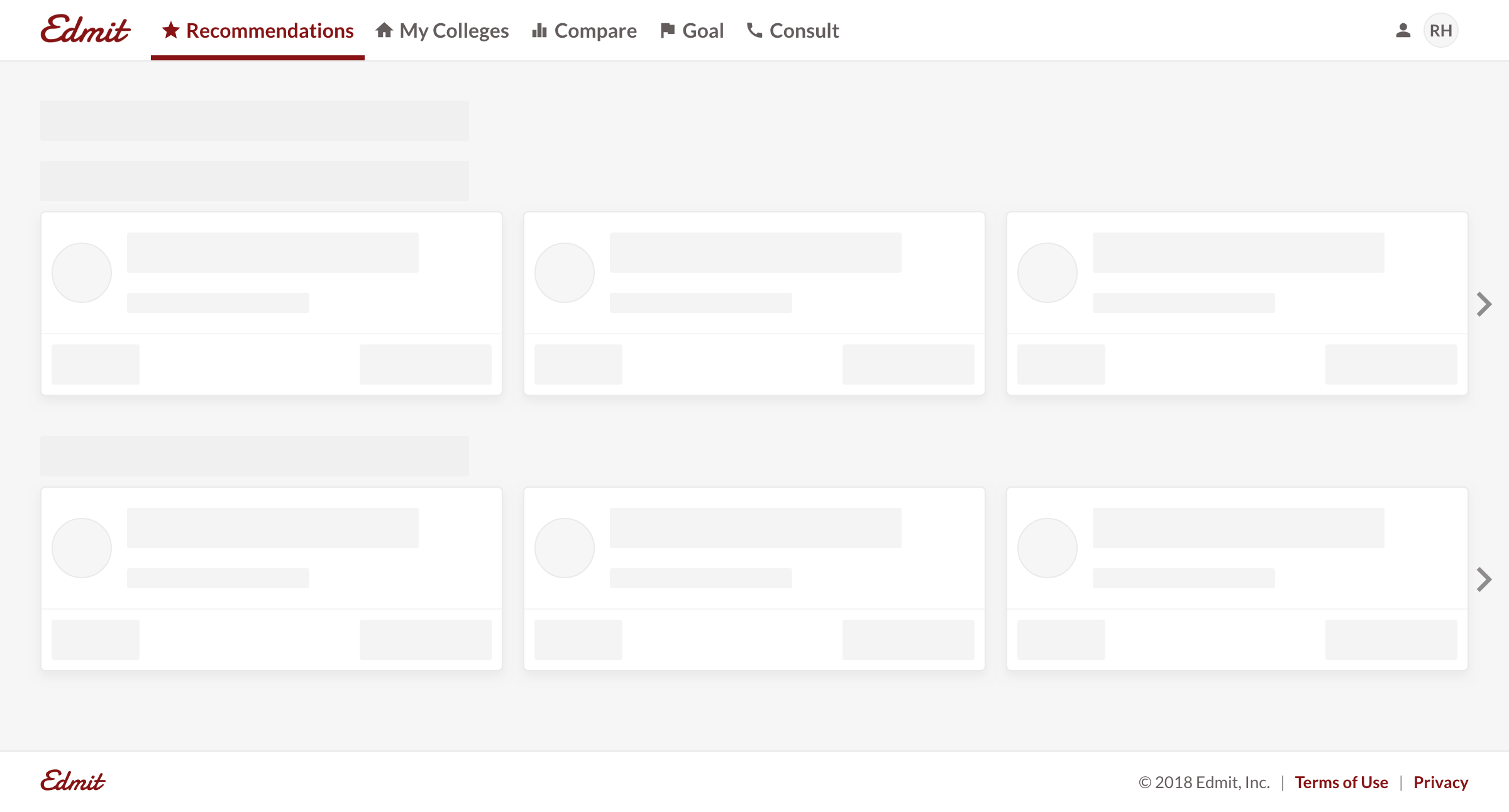
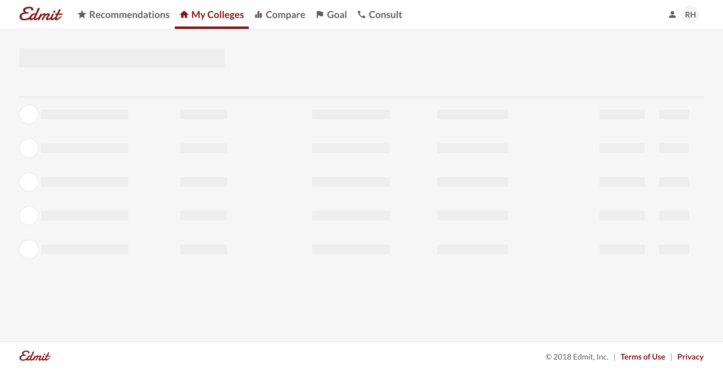
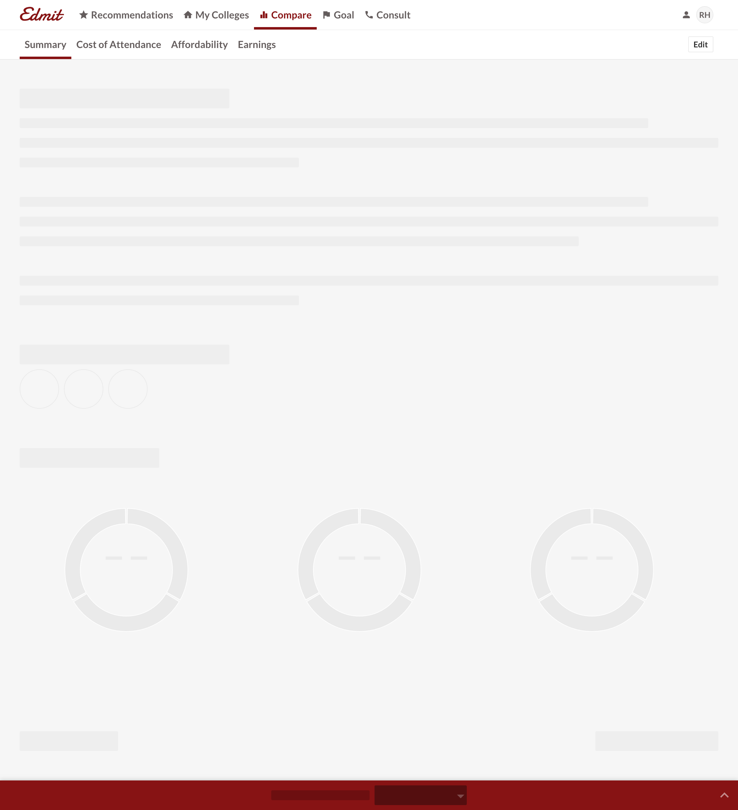
Loading states. Here’s a look at some loading screens throughout the app. You’ll note that within Compare, there is a unique loading state for each tab. With a minimal amount of effort, a user can see which tab is active when it’s loading.
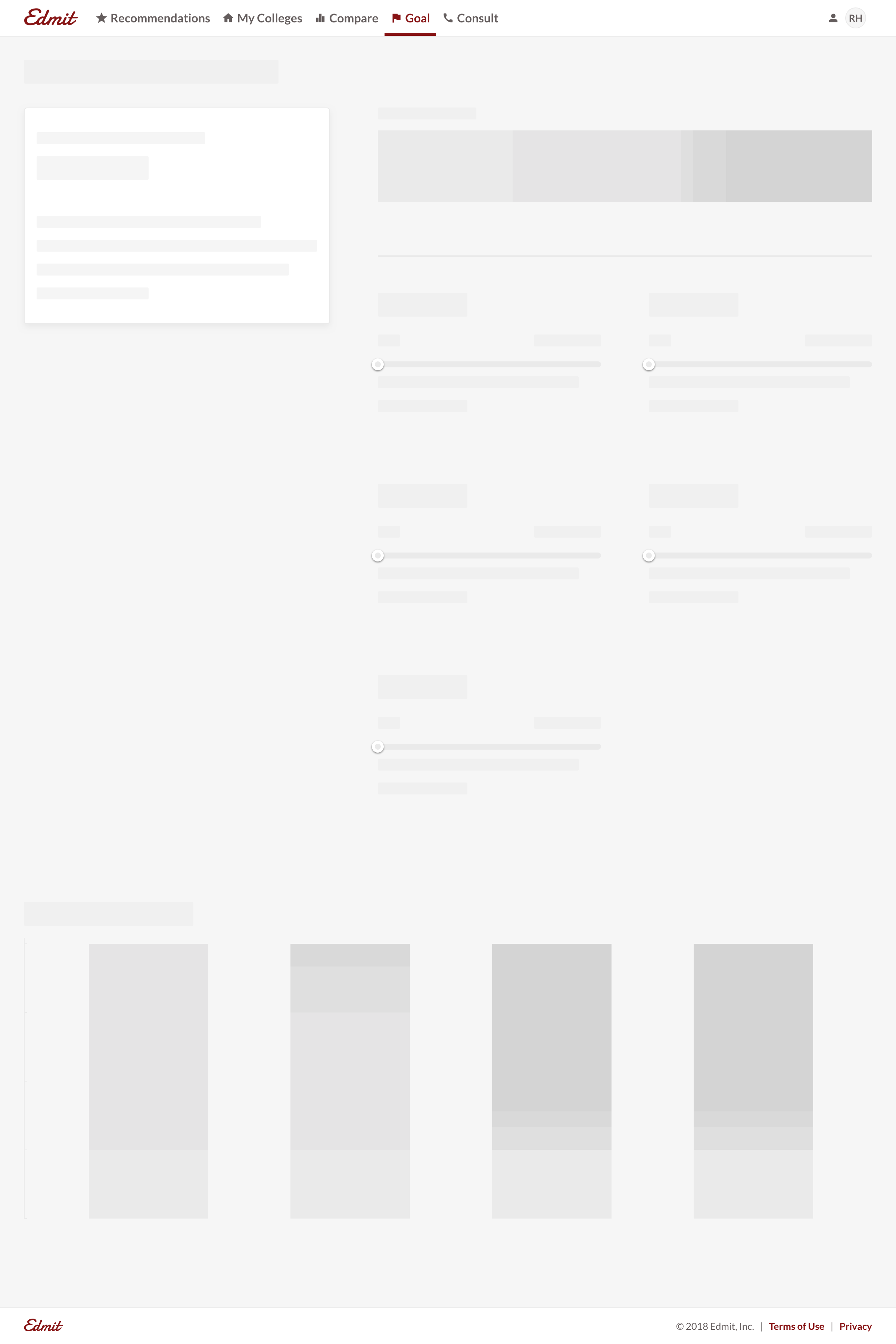
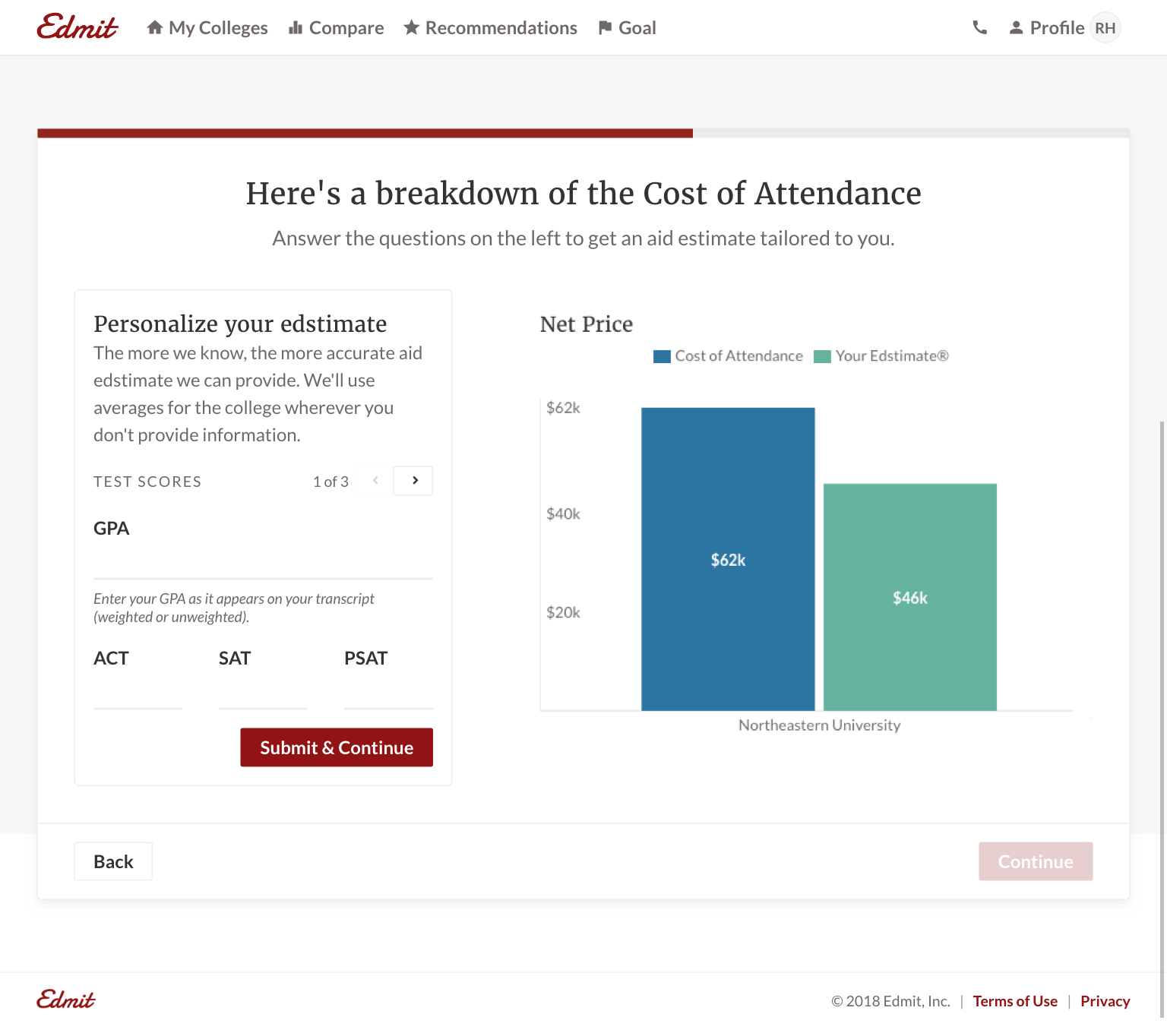
Empty states. I wanted to call out the Goal empty state because it’s a screen where we have to ask for many new inputs from the user. Similar to onboarding (below), we update the chart with each new input. It establishes a direct and visible relationship between inputting data and chart quality. It also adds a sense of ownership to build the chart incrementally.
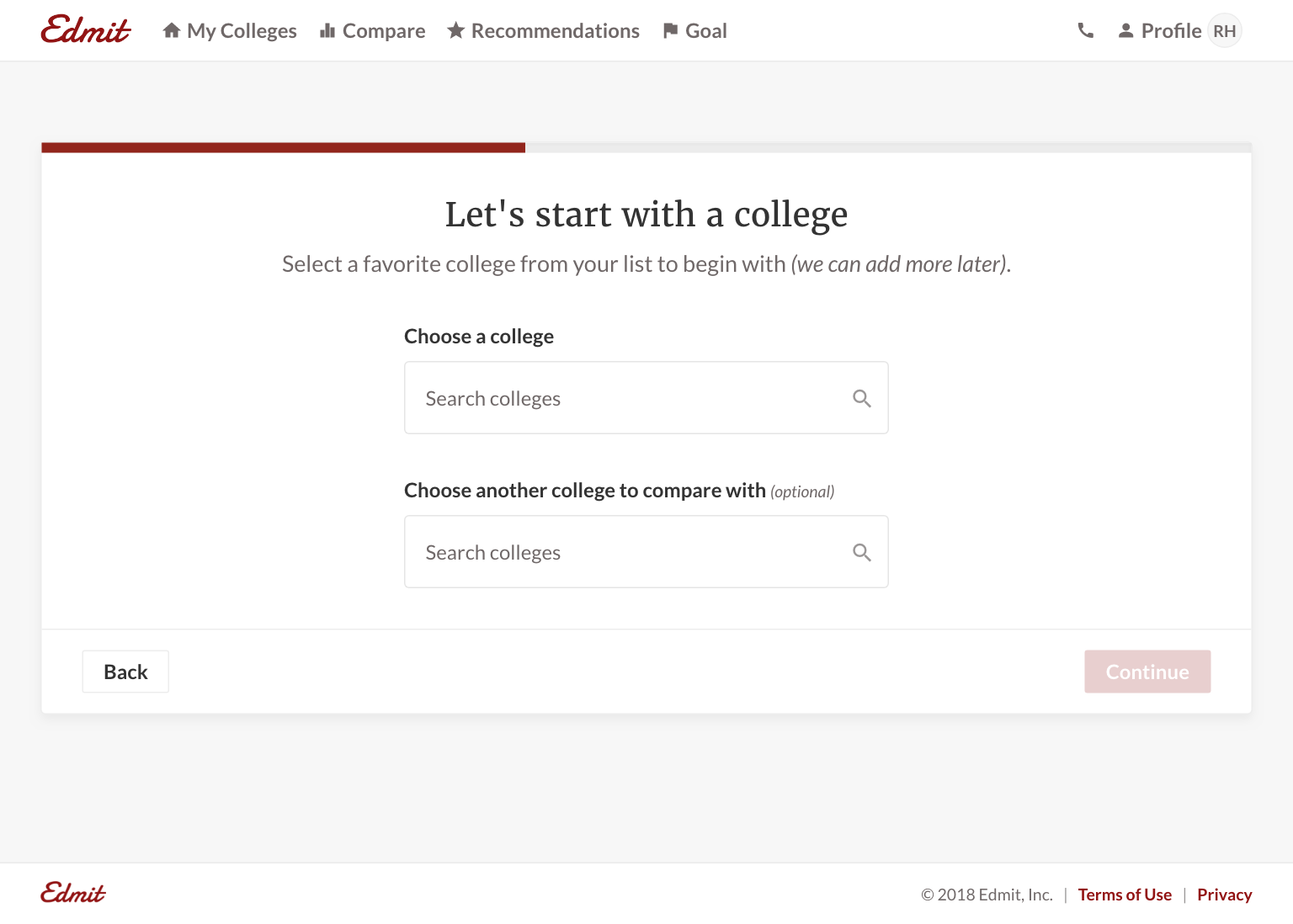
Onboarding
Because the quality of the product relies on user inputs, there’s a minimal set of data we need to collect upfront in onboarding. We also needed to support multiple entry points and have onboarding be contextual to users. For example, we have Widgets which are a single chart in an iFrame that 3rd party sites can use. If a user comes from a third-party site, we need to pull in the existing data and use the same chart from the widget they came from.
For onboarding's design, a couple of design decisions to highlight:
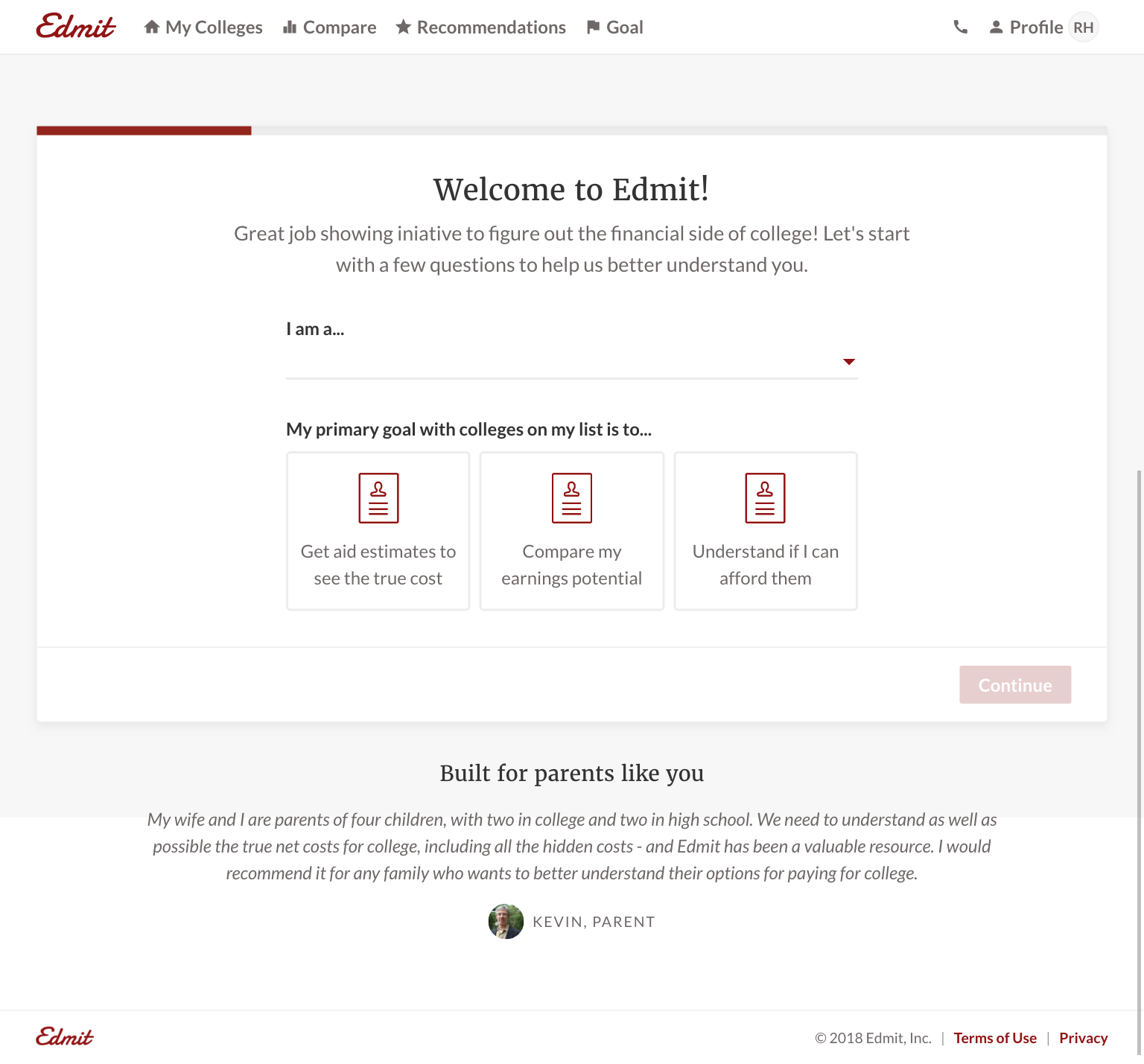
- Removed all extra navigational items to remove distractions.
- Included social proof on the first step. Even though a user might click “Get Started” on the marketing site, they may not be fully committed to signing up.
- Used default values and optional fields to reduce friction.
- But presented those fields next to a chart that updates live to establish the relationship: more data = more relevant chart.
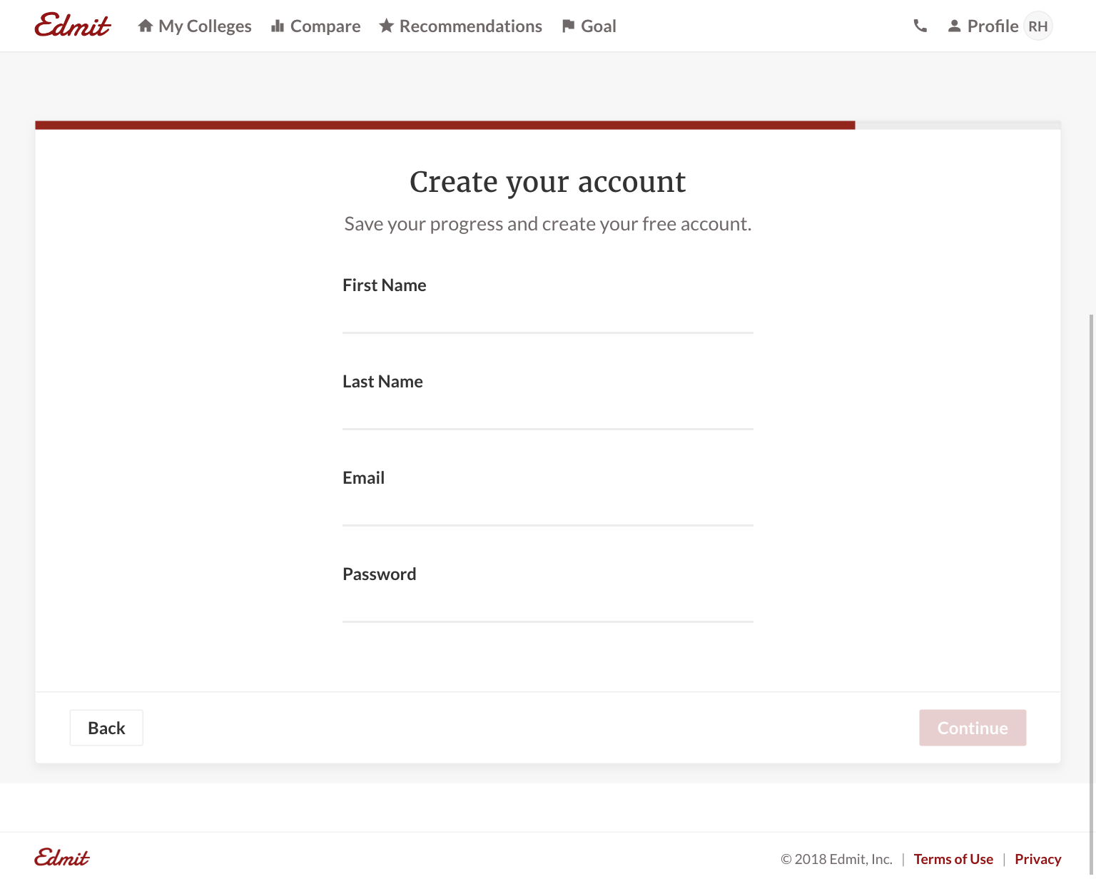
- Used first-person ownership of the experience ao allow a user to build momentum; e.g “I am a student”, “My goal is..”. When a user got to the final step for name, email, password, they have already made a personal investment.
Two areas of improvement (that will be addressed in PRs shortly):
- Making sure every button reinforces a desirable action (“Continue” is too vague).
- Every question should provide value to the user, or at least show potential future value. For example, we ask a user to select a college, but aren’t telling them it leads to a personalized aid edstimate.
Results
The proof is in the pudding and we’re seeing awesome results from customers:
I feel like I have the tools to effectively advocate every year and wait till 4 years from now when it’s my son’s turn...I’ll be an expert!! I’ve already shared your resource for mothers coming behind me.
I am shocked, [Redacted] just awarded $5,000 per year!...I am so happy!
We received $8,000 from our [Redacted] appeal today!!!!!! Thank you, thank you and thank you. Your service was incredible and so helpful.
[Redacted] is offering $4,000 more per year in scholarship...Thanks for your help. You have been awesome!!!
Going forward
It’s impossible to overstate the value in listening to customers. Without user testing, we would have shipped a worse product. Getting a user on the phone allows you to hear how they value the product in their own words. You can then use those words throughout the product. It’s equally important to listen to users’ actions as well with tools like Full Story and Amplitude. User testing continues to shape the product by improving upon existing features and identifying opportunities for new ones.