
Appcues | NPS & Checklists
Designed the onboarding and creation experience for Appcues’ new Net Promoter Score product.
Appcues lets teams build in-app experiences that drive people to take action in products with product tours, NPS surveys, onboarding checklists, and more. When I was brought in, the team had already validated the need for a new NPS survey product with customers. My role was to design the creation flow within Appcues. I was the sole designer, working with a PM and the head of product design. I established the rhythm needed to rapidly evolve the design with daily user testing sessions.
Words before pixels
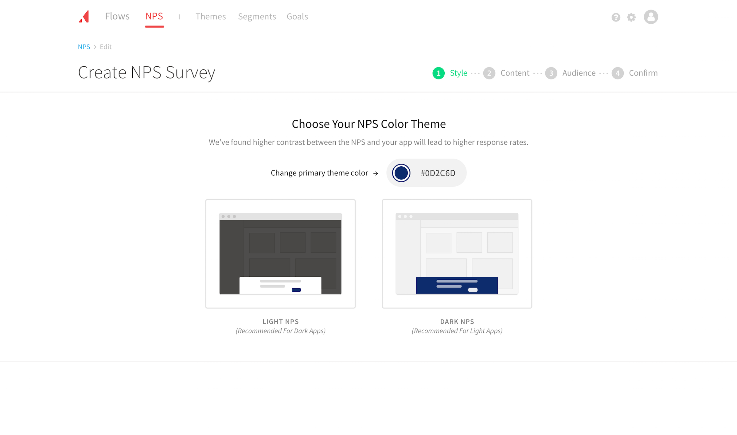
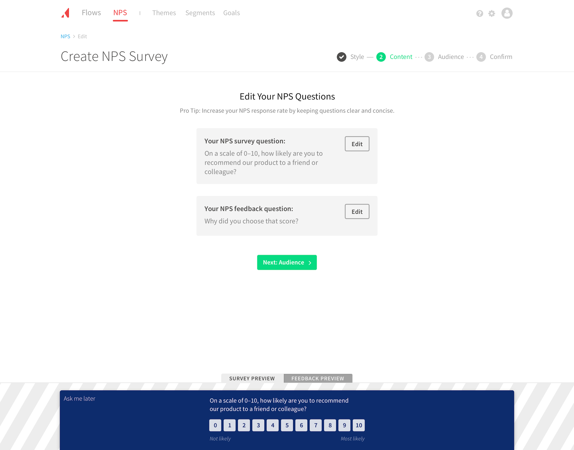
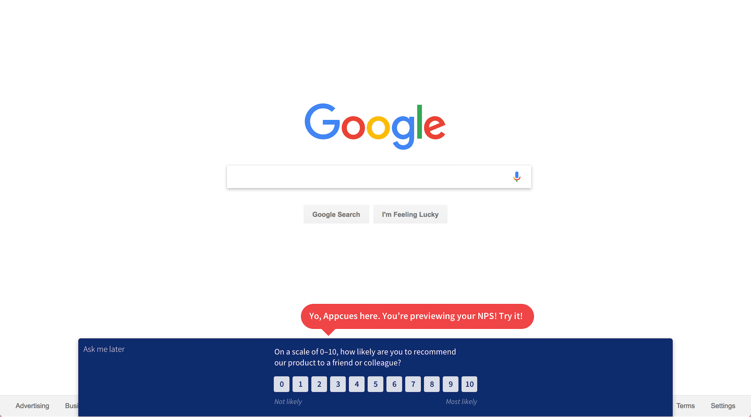
I started by writing down an exhaustive list of every input we needed. It was a long list but we needed to align on the structure before jumping into the screens. I established logical groupings of “style,” “content,” “audience,” and “confirm.” I then drew two named concept sketches, “Appcuesception” and “Theming,” and identified the risks of each. We decided to pursue the “Appcuesception” route to provide immediate feedback and demonstrate value as you created a survey.
Breaking down complexity
The initial groupings of “style” and “content” allowed customers to make quick, tangible progress. We knew audience targeting could be visually and logically complex depending on how specific customers got. Separating out those primary steps allowed customers to focus on independent steps and build momentum.
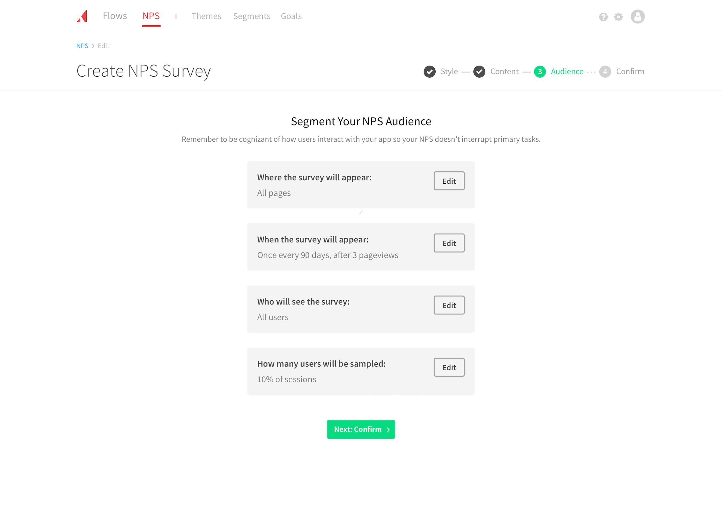
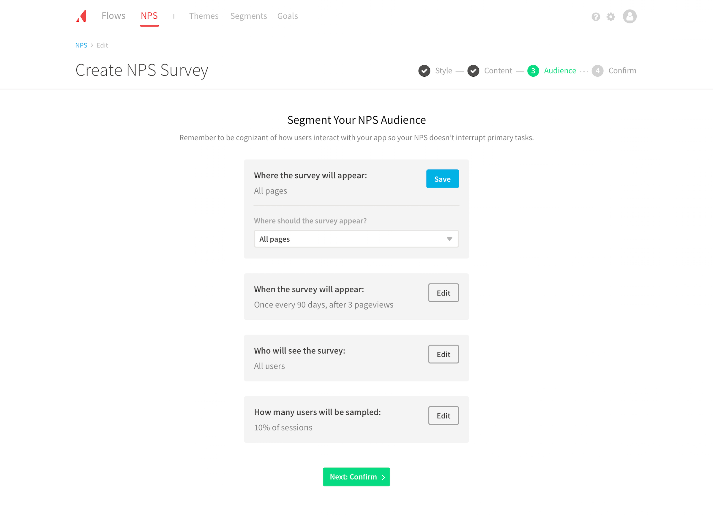
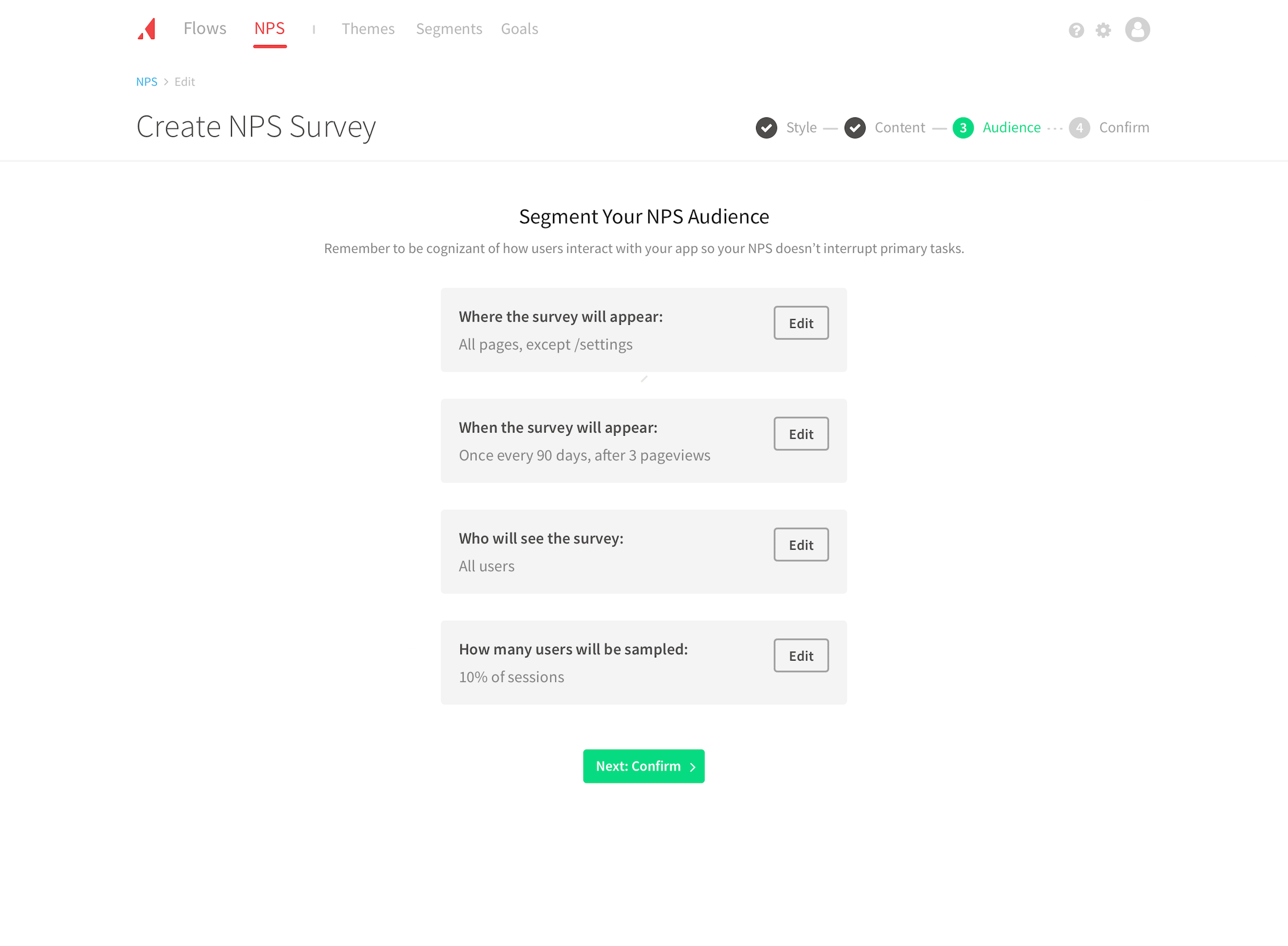
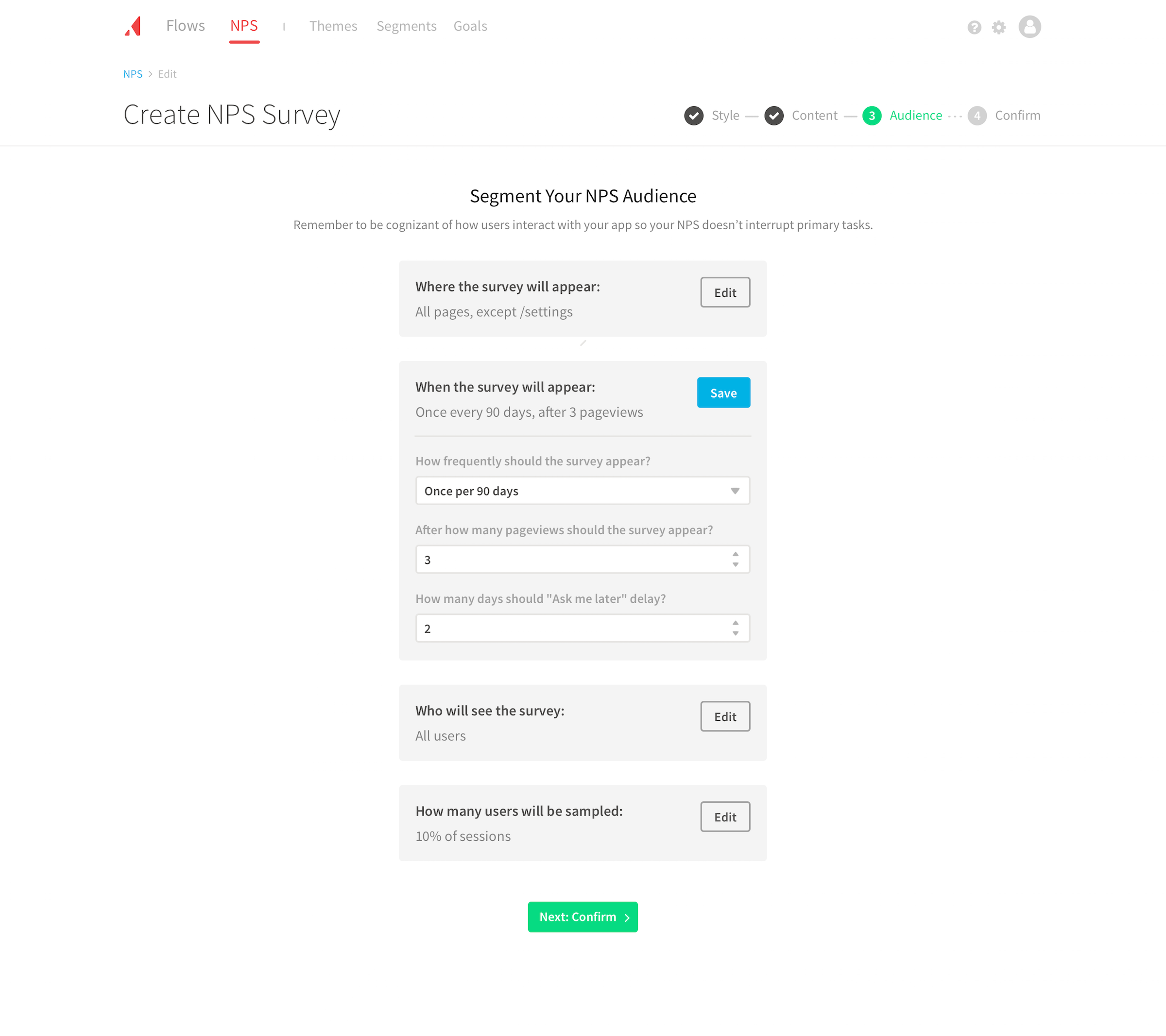
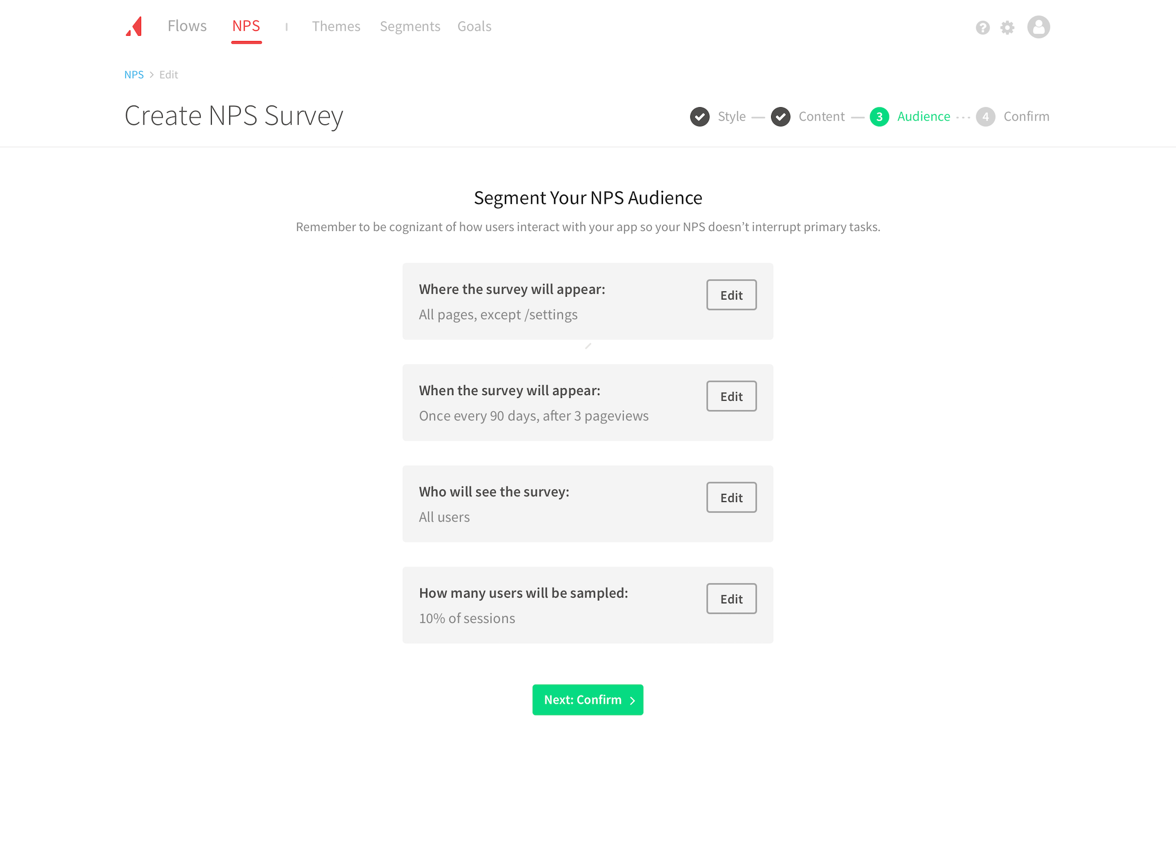
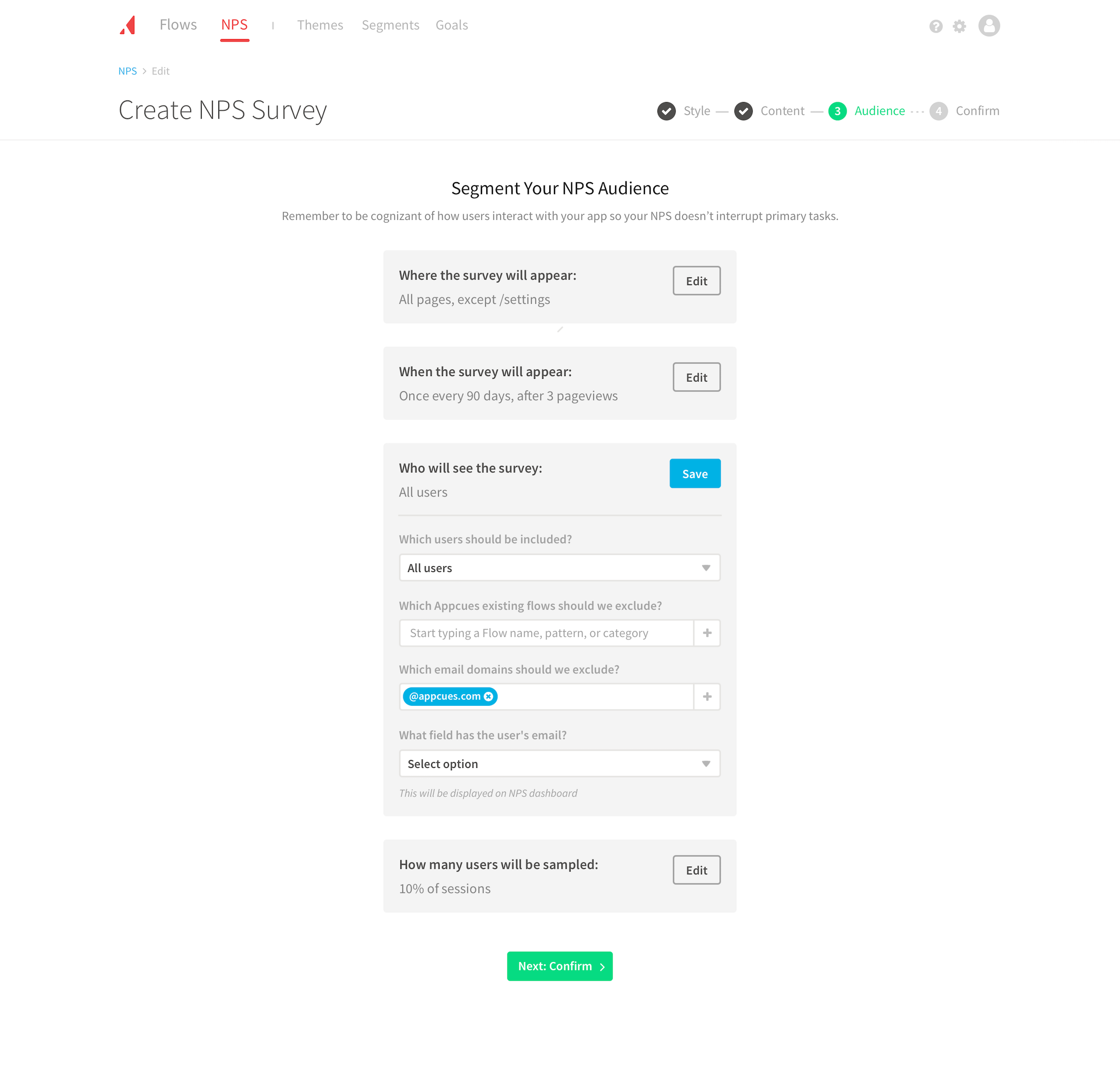
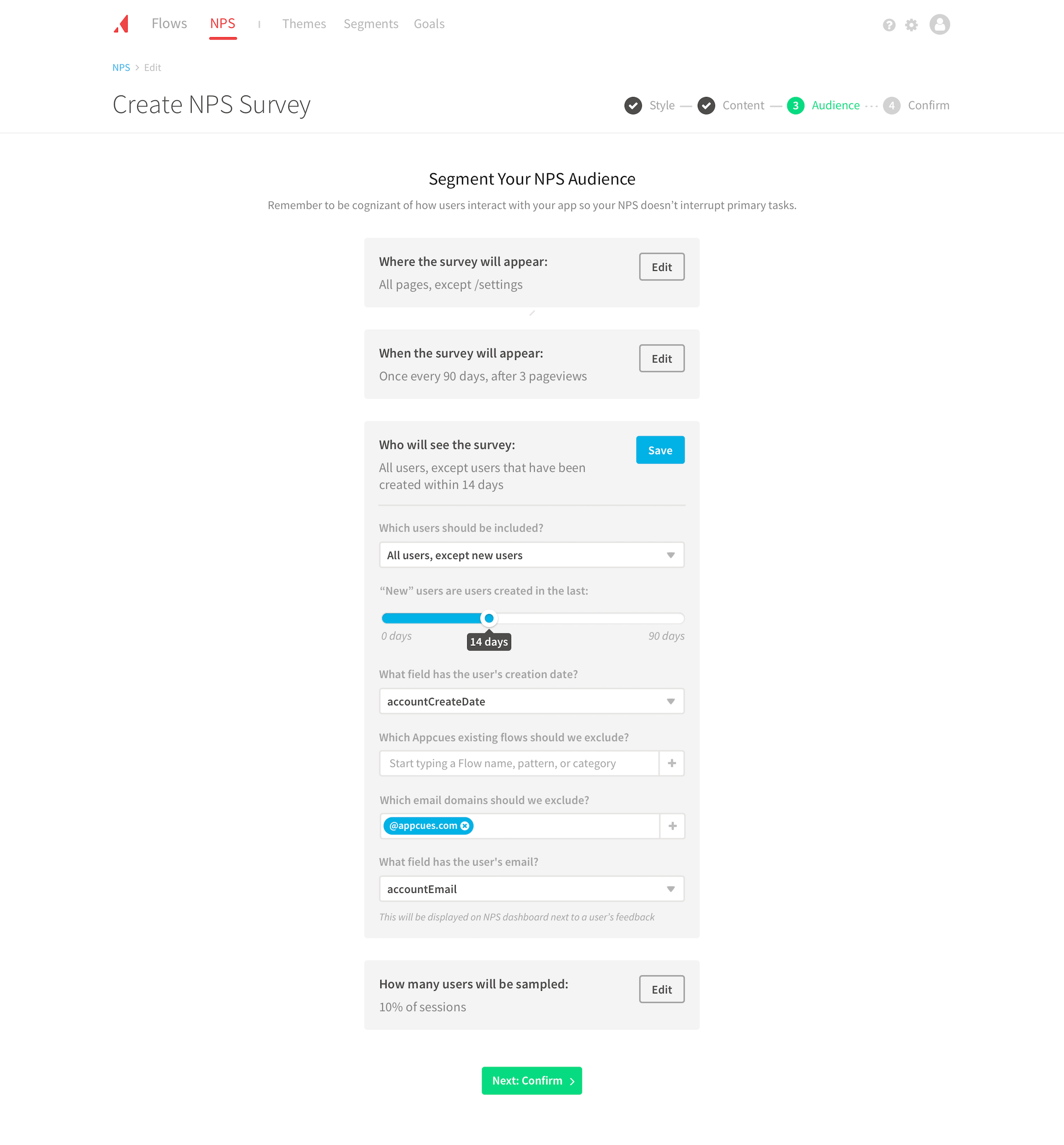
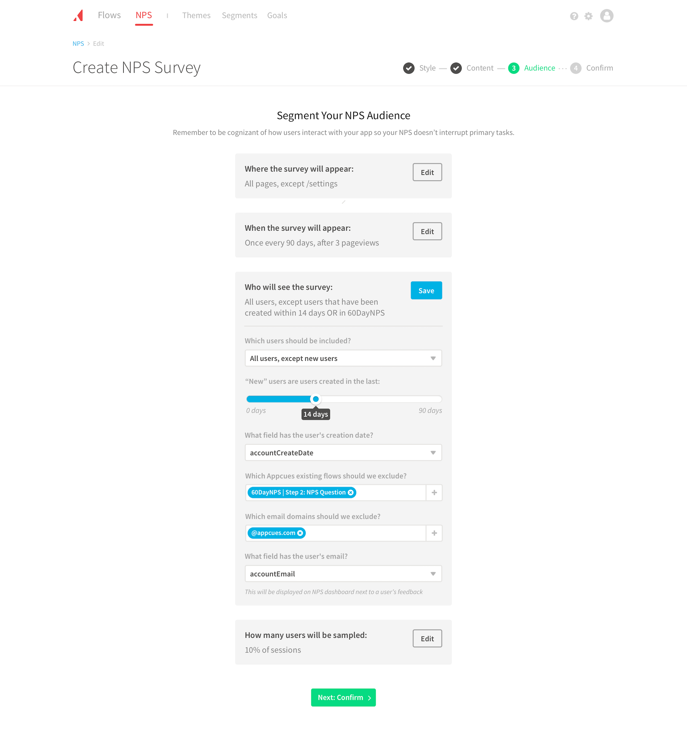
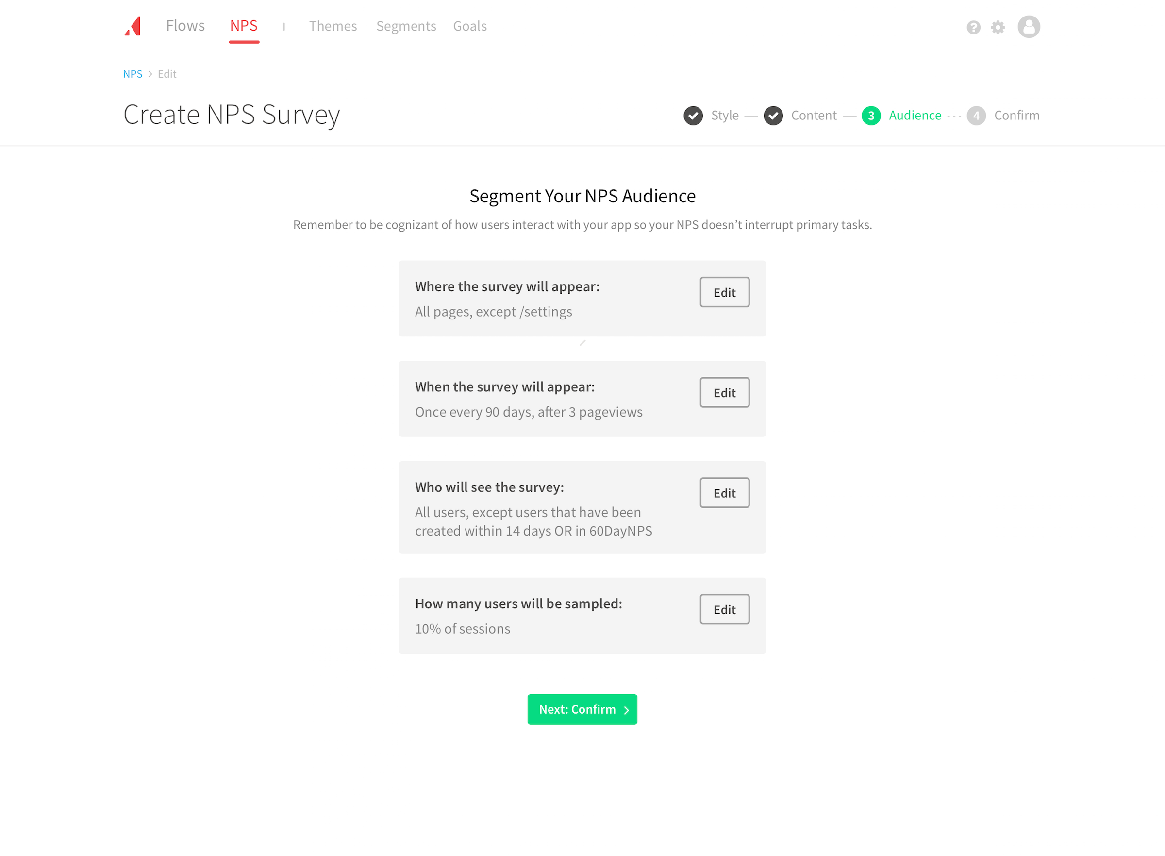
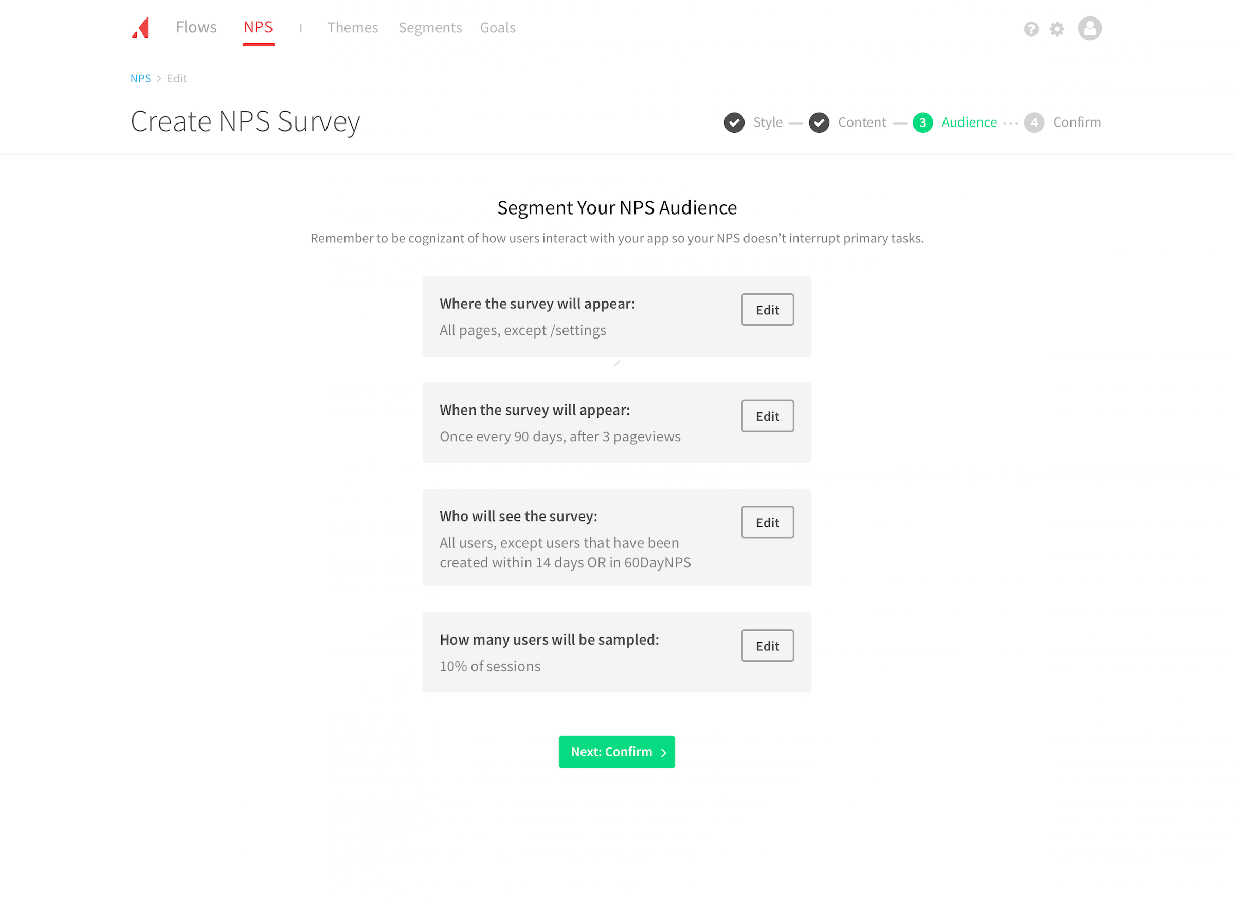
The audience step could have been a massive condition builder. However, I wanted to test breaking that specific step down into questions a customer would ask themselves: where will it appear, when will it appear, and who will see it? Underneath it all are 13 questions, but this allowed customers to answer one at a time in a human-readable way.
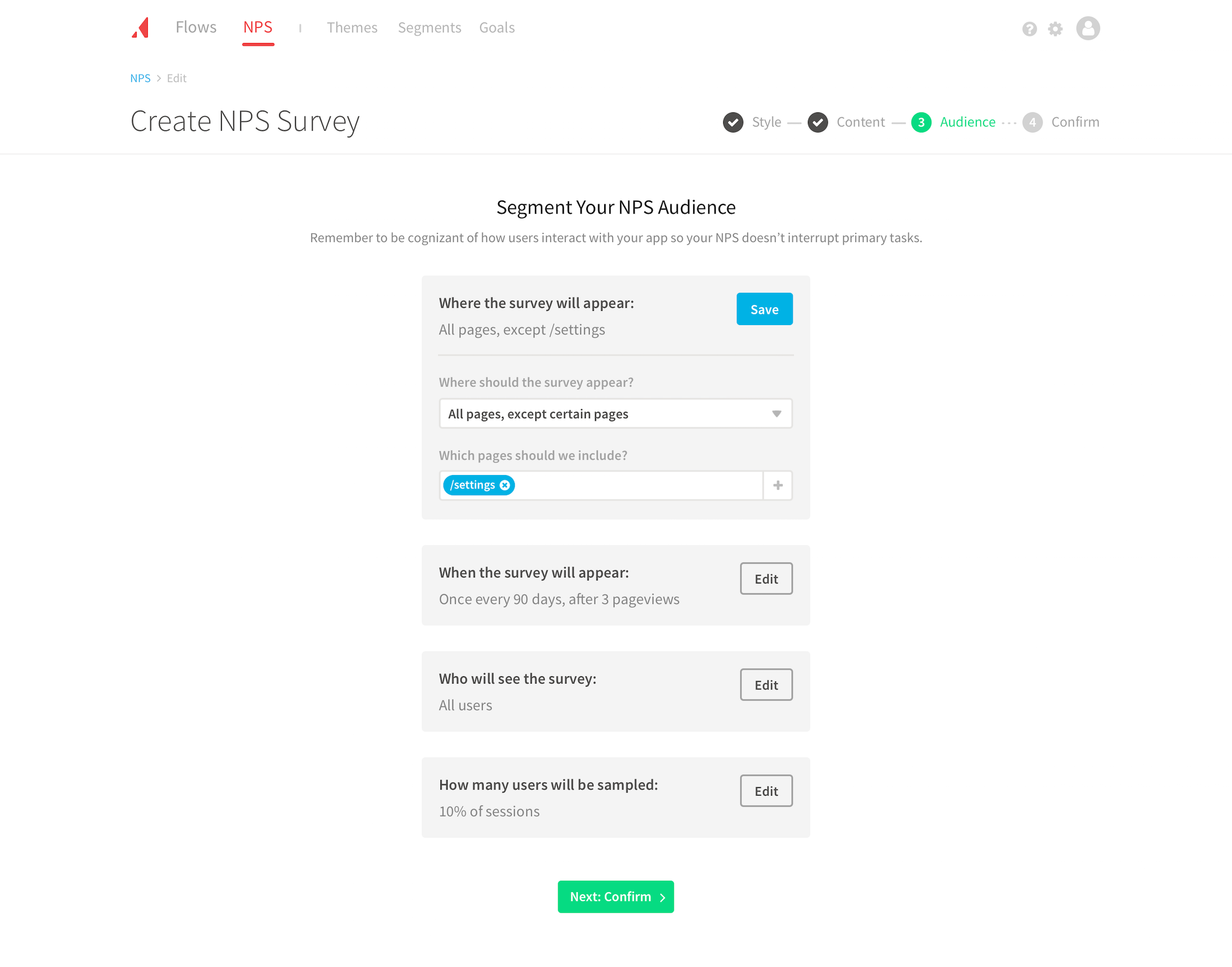
Smart defaults and progressive disclosure
The audience for an NPS survey can vary widely. An early-stage customer may target everyone with an NPS survey because they have fewer users. An enterprise customer may build an NPS for a specific product and only want to target those who used it. To handle the difference, I designed around smart defaults and progressive disclosure.
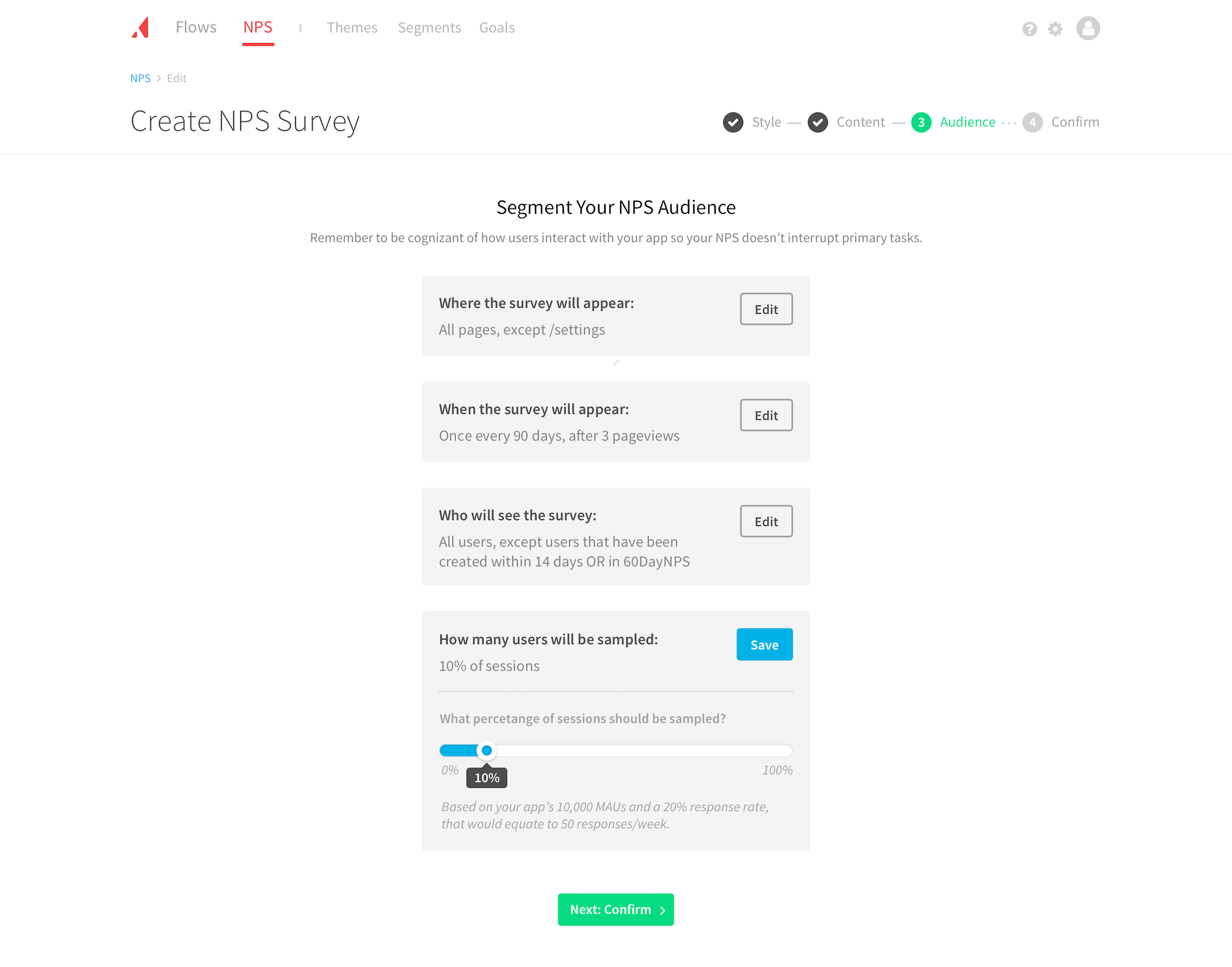
Being prescriptive meant every one of the questions in the flow was answered by default. Where I could, I pulled in values from the customer such as their primary brand color. I labeled the recommended option based on the customer’s app. Elsewhere, I relied on best practices and Appcues’ collective knowledge: the wording of the NPS question, the 90-day resurvey cadence, a 14-day new-user exclusion, and 10% sampling. Using defaults gave most customers a solution that worked out of the box:
Copy changes for the Qualitative and Quantitative parts of the NPS survey? None - let’s use the standard ones.
Awesome, that was going to be exactly what we wanted to do
Testing daily
The product manager had user research calls scheduled daily. We treated them as the project’s heartbeat: multiple cycles per day of designing, testing, redesigning, and retesting. I matched the scope of change to the time available. When we only had an hour or two, I would tackle smaller design problems with known solutions. When we had a whole morning or even a day, we would tackle the unknowns. We launched with reduced risk because each decision, small or large, was validated through user research.
Little details
I particularly focused on guidance throughout the experience. In the sampling control slider, I included dynamic helper text to translate a percentage into a number you could understand. “10% of sessions” was accompanied with “Based on your app’s 10,000 MAUs and a 20% response rate, that equates to 50 responses/week.”
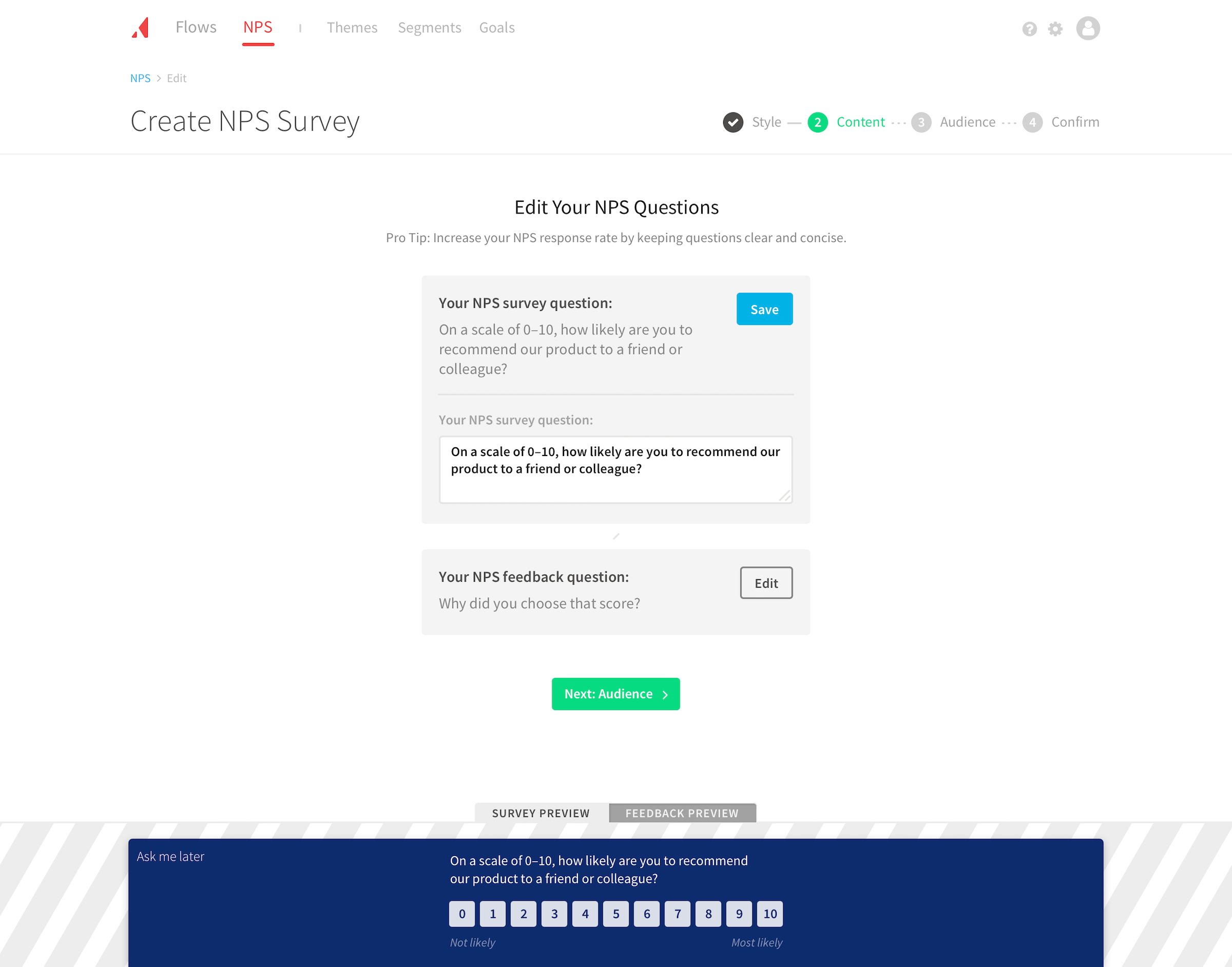
On the style step, I surfaced the finding that higher contrast would lead to more responses. When choosing the style, customers saw a skeleton preview. When they moved to the content, they saw a higher-fidelity preview with a clear background pattern.
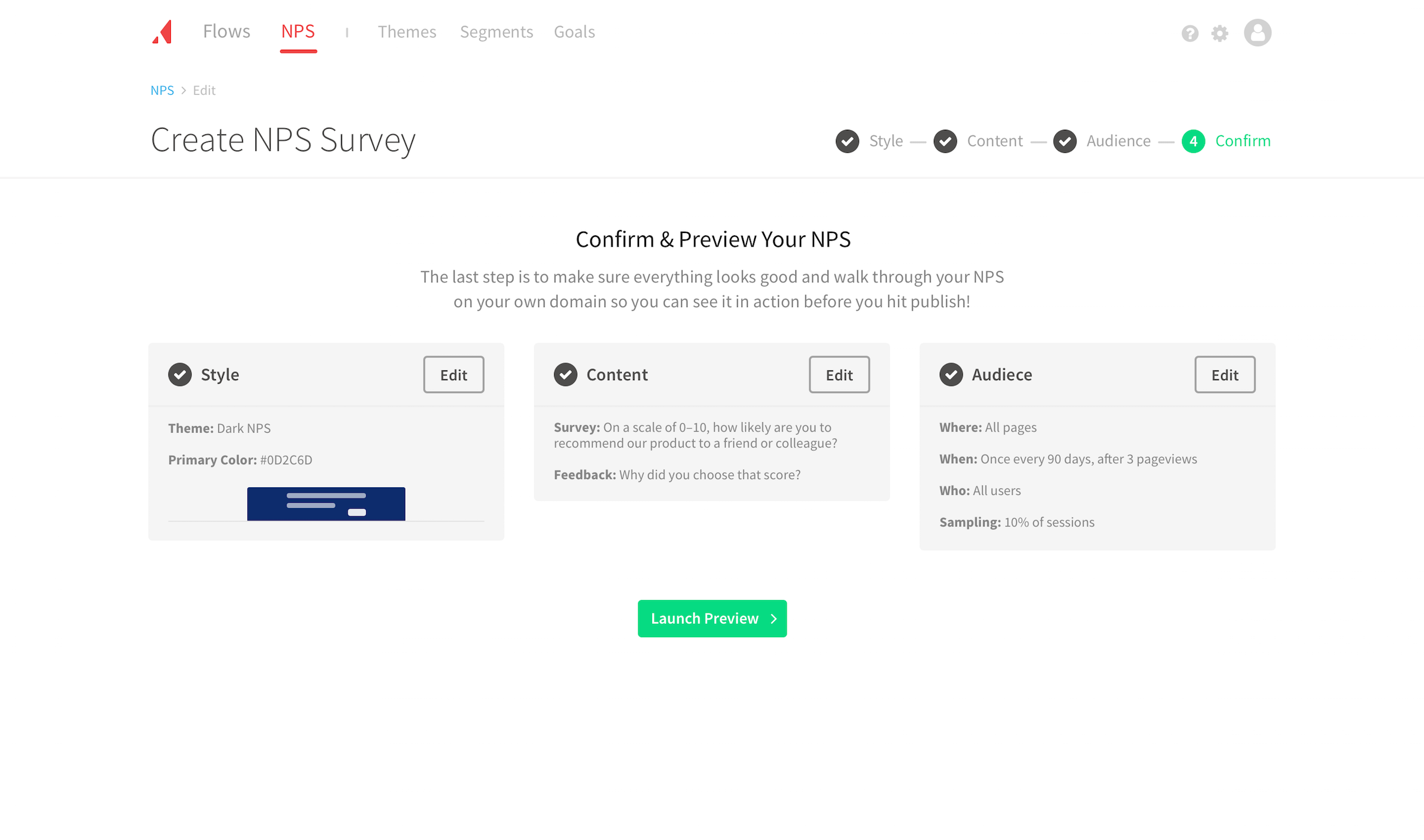
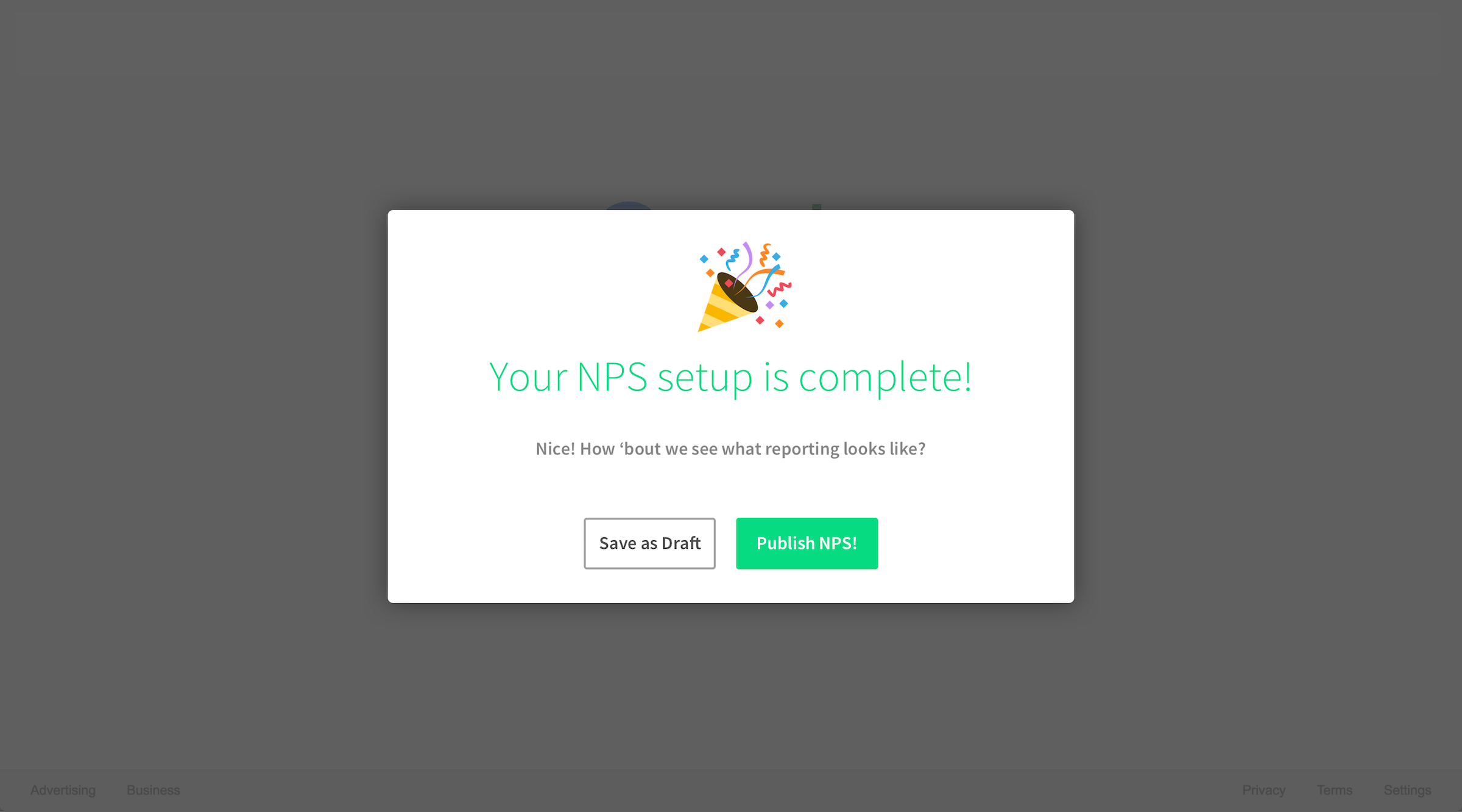
On the confirm step, I included a final summary with completion status to reinforce their progress. It played an emotional role in a high-stress moment.
He LOVED the summary at the end of the creation flow. Said “It made him feel extremely confident.”
Future-proofing components
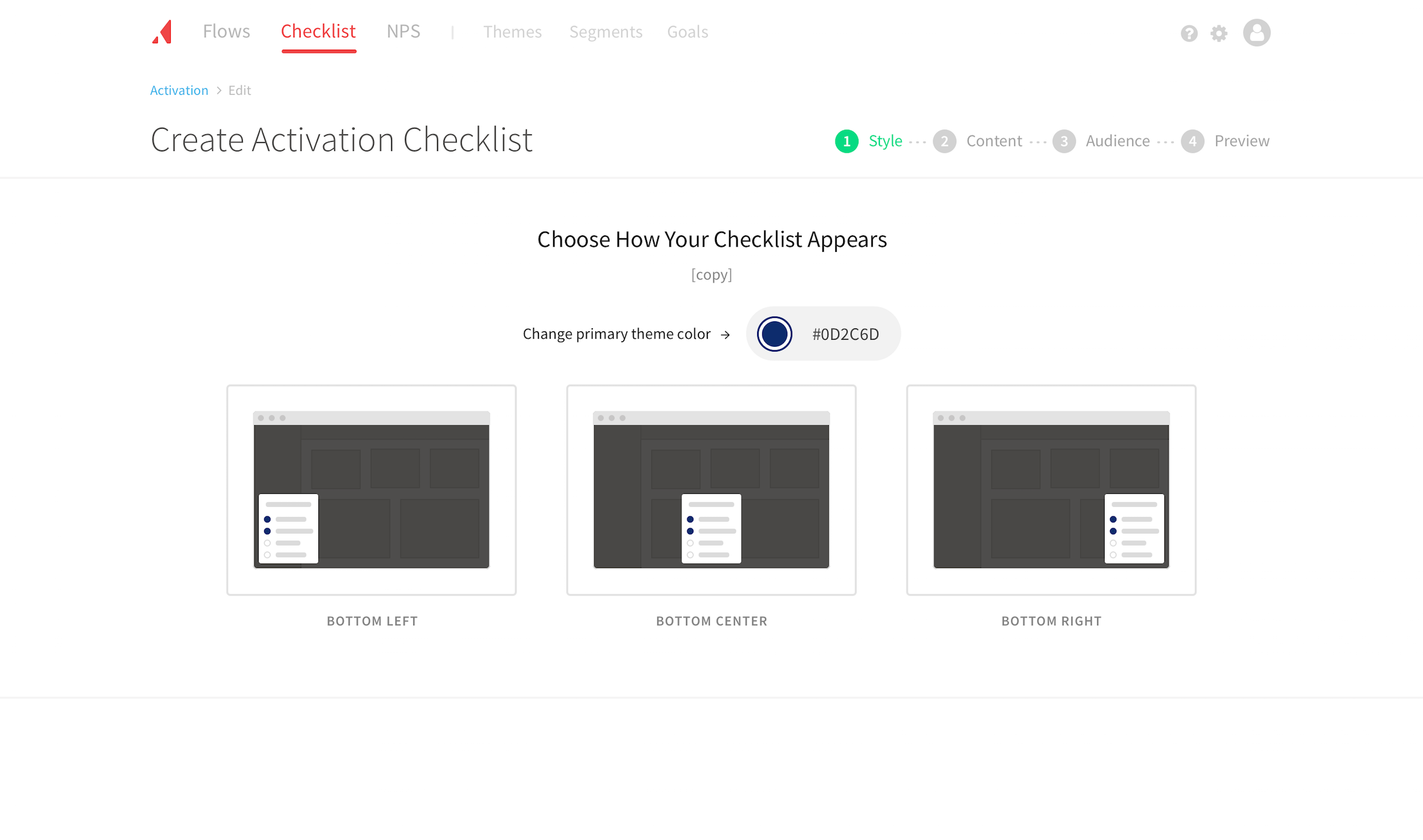
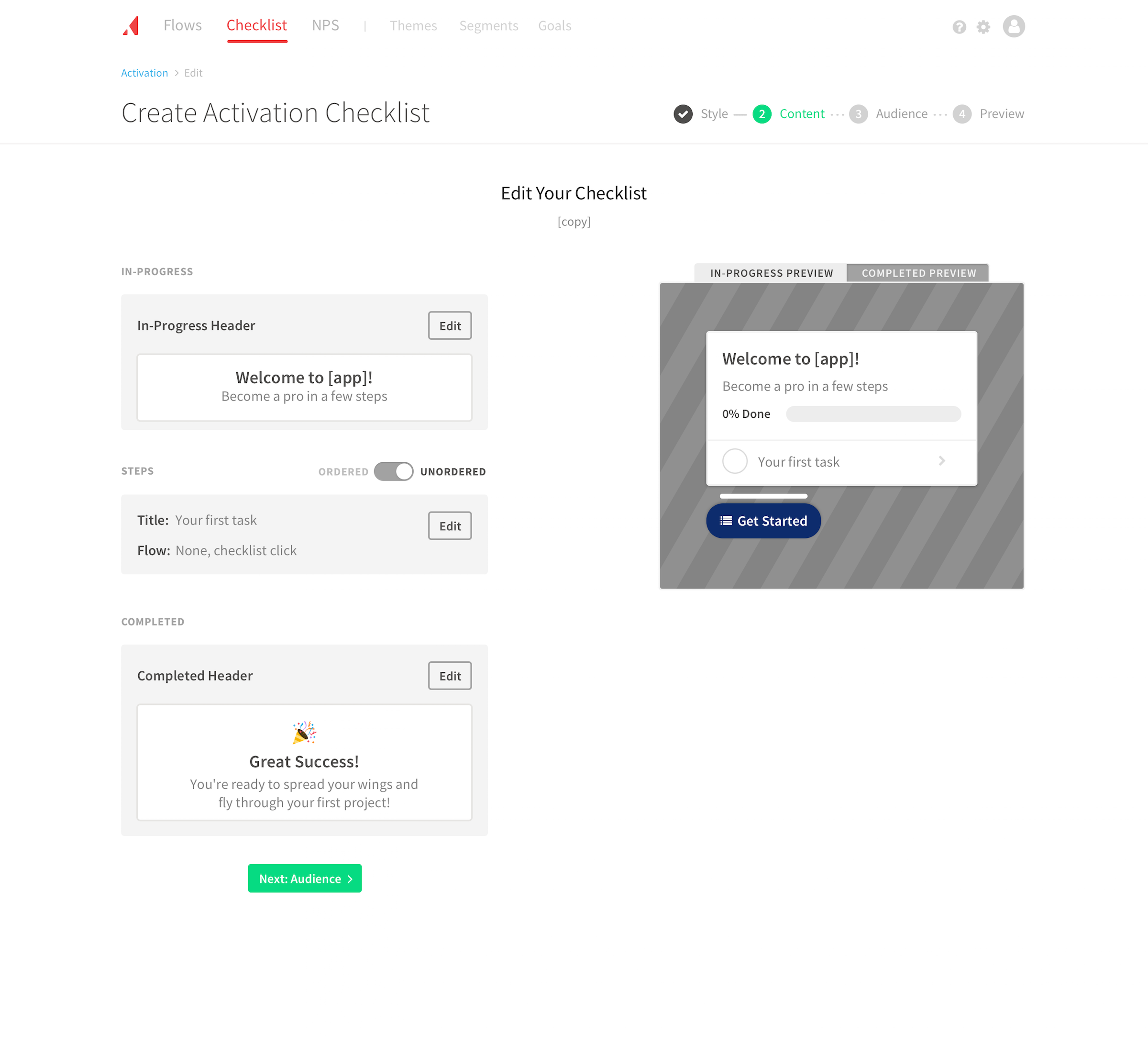
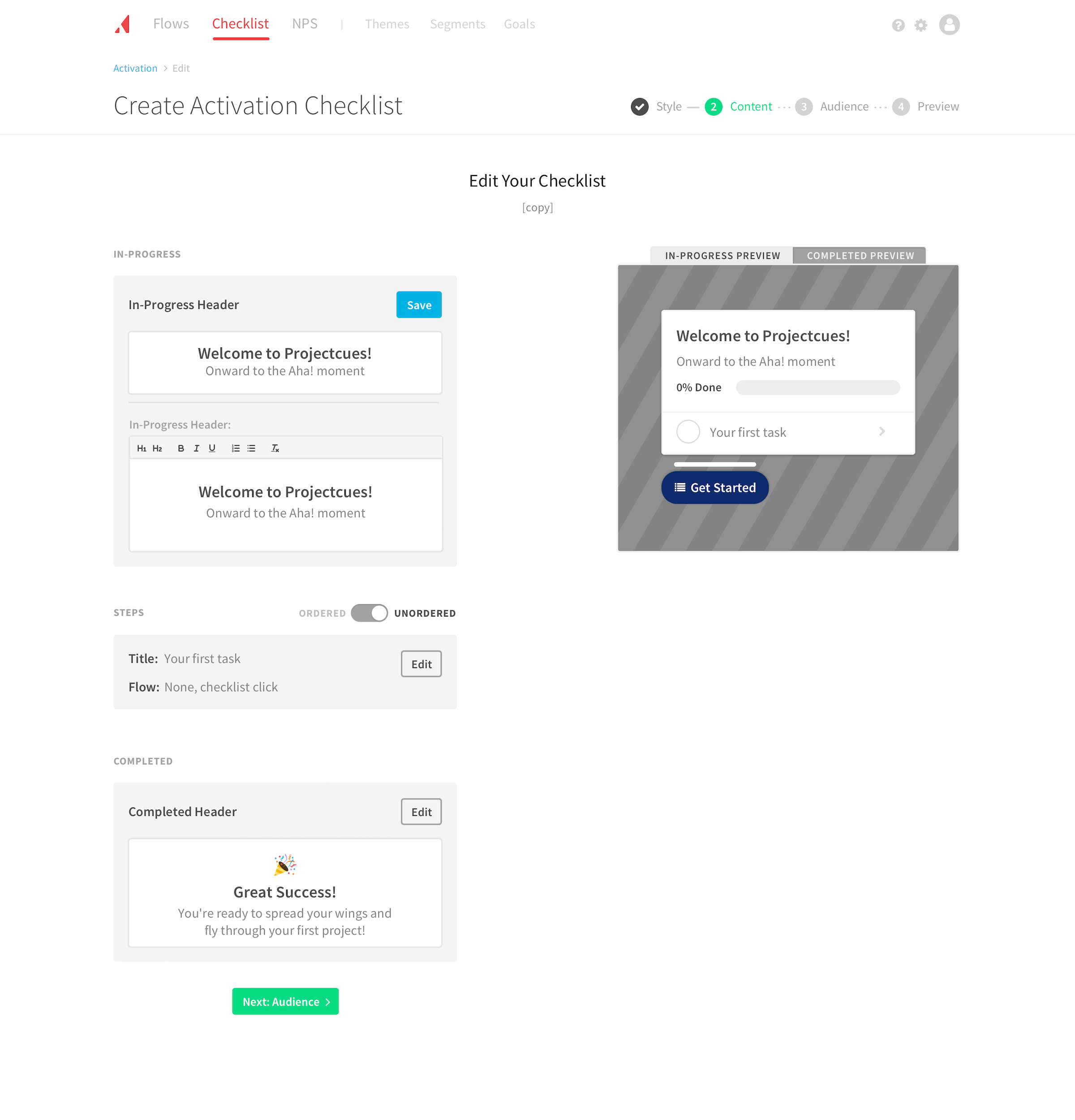
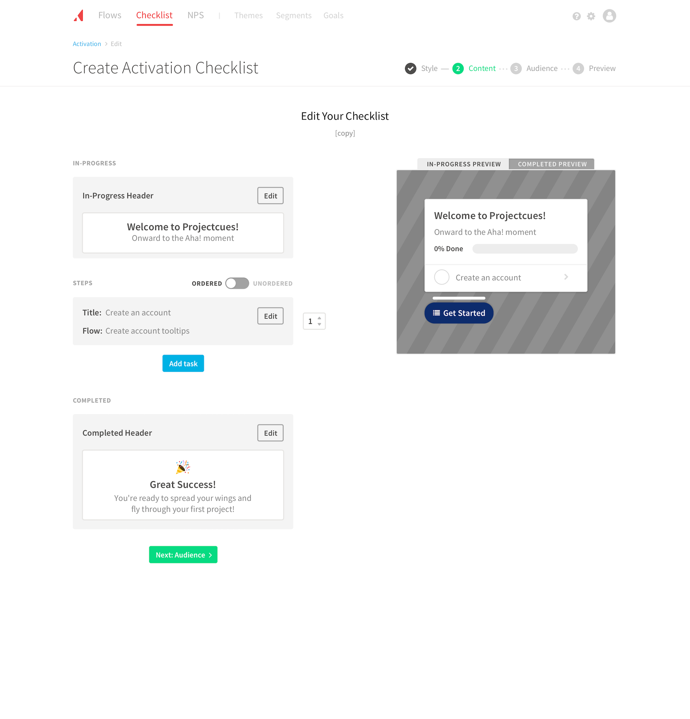
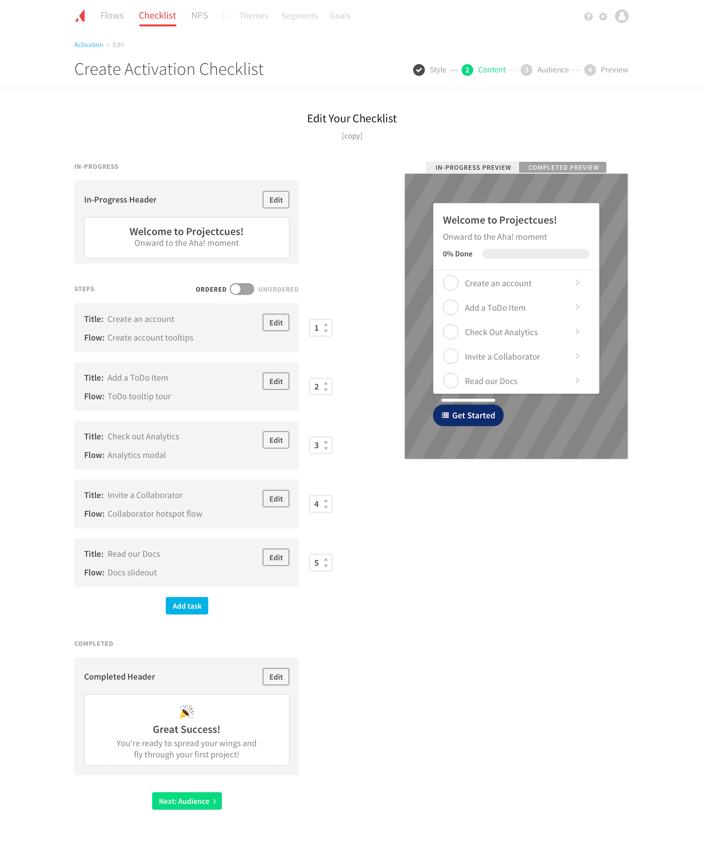
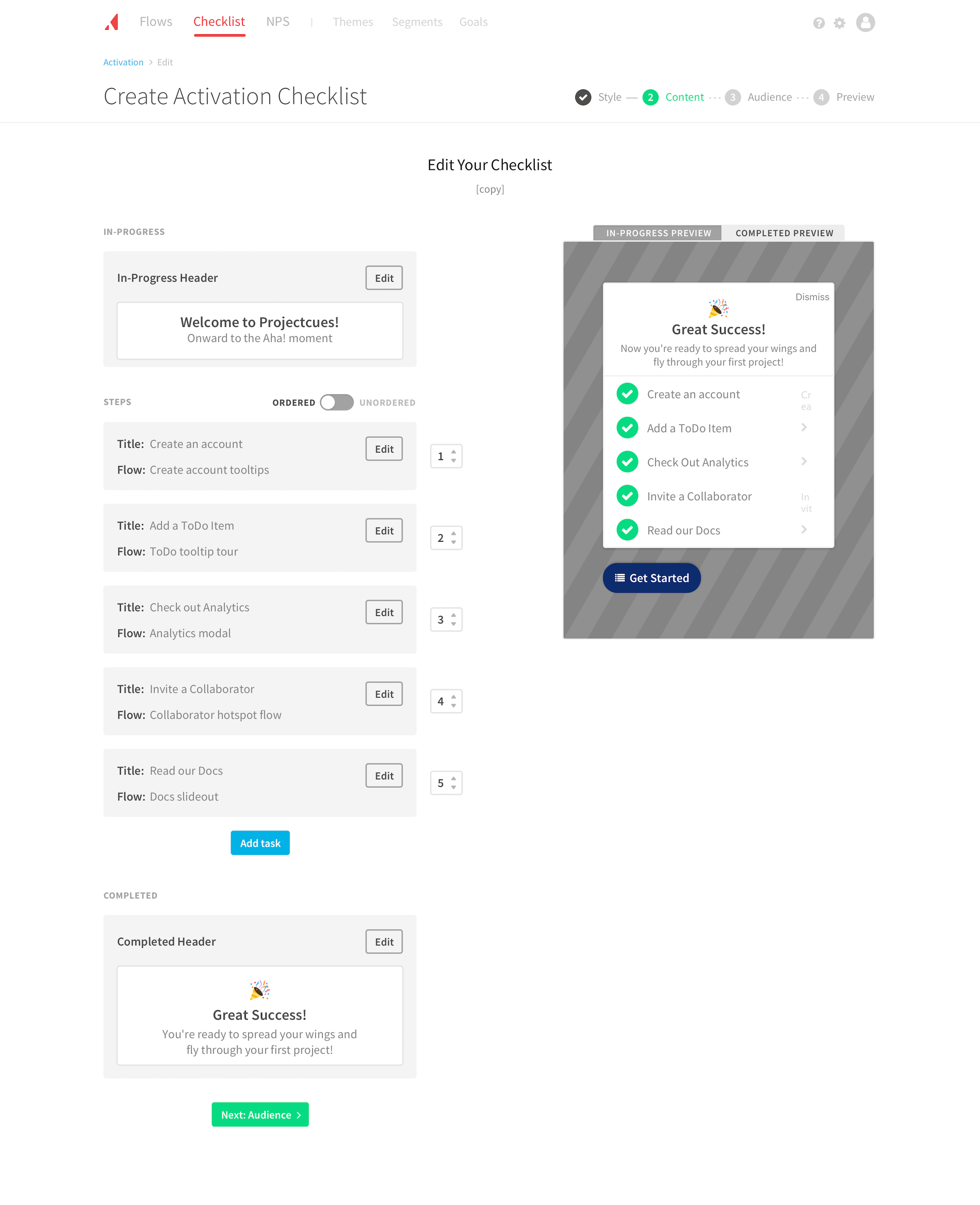
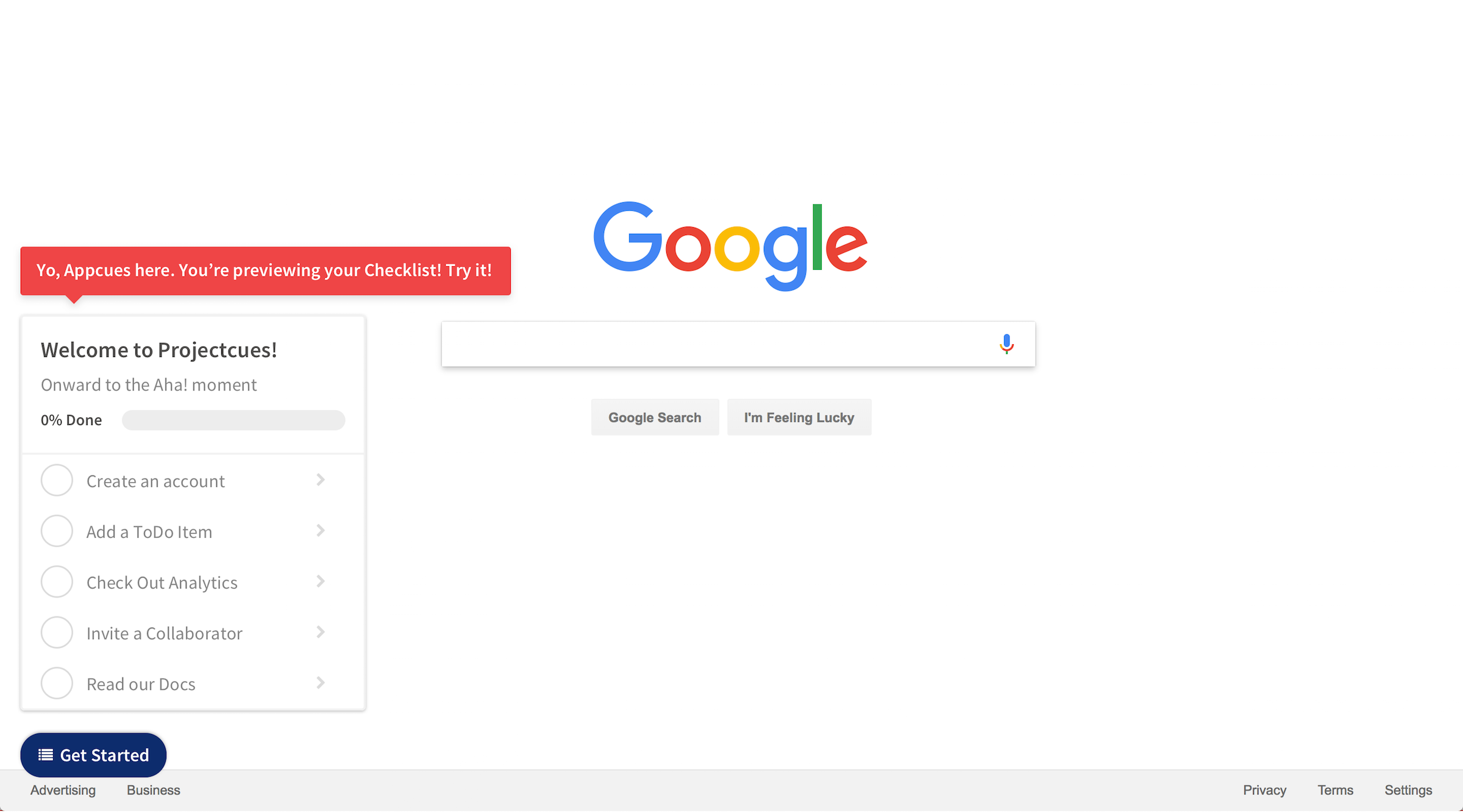
A new onboarding product, Checklists, would quickly follow NPS surveys. As I designed NPS surveys, I pressure-tested the components against the new product. Many components carried over directly: progress navigation, appearance selection, editable blocks, content preview, audience targeting, summary, and confirm preview. This gave customers a familiar experience while speeding up implementation.
Going forward
As a contractor, I didn’t get the opportunity to measure performance post-implementation. However, both products remain in production today. That doesn’t surprise me given the confidence we built with our process and the feedback we received:
This is so much better. Than everything. You guys have done a really, really good job. I’m so excited.
I was really impressed with what you all have so far and am excited to implement the new NPS feature.
The creation flow was splendid in his eyes.
[Redacted Company] was really wowed.
Continuous user testing is a valuable lever to reduce the risk of shipping new products. When you’re exploring a new problem, it only takes a few users to point out opportunities for improvement. This project proved how tight that feedback loop could be.