Appcues
Appcues is:
Software that lets you add experiences (onboarding, NPS surveys, etc) to your app to drive product adoption.
What I’m proud of:
Taking full advantage of daily user testing sessions to rapidly evolve a design while planning and creating reusable components for future features.
The project:
Context
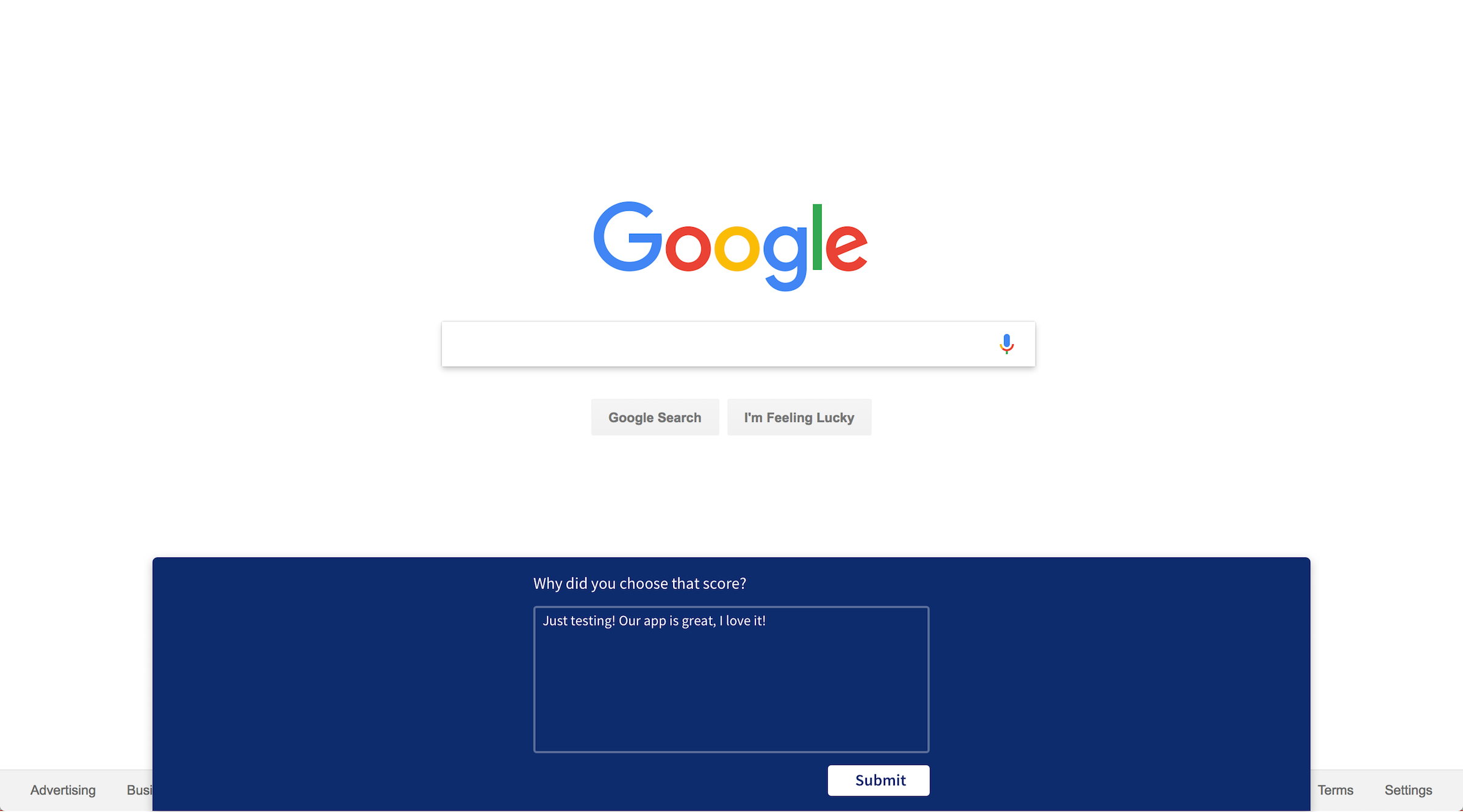
At the time of the project, Appcues was building a new product: Net Promoter Score (NPS) survey. They had built a functional prototype of the actual NPS survey portion (what Appcues customers would display in their product to their users). They were actively using this on user research calls to test its potential value. Having validated the idea, the team needed help designing how the survey would exist within the Appcues product. I was tasked with designing the creation flow for the NPS survey.
Goal
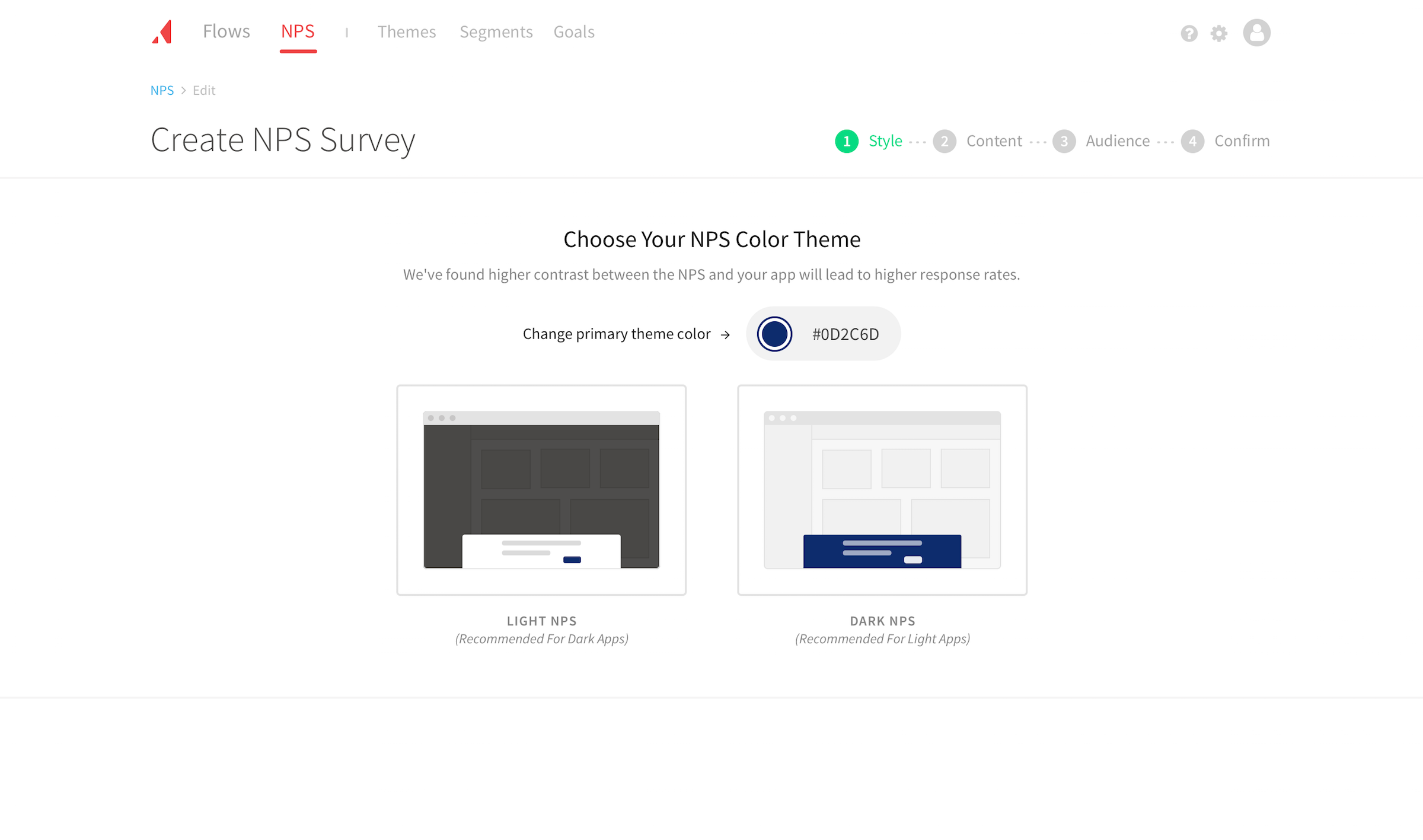
One of the values of Appcues is the ability to seamlessly provide an experience layer to a product. The Appcues team wanted the NPS creation flow to share that sentiment of being an experience v. a page of form fields. Another goal was to incorporate Appcues’ expertise by prioritizing prescriptiveness over customization. Lastly, the team wanted to identify opportunities to improve existing patterns. Specifically, they highlighted the importance of creating reusable patterns for future products.
Getting started
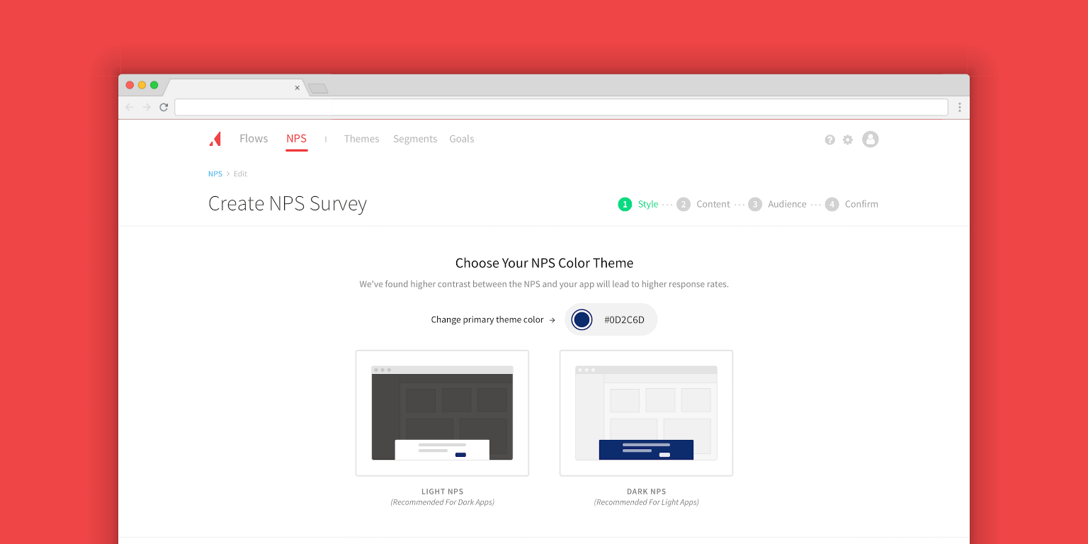
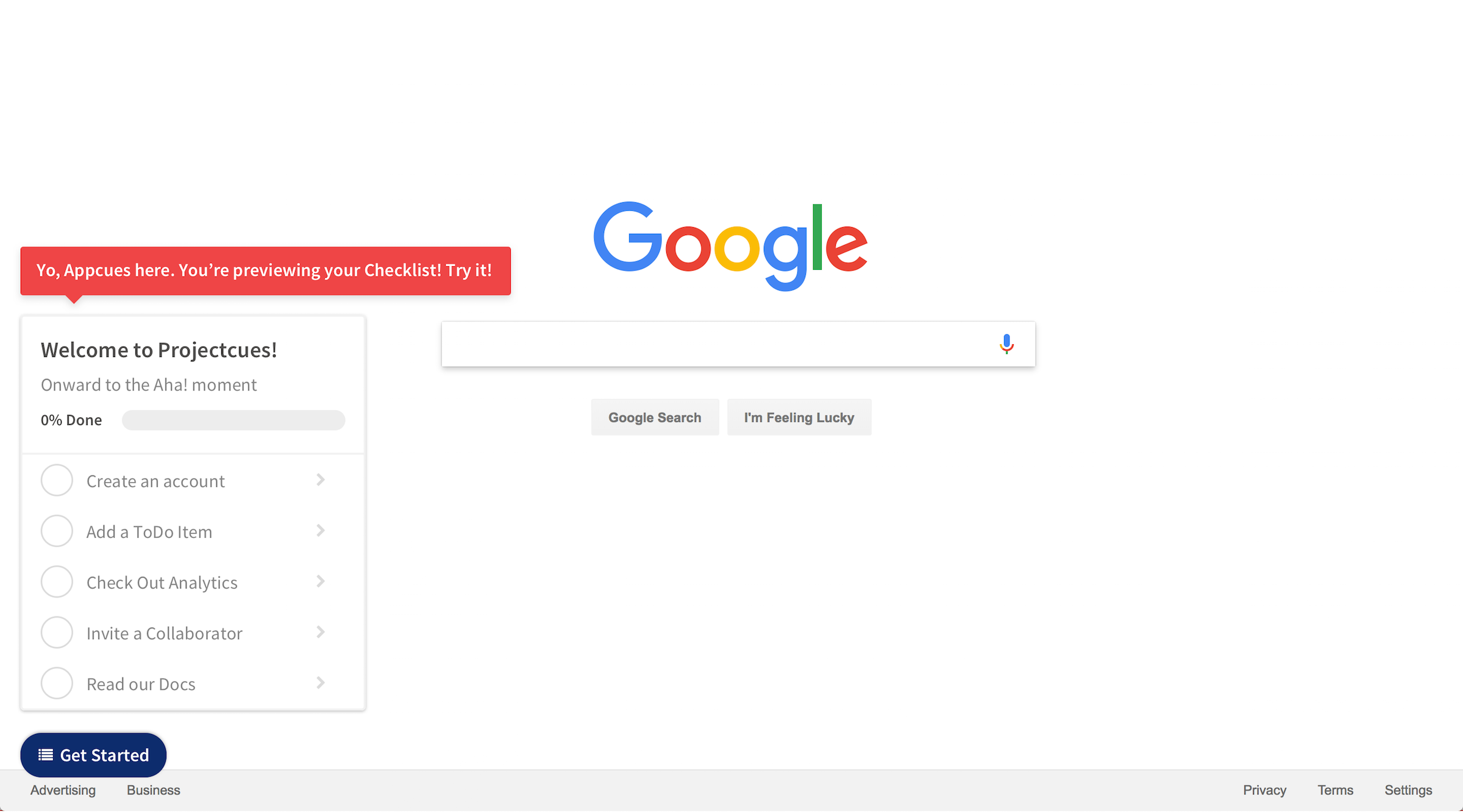
I started with sketching concepts and we decided to pursue the “Appcuesception” direction. We then wrote down all the inputs needed from the user to create an NPS and put them into groups of like items. These groups would become our progress navigation consisting of Style, Content, Audience, Confirm. Now that we had each input mapped to a step, I designed each step in detail.
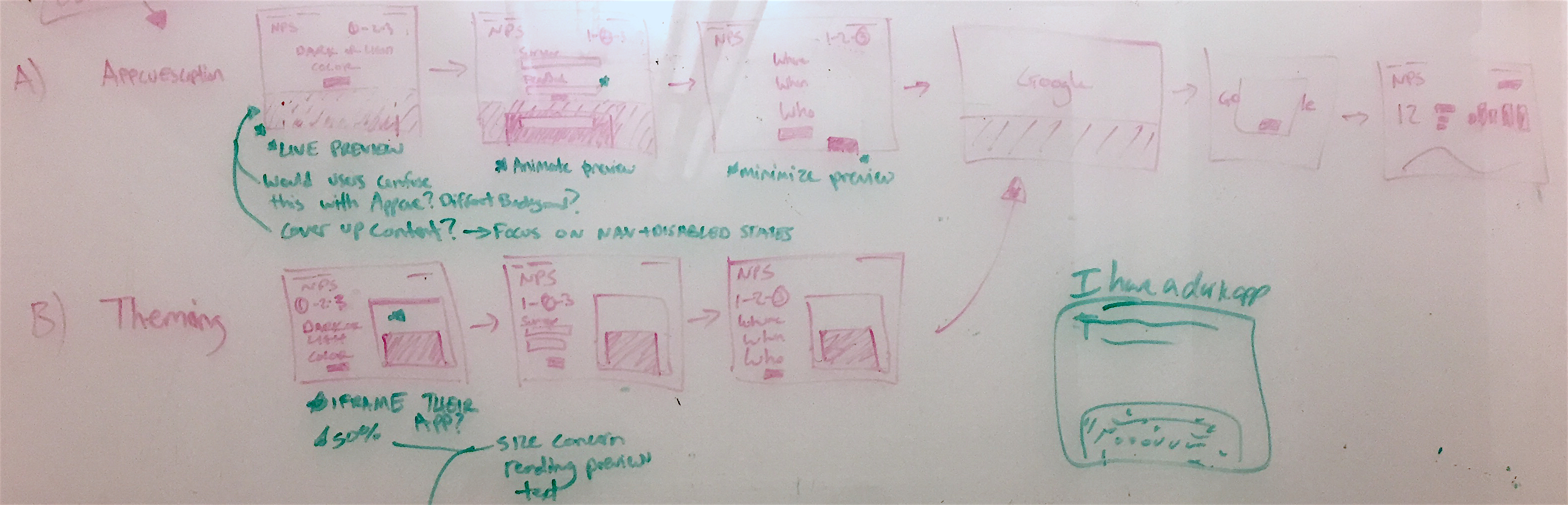
Note: it’s helpful to give concepts a name as opposed to “A, B, C” to reinforce the motive behind the concept.
The process of designing each step in higher fidelity had a welcomed balance between design and user feedback. I had daily check-ins with the head of product design to review progress. I asked questions, we discussed challenges, and we collaborated on potential solutions. For user feedback, we took full advantage of ongoing user research calls the product manager had already scheduled. Using these daily calls, we iterated and re-tested designs frequently, often multiple times a day.
User testing
Working for a client that valued user testing as much as Appcues was a highlight of my work there. Iterating daily enabled us to to quickly validate assumptions and move forward. Prioritizing when to make certain design changes became important. When we only had an hour or two, I would tackle smaller design problems with known solutions. When we had a whole morning or even a day, we would tackle the unknowns. Matching time between calls with scope of changes allowed us to maximize impact. Each decision, large or small, validated on ensuing research calls meant reduced risk for launch.
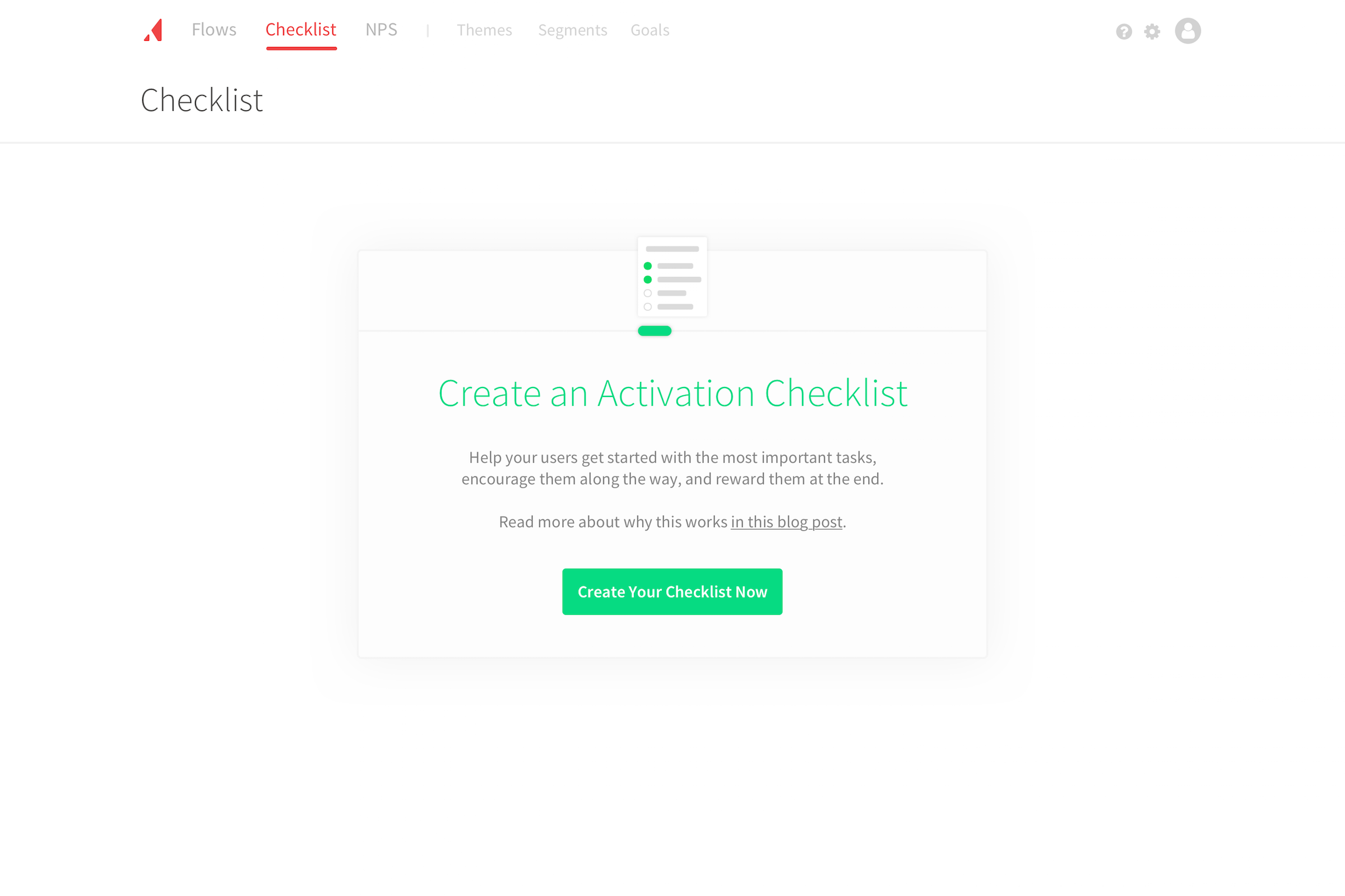
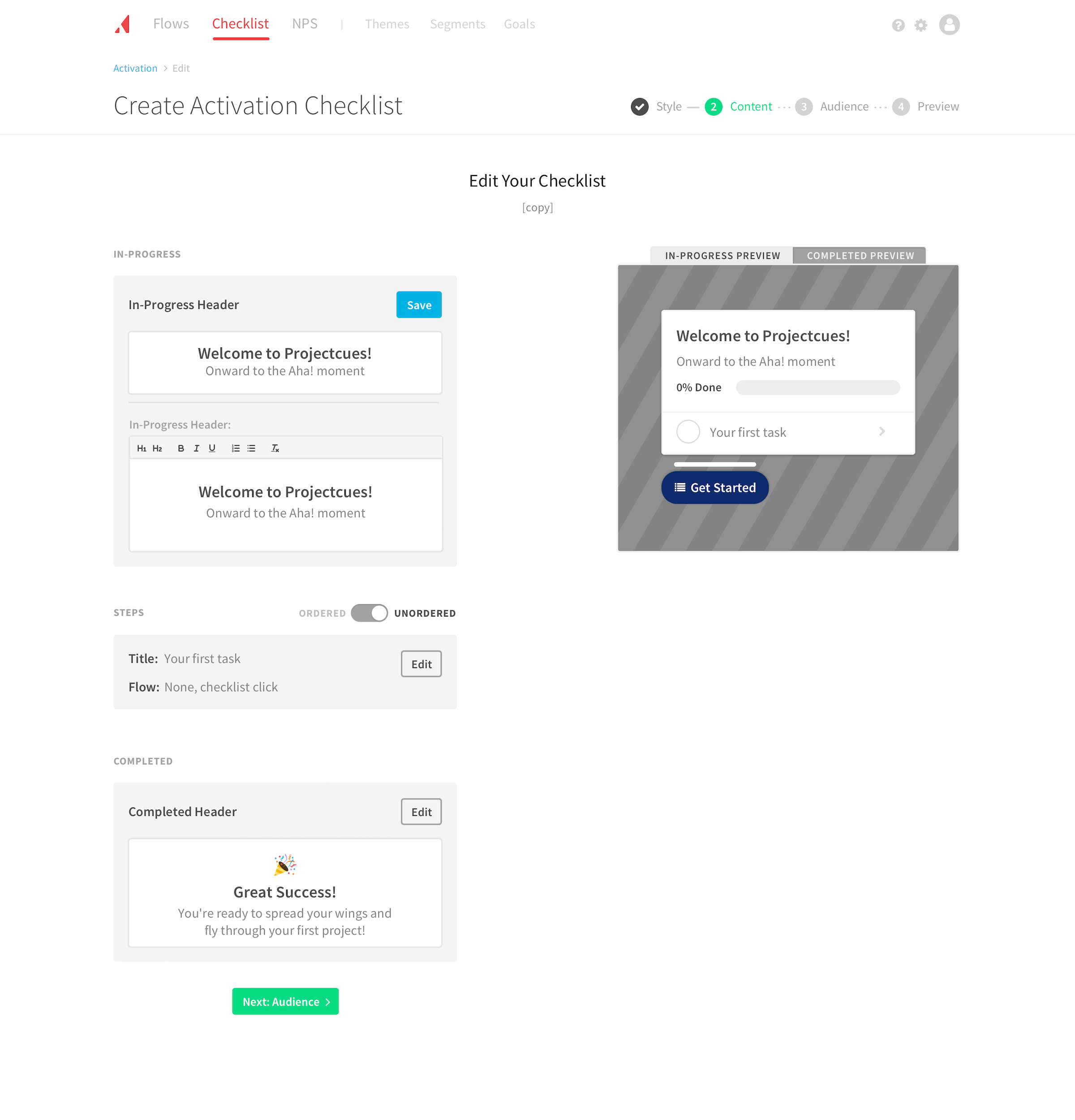
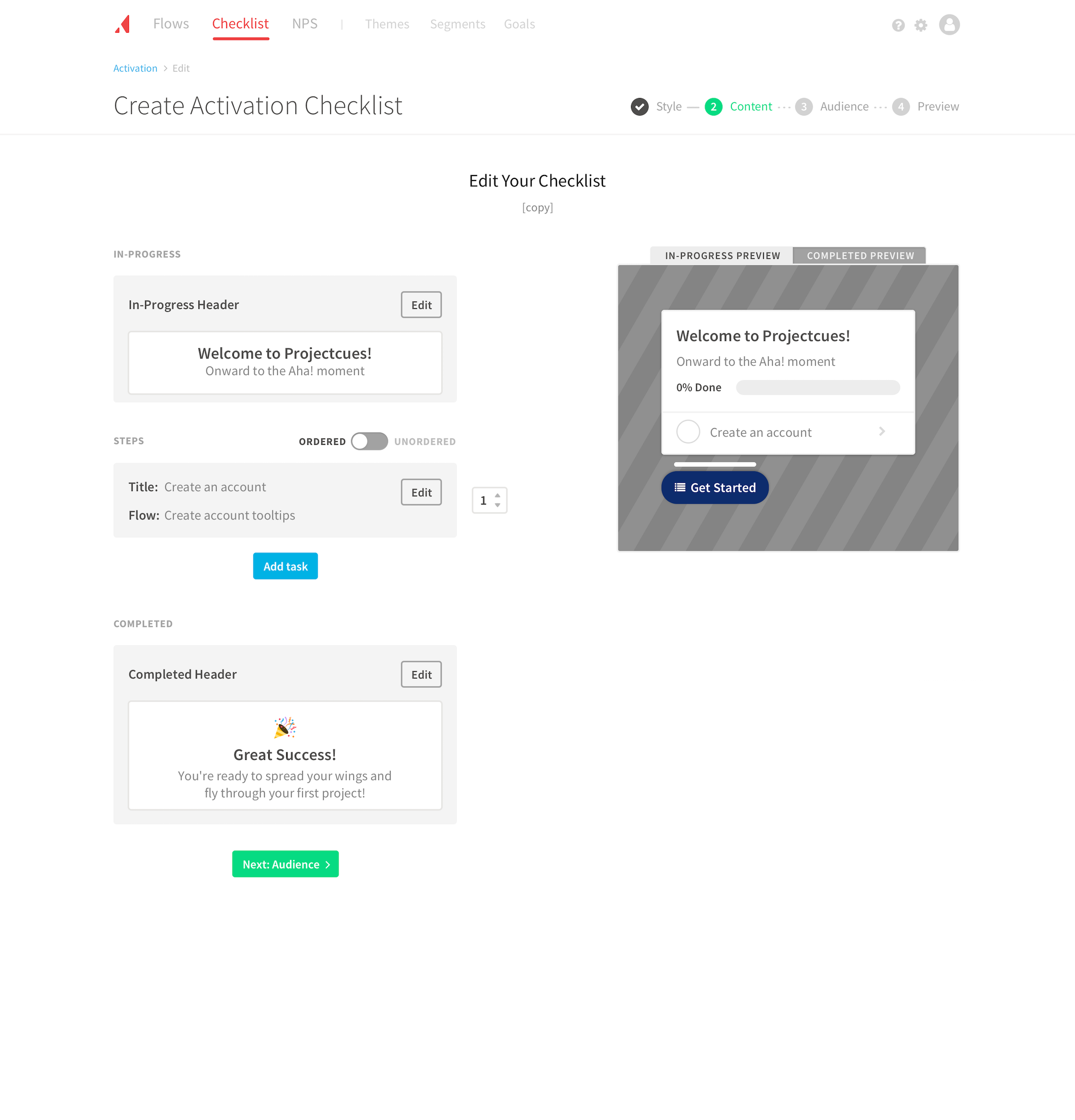
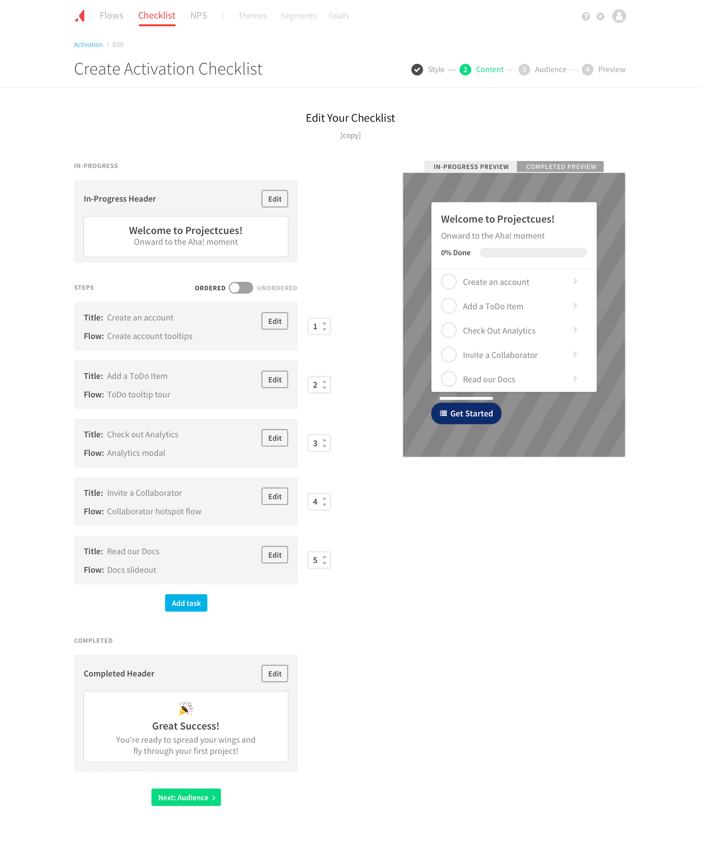
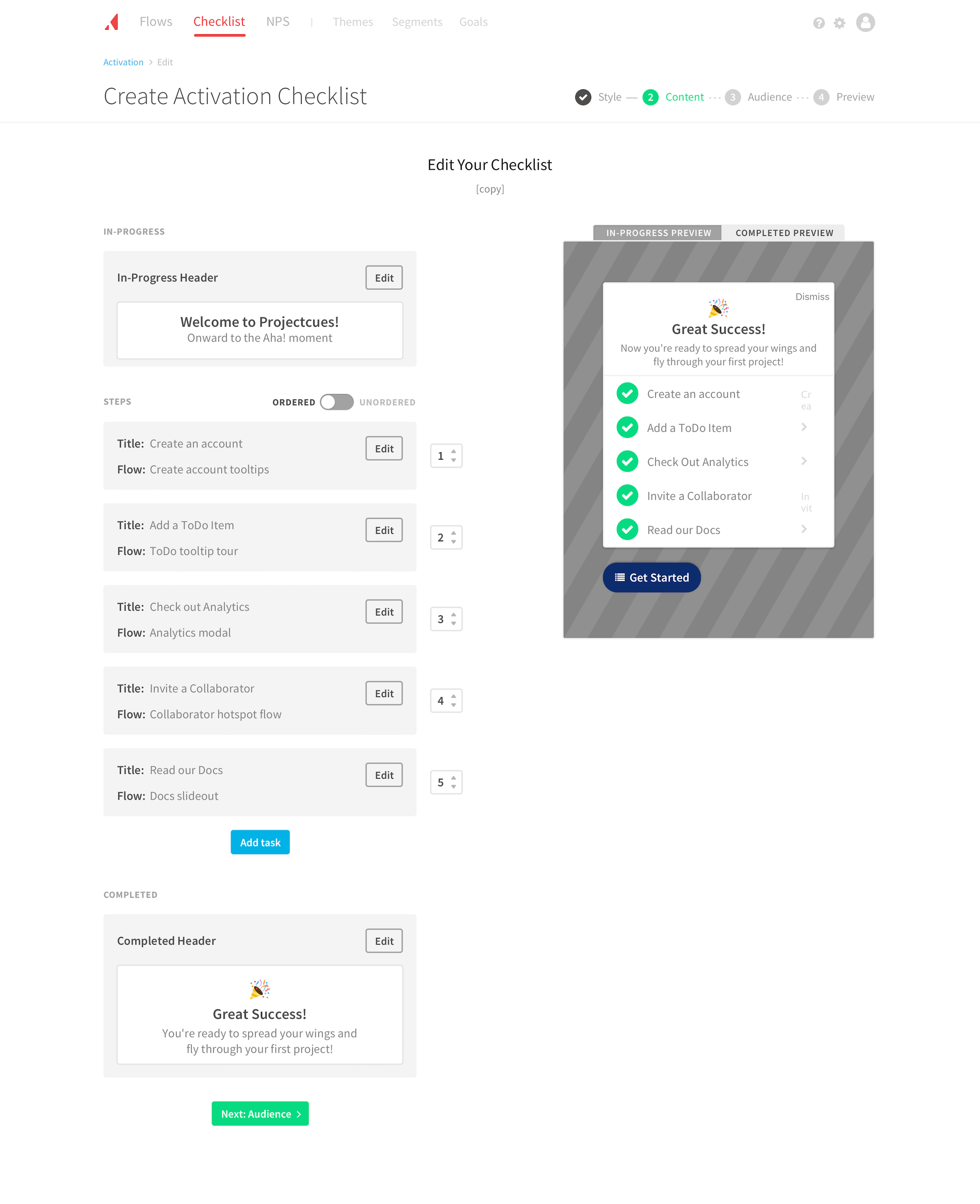
Creation flow
Within a few weeks, we had a prototype we felt confident in to begin developing.


The following are a couple of elements that stood out to users:
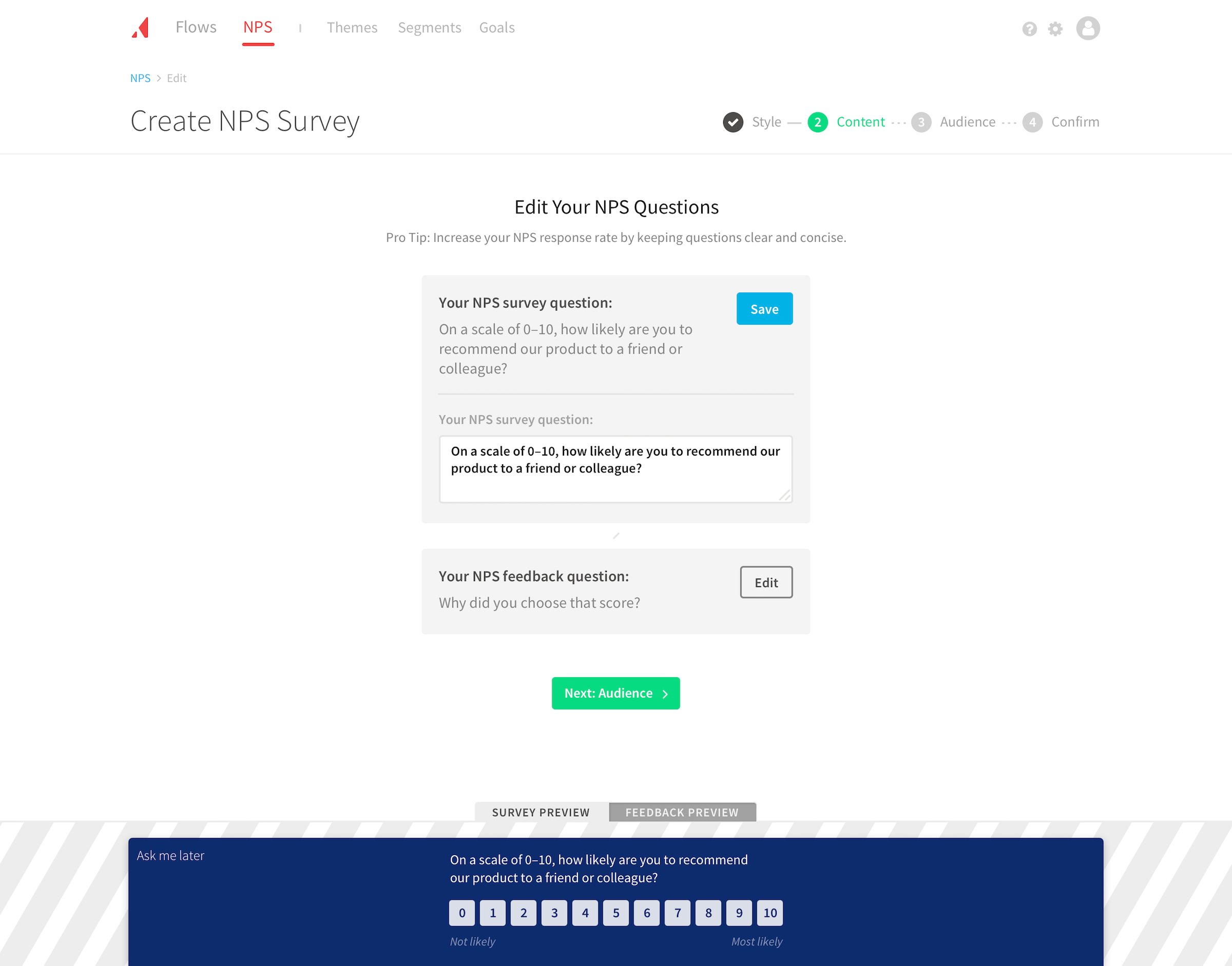
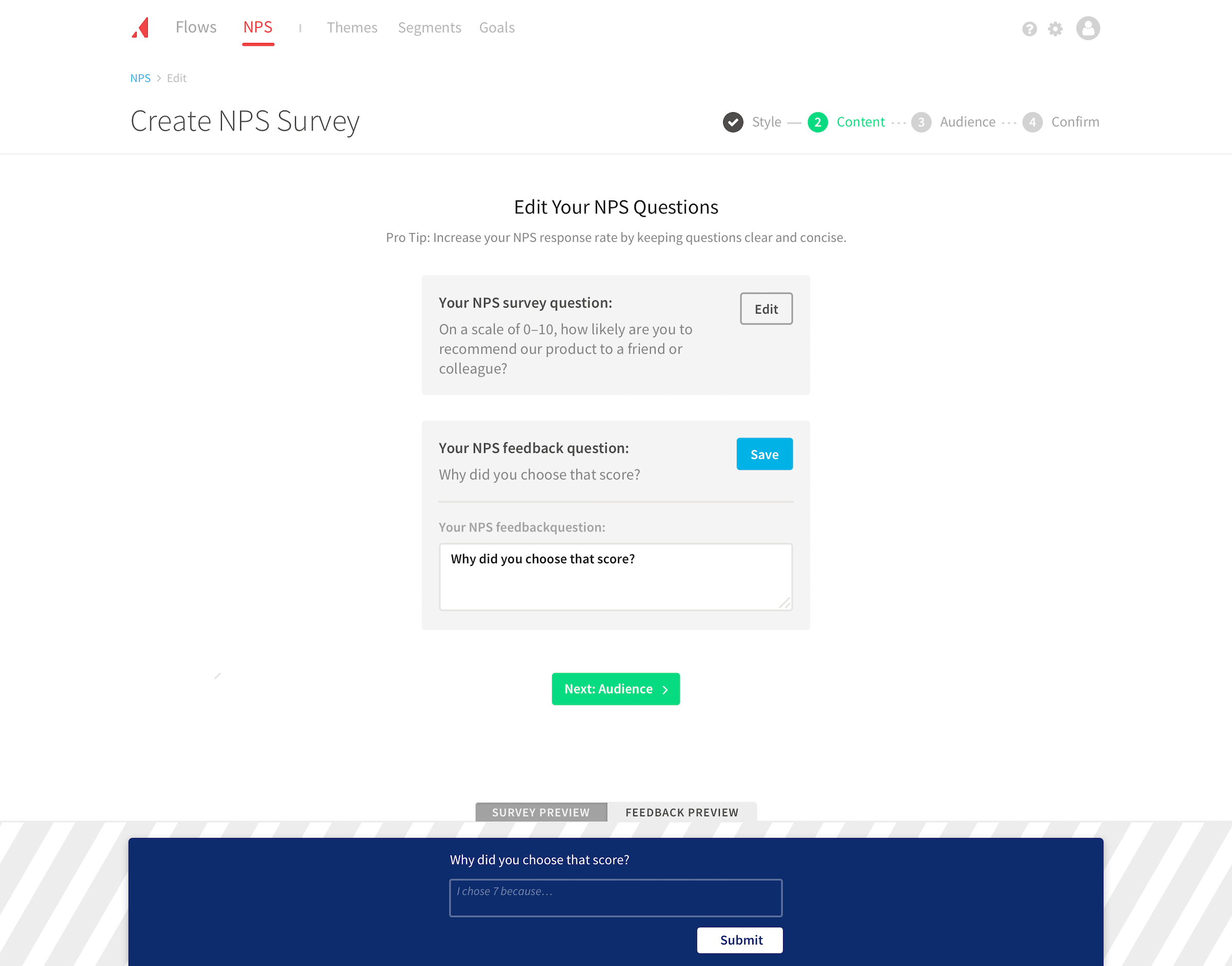
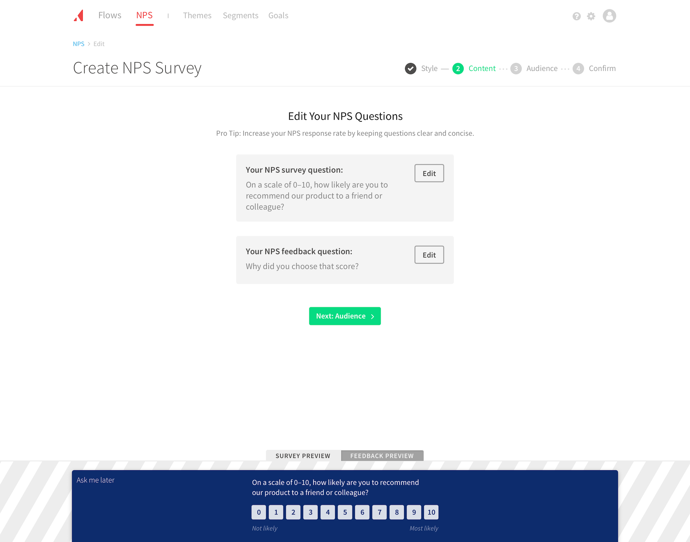
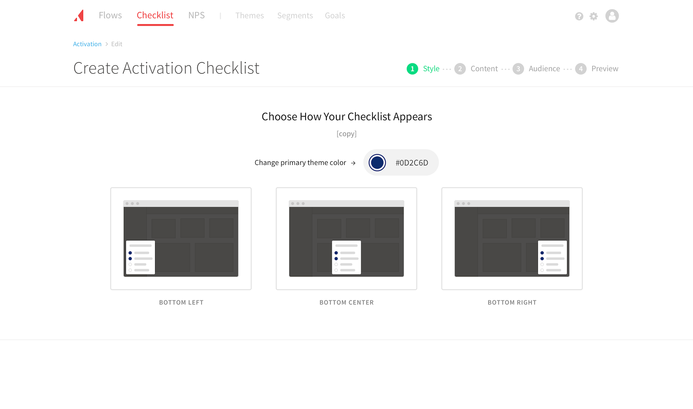
Smart defaults. With the goal of being more prescriptive, we decided to add smart defaults to inputs. Where we could, we pulled information from the user (e.g. primary brand color). Elsewhere, we relied on best practices and Appcues’ collective knowledge (e.g. wording of the NPS question). Using defaults gave users a solution that worked out of the box and satisfied most users. Here are some of the responses we heard:
Copy changes (if any) for the Qualitative and Quantitative parts of the NPS Survey? None - let’s use the standard ones.
Awesome, that was going to be exactly what we wanted to do
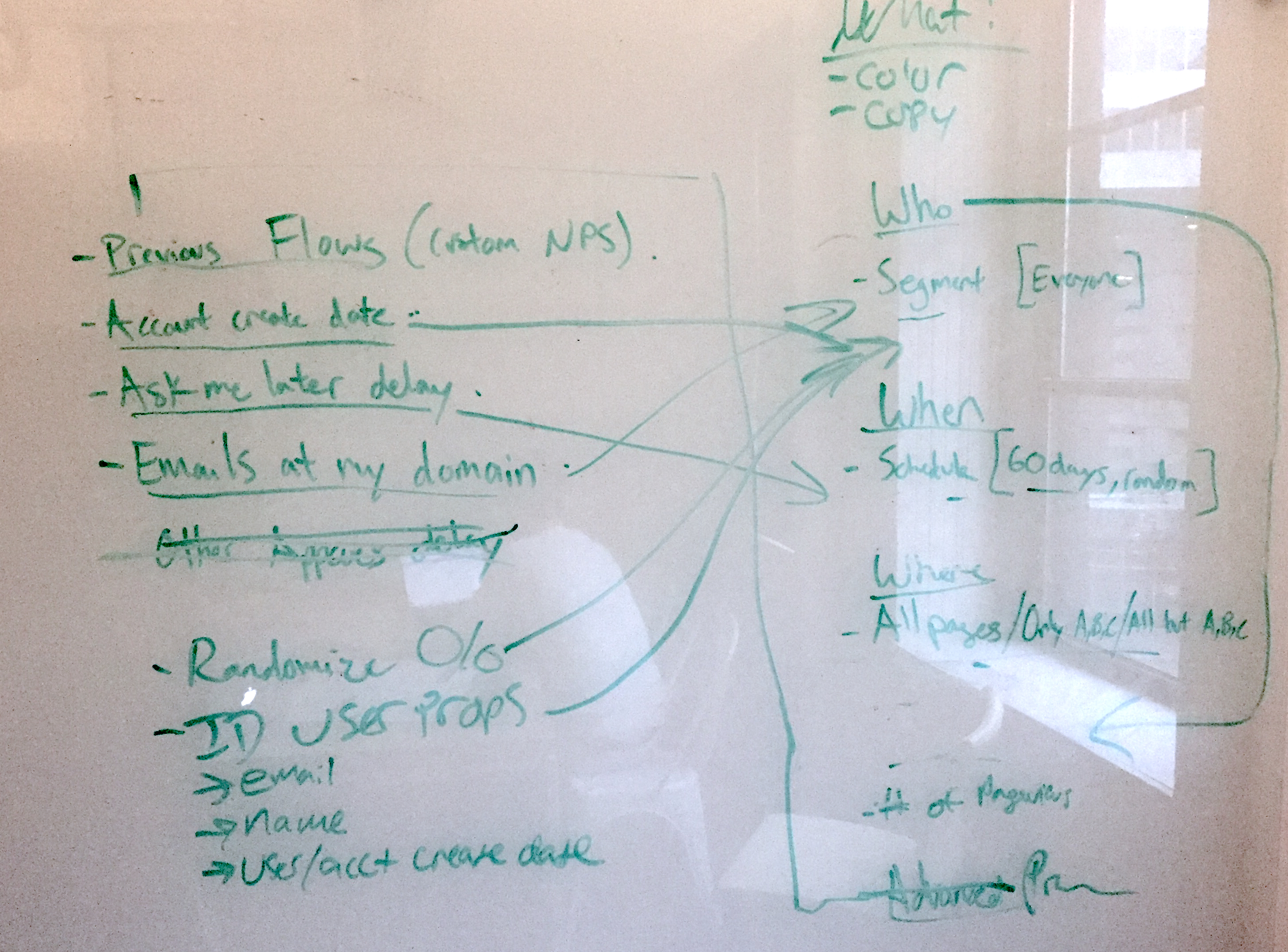
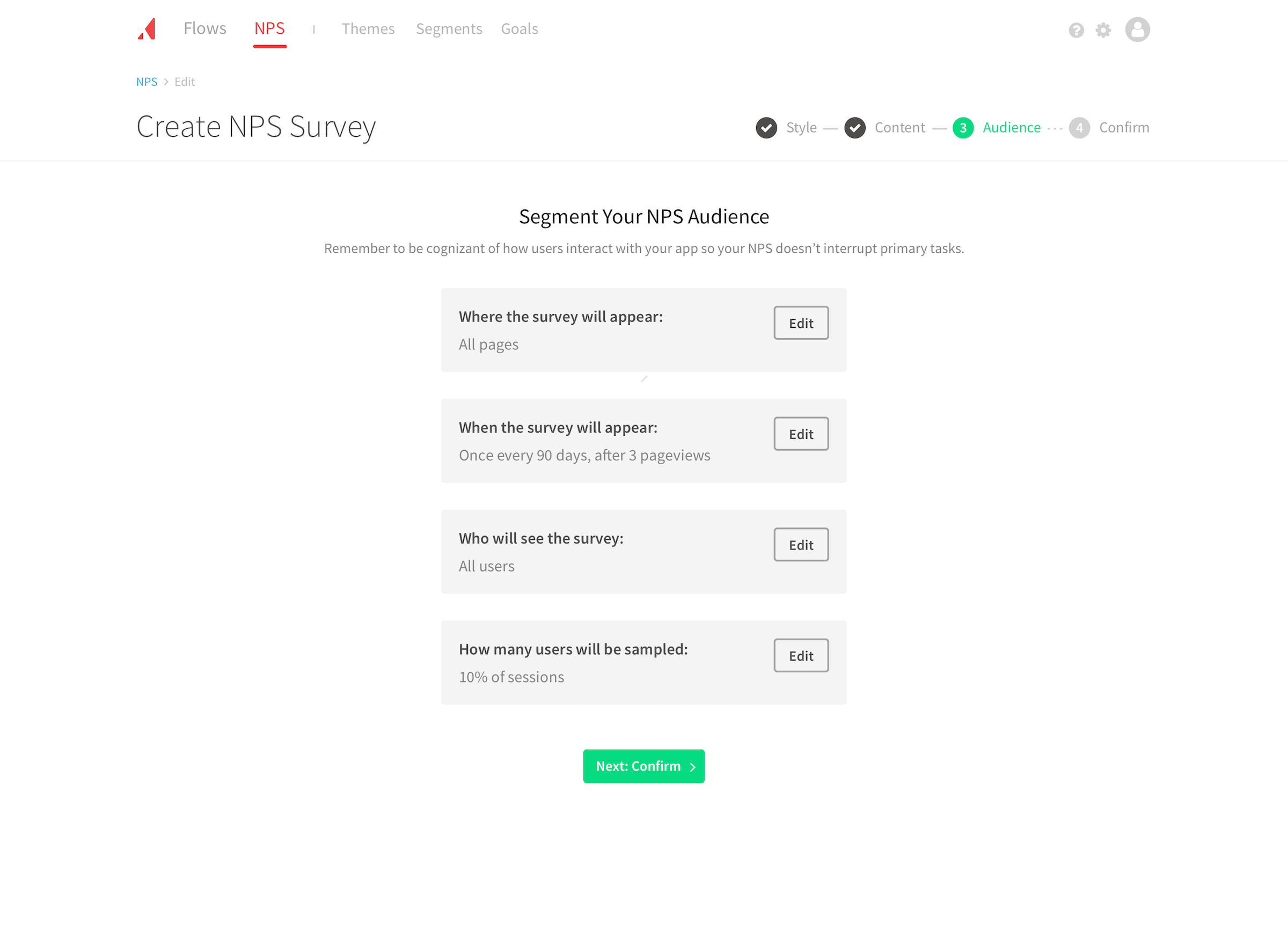
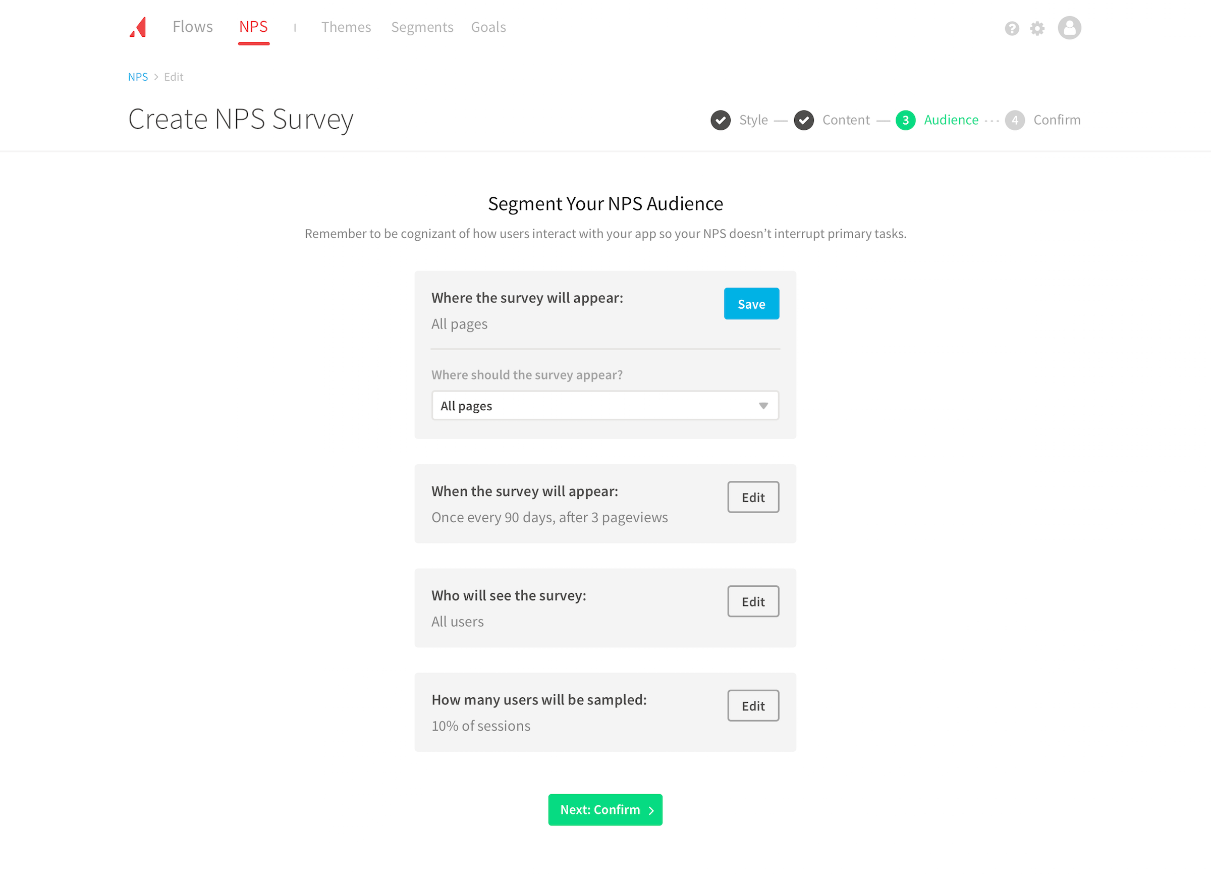
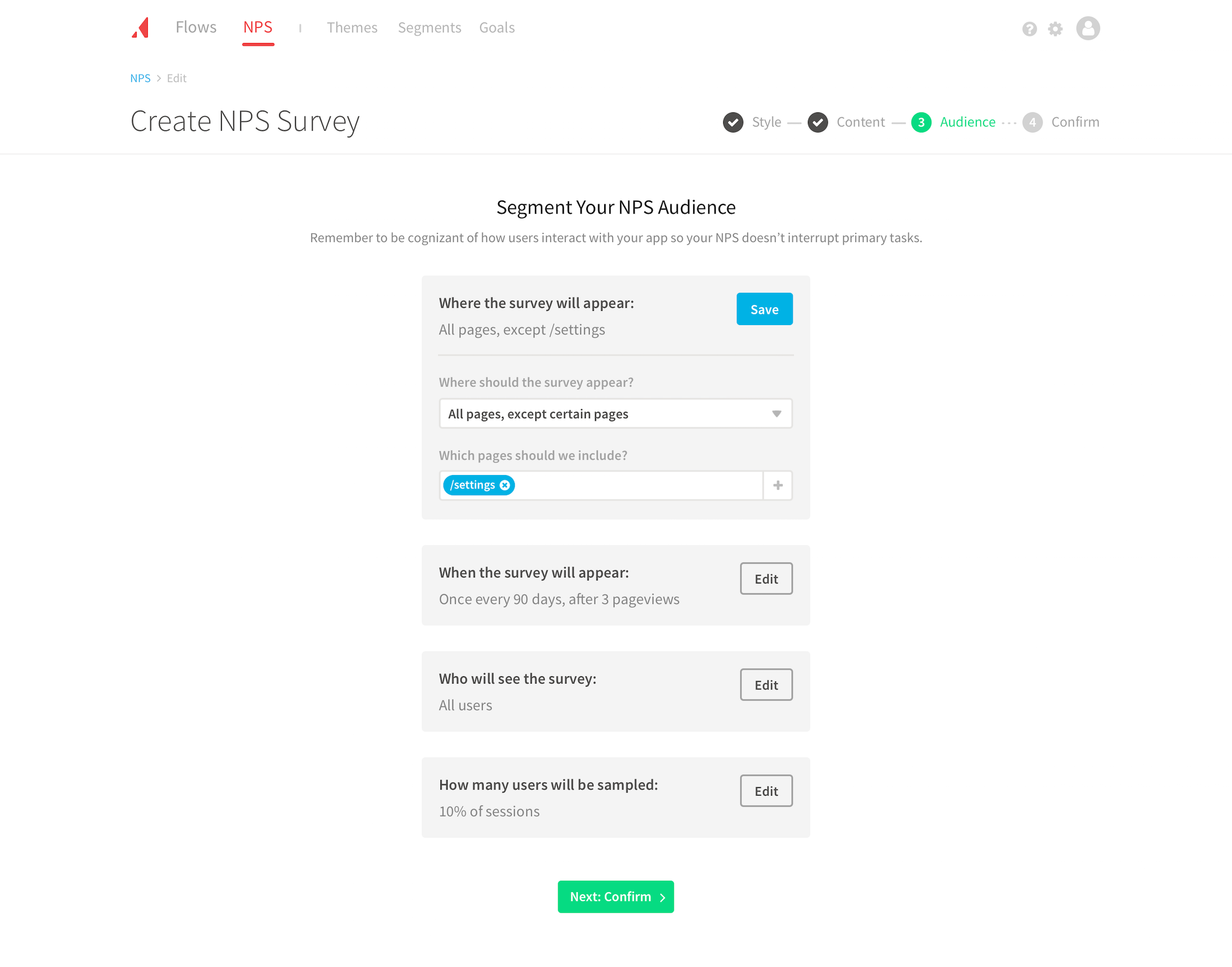
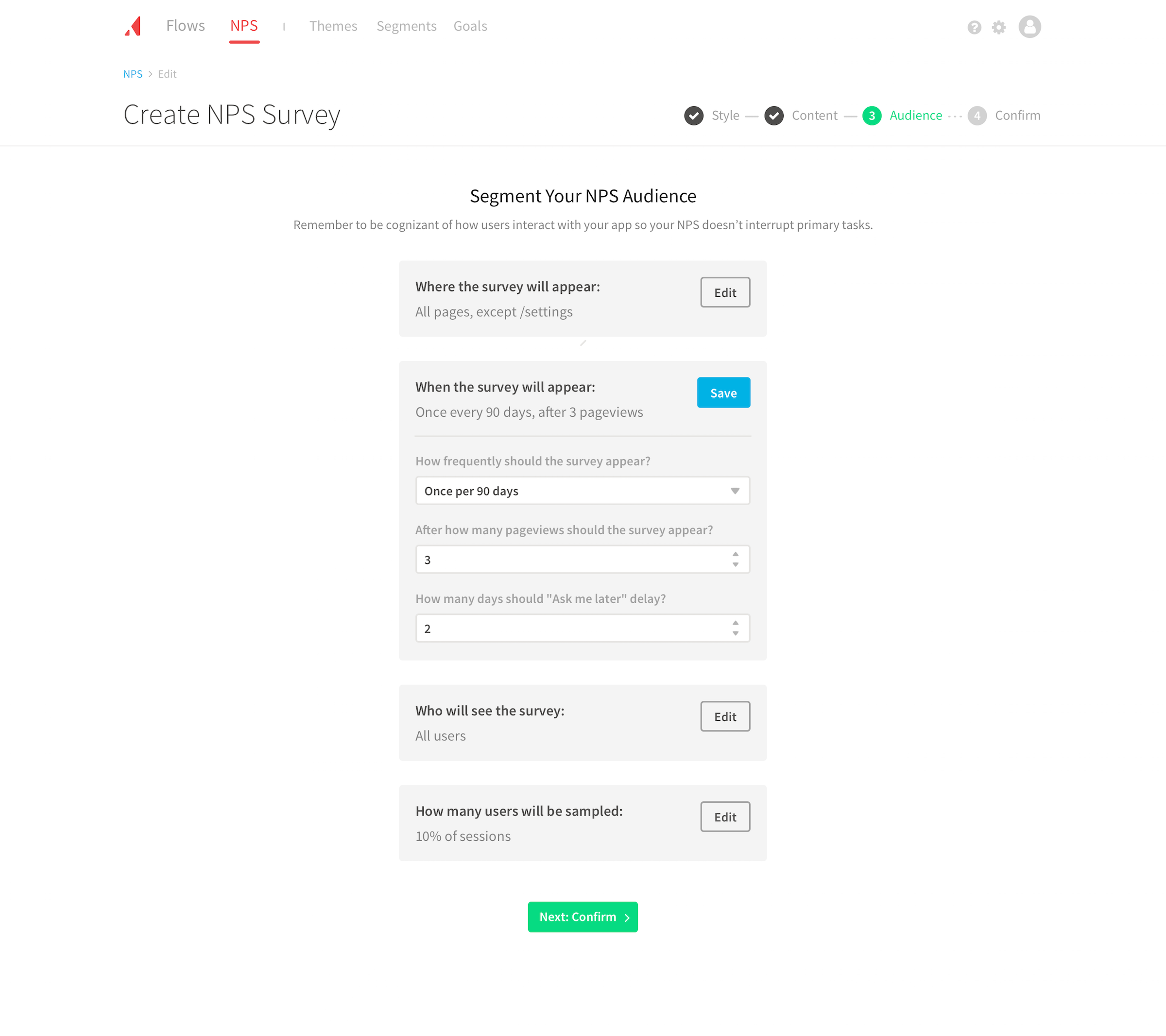
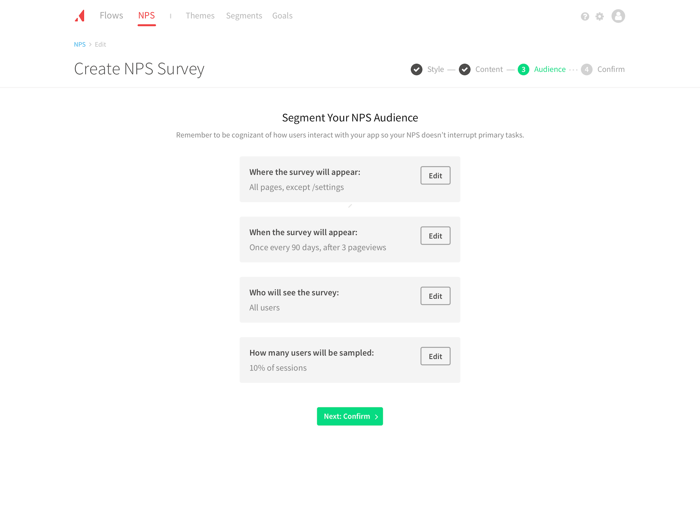
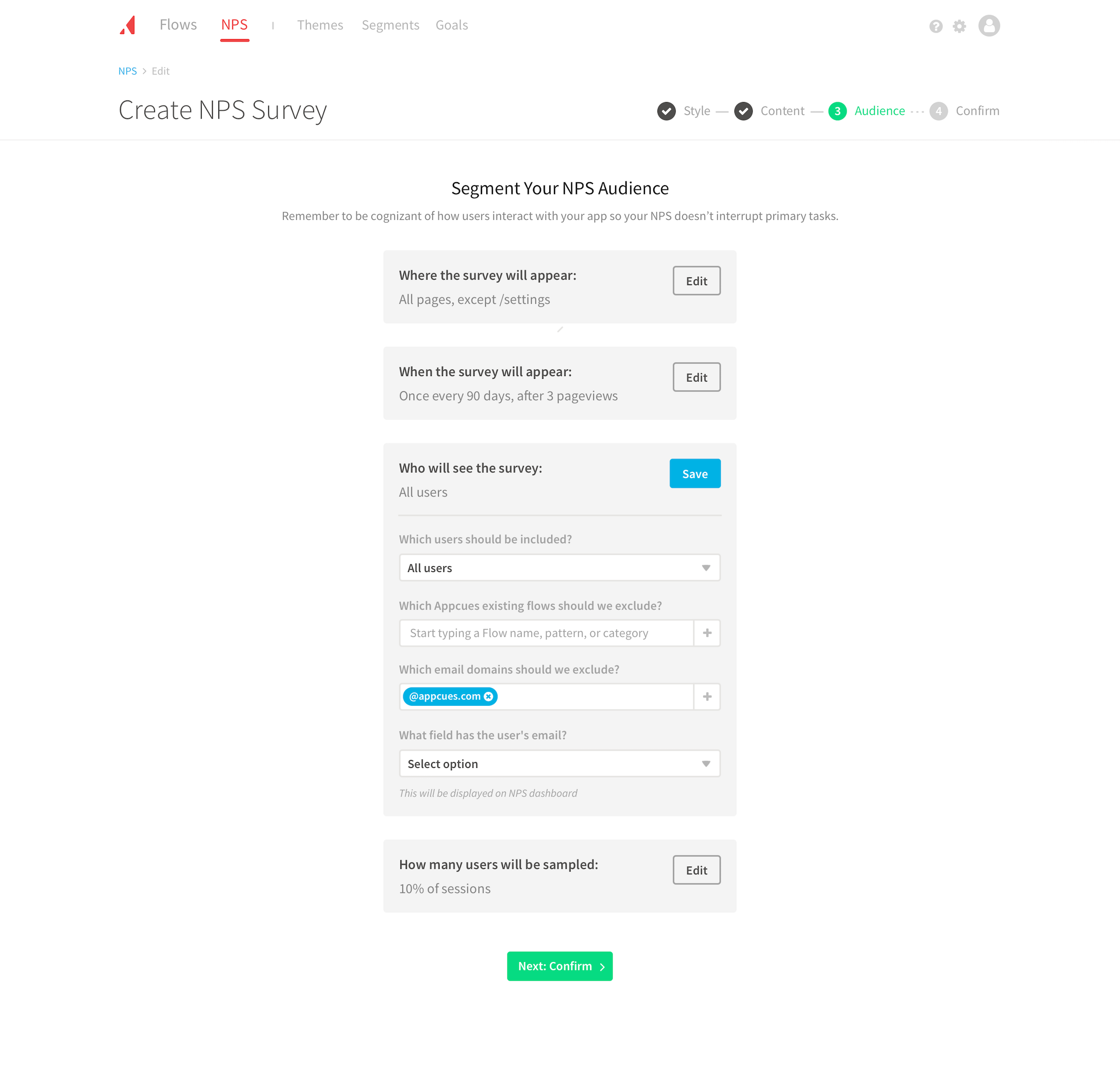
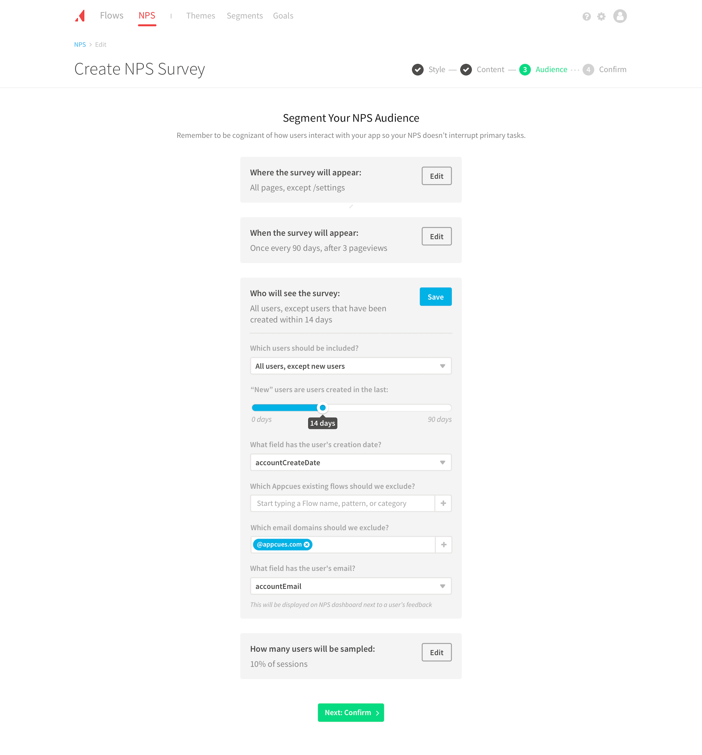
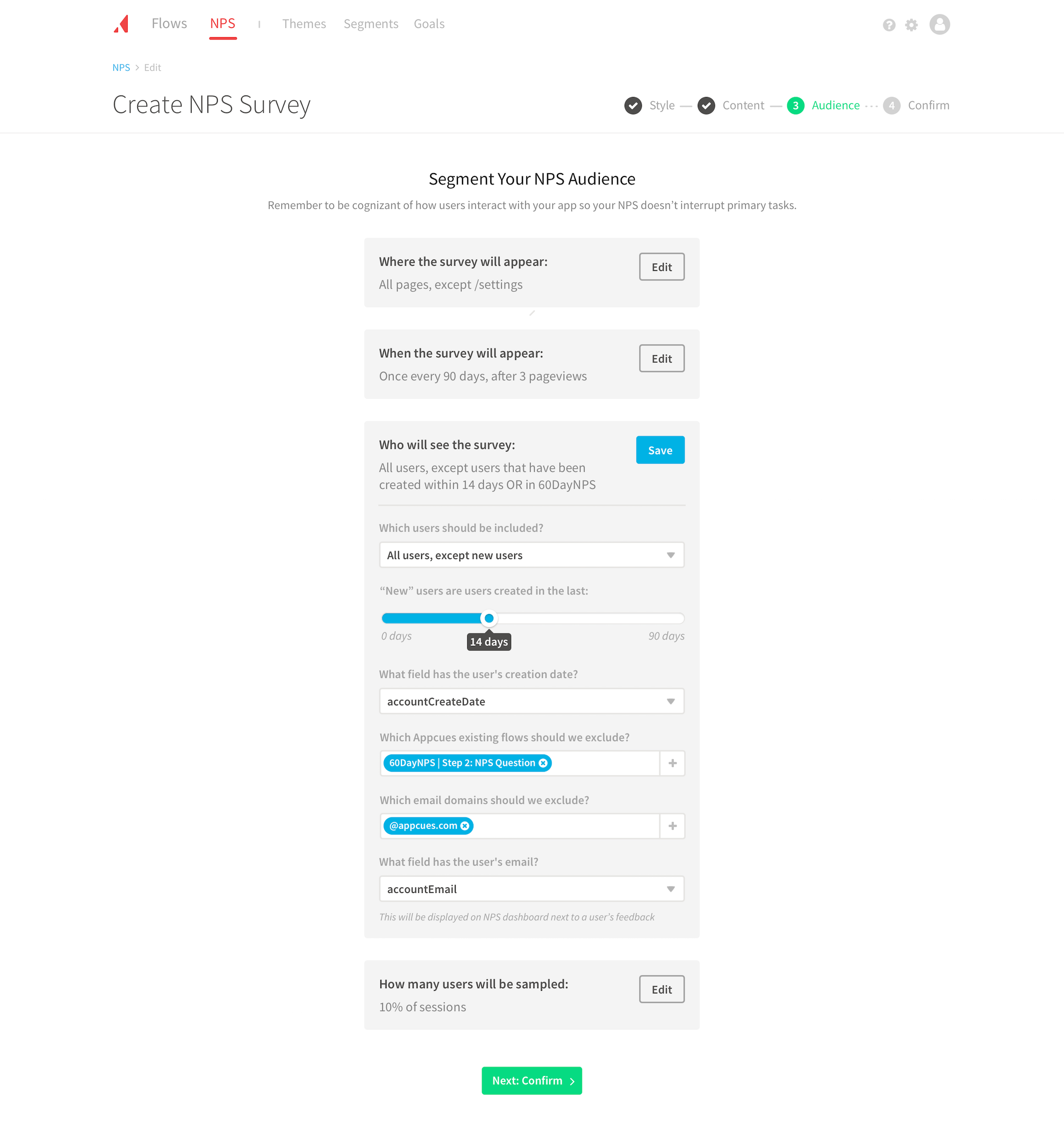
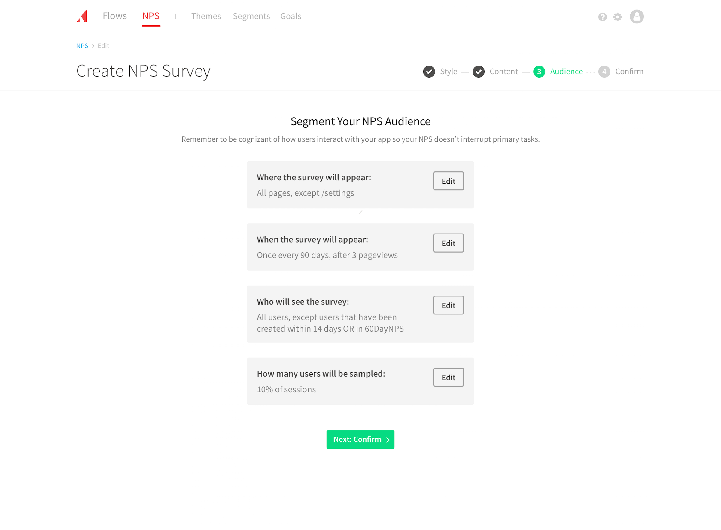
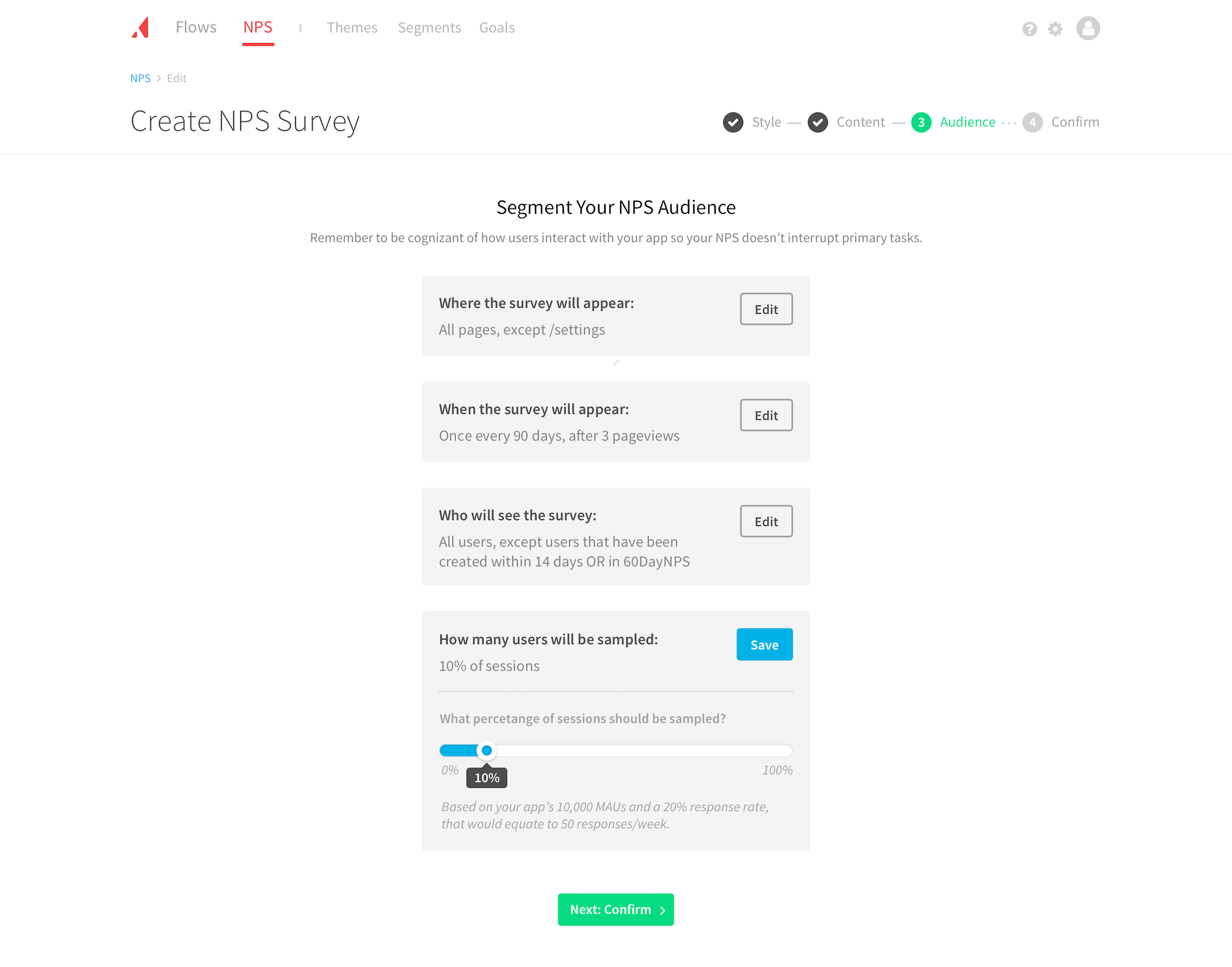
Conditional inputs. The most complex problem we faced was how to design targeting within the Audience step. Targeting currently existed as the standard conditional statement decision tree you see in many apps. That can often turn into a 40+ line monster with too many ANDs, ORs, IFs, or ANYs to count. The first step was to list all possible inputs we needed and look for natural groupings.
These groups took shape as Who, Where, When, How, with the What being accomplished in the previous Style and Content steps. We then used these directly to define the targeting subgroups: “Where the survey will appear,” “When the survey will appear,” “Who will see the survey,” and “How many users will be sampled.” And within each subgroup we only showed the inputs necessary. Users now had logical subgroups and only had to ask themselves one question at a time.
This changed the perception of what targeting an Audience entailed for users. Before it was a daunting decision tree awaiting potentially endless conditions with no order. Although the five groups combined for up to 13 questions, users never saw more than a couple at a time. Combining this with our defaults resulted in most users not having to edit all sections.
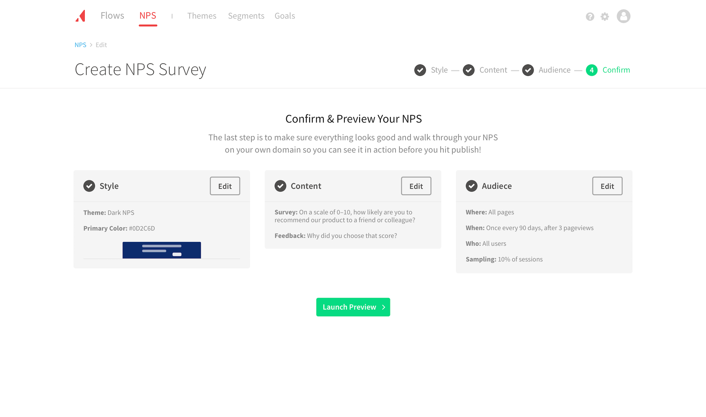
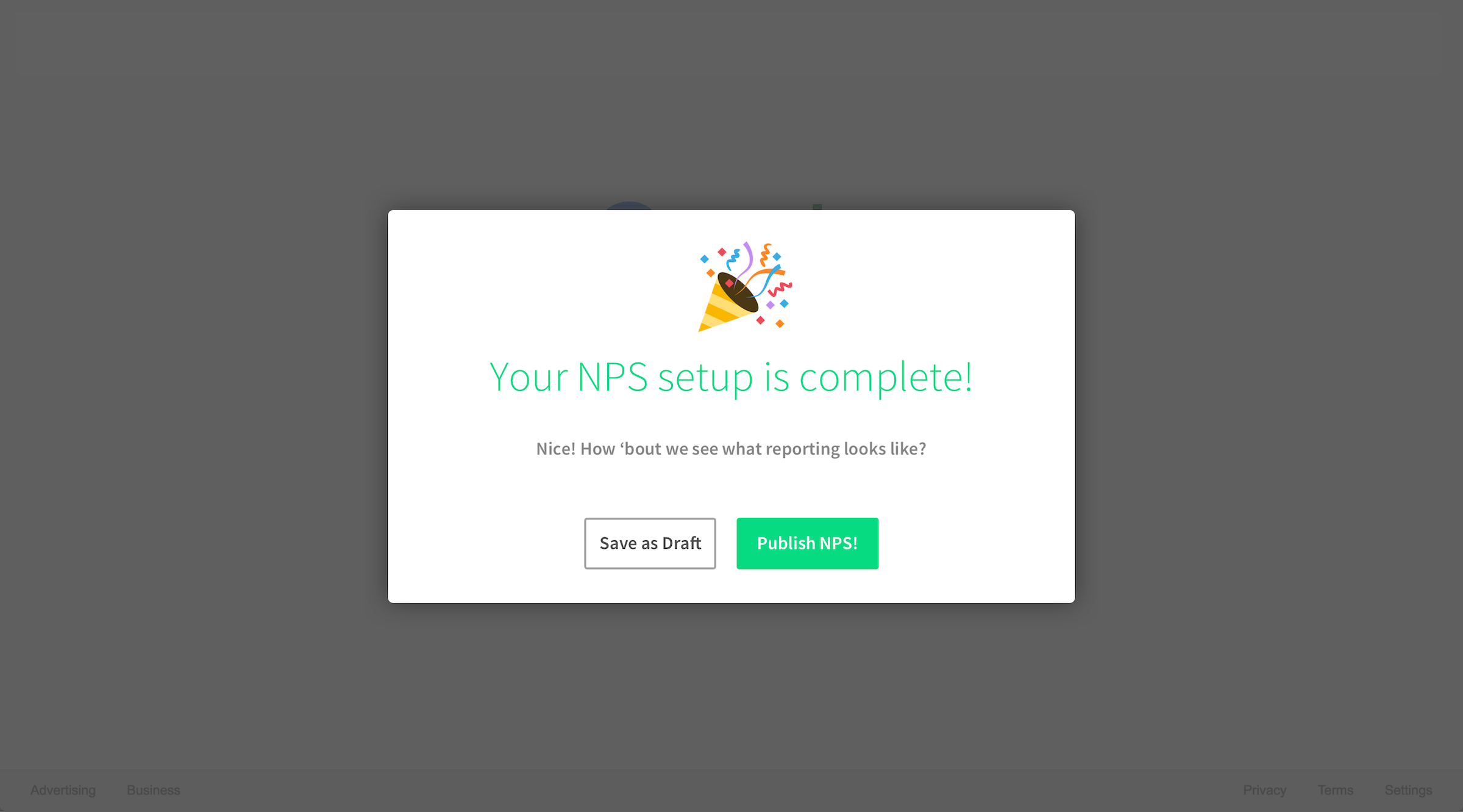
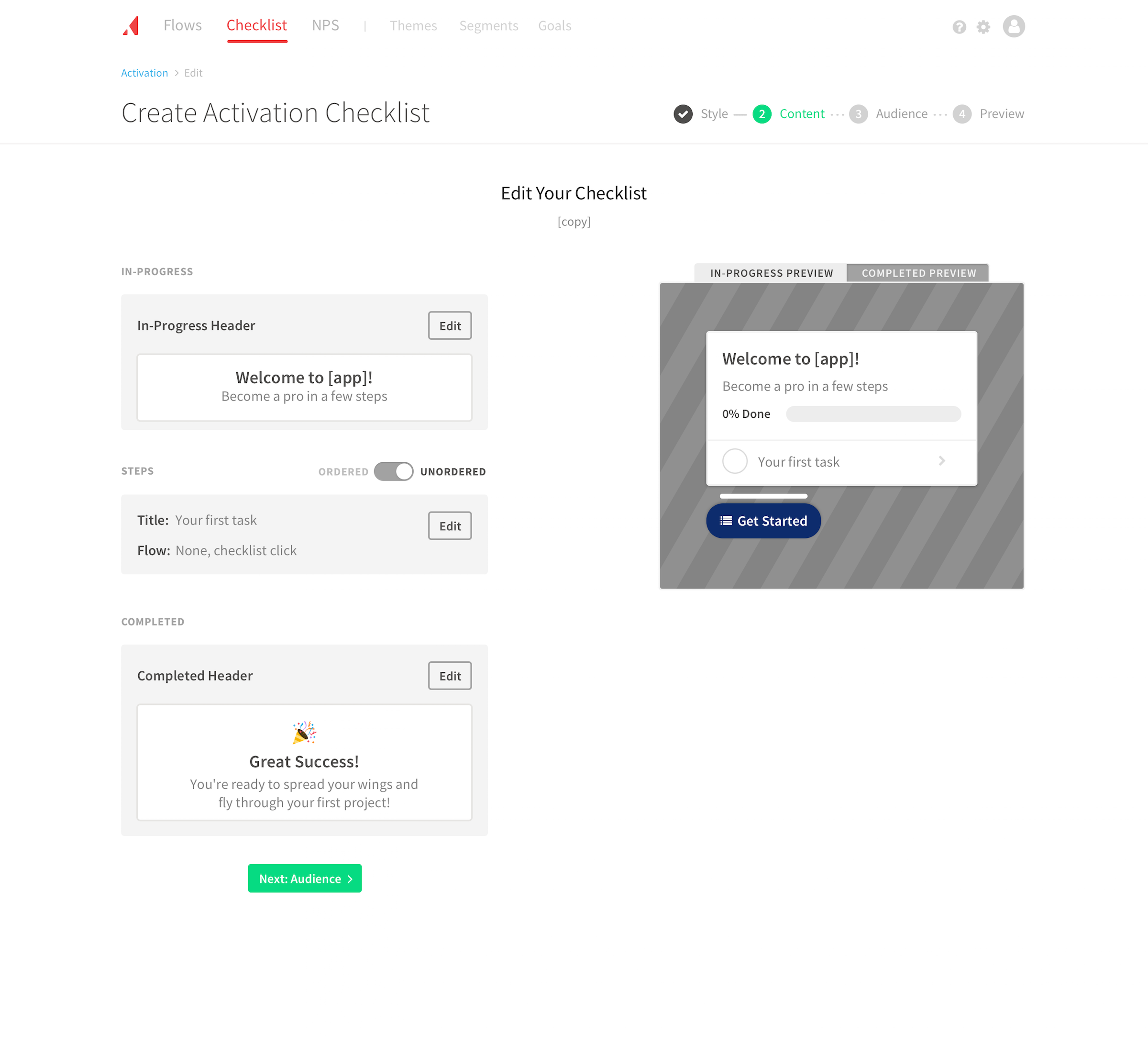
Step summary. We repurposed our editable blocks seen throughout the creation flow on the Confirm step. This allowed users to see a summary of their inputs in a way they had already seen. Users could also quickly navigate and revise a specific section. We also added the completion status icon (checkmark) to reinforce their progress. While adding the status icon was a small touch, it played a emotional role in the flow, as one user pointed out:
He LOVED the summary at the end of the creation flow. Said “It made me him feel extremely confident.”
Reusable components
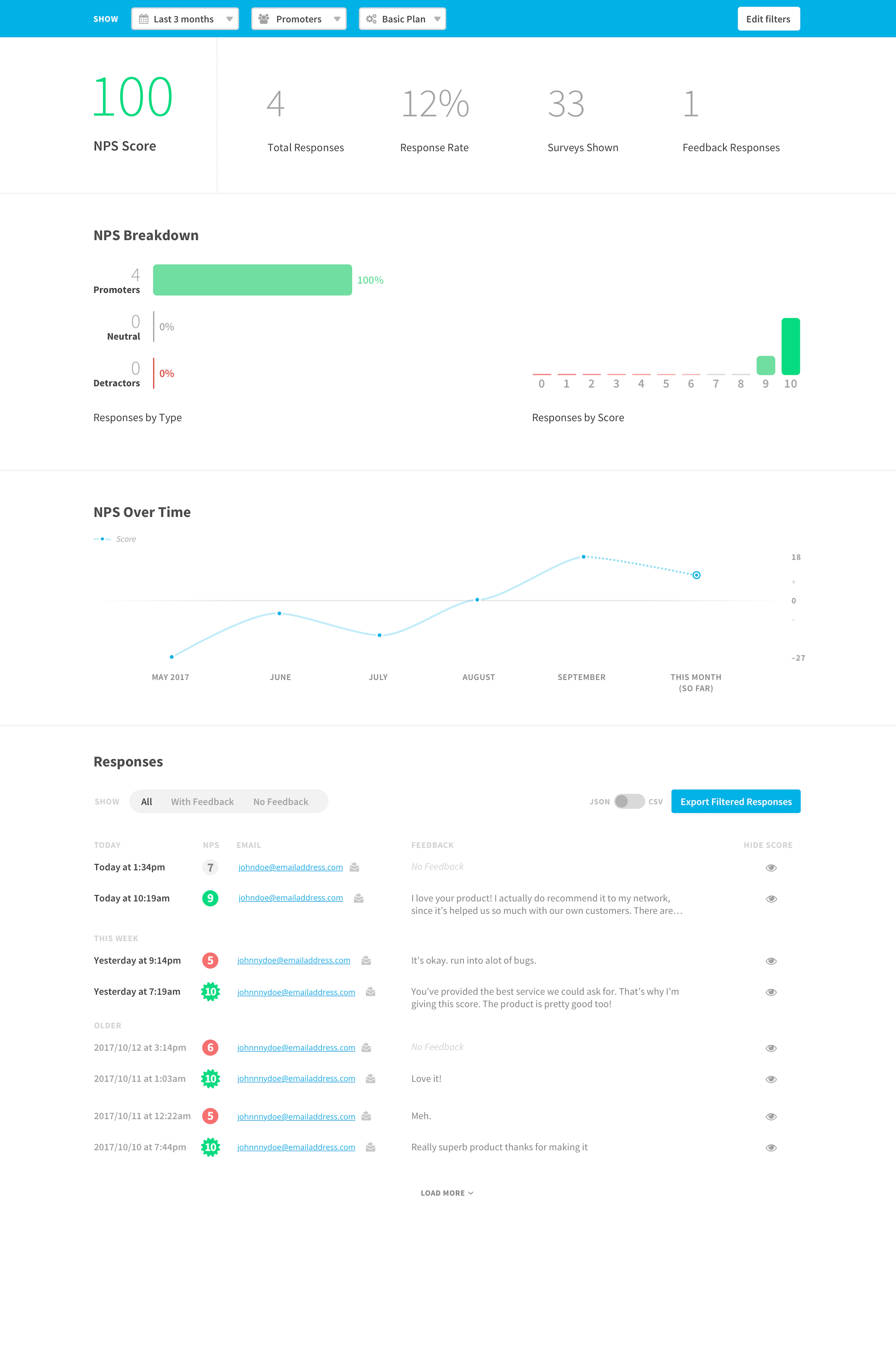
While the NPS flow was in development, I designed a potential creation flow for a new onboarding product. We were able to repurpose many components, including: progress navigation, appearance selection, editable blocks, content preview, audience targeting, summary, and confirm preview.
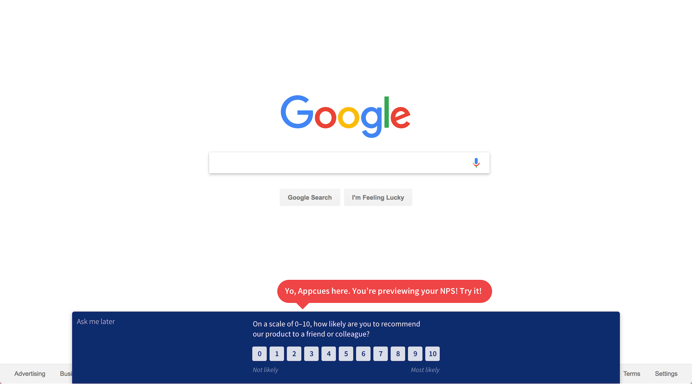
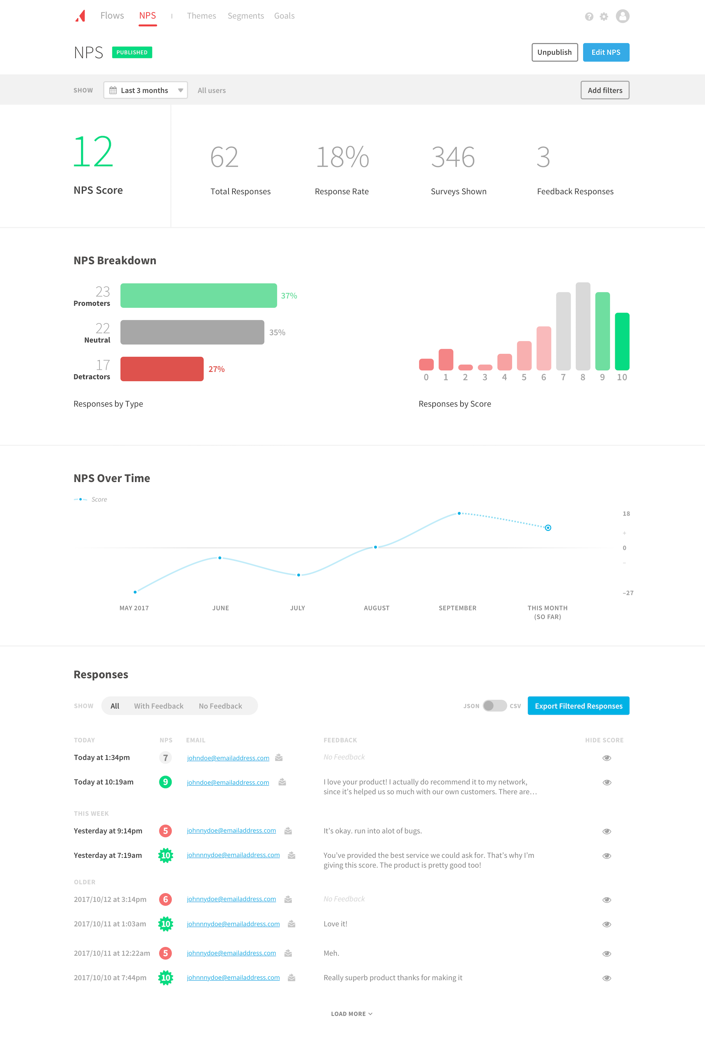
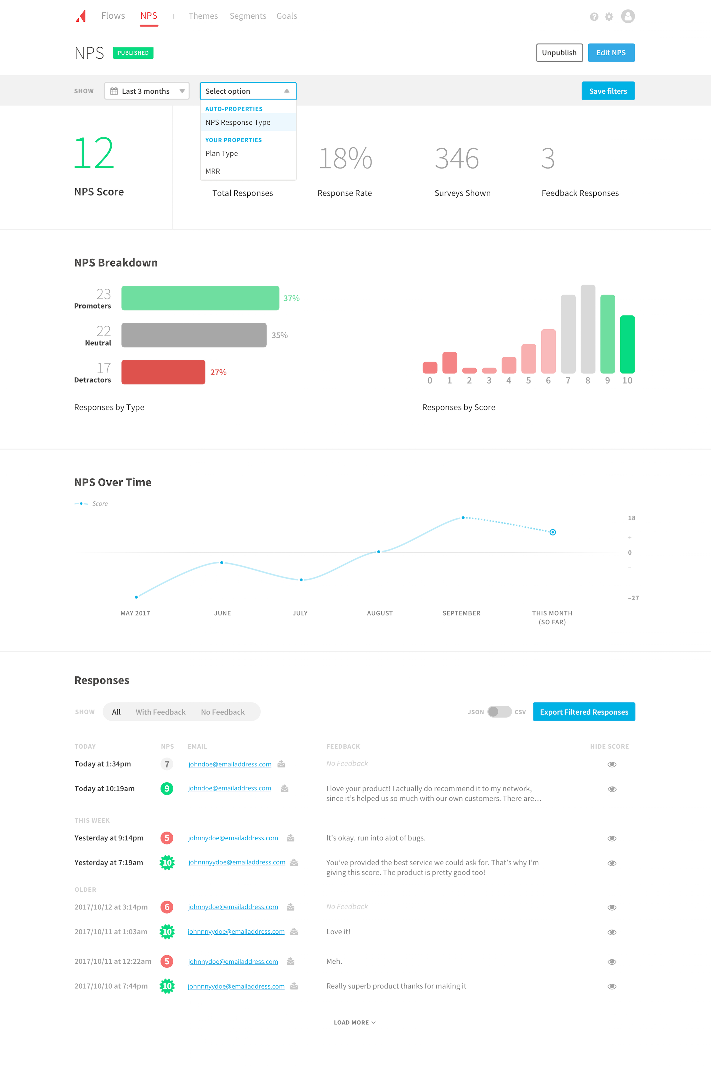
Here are a few select screenshots re-using the components:
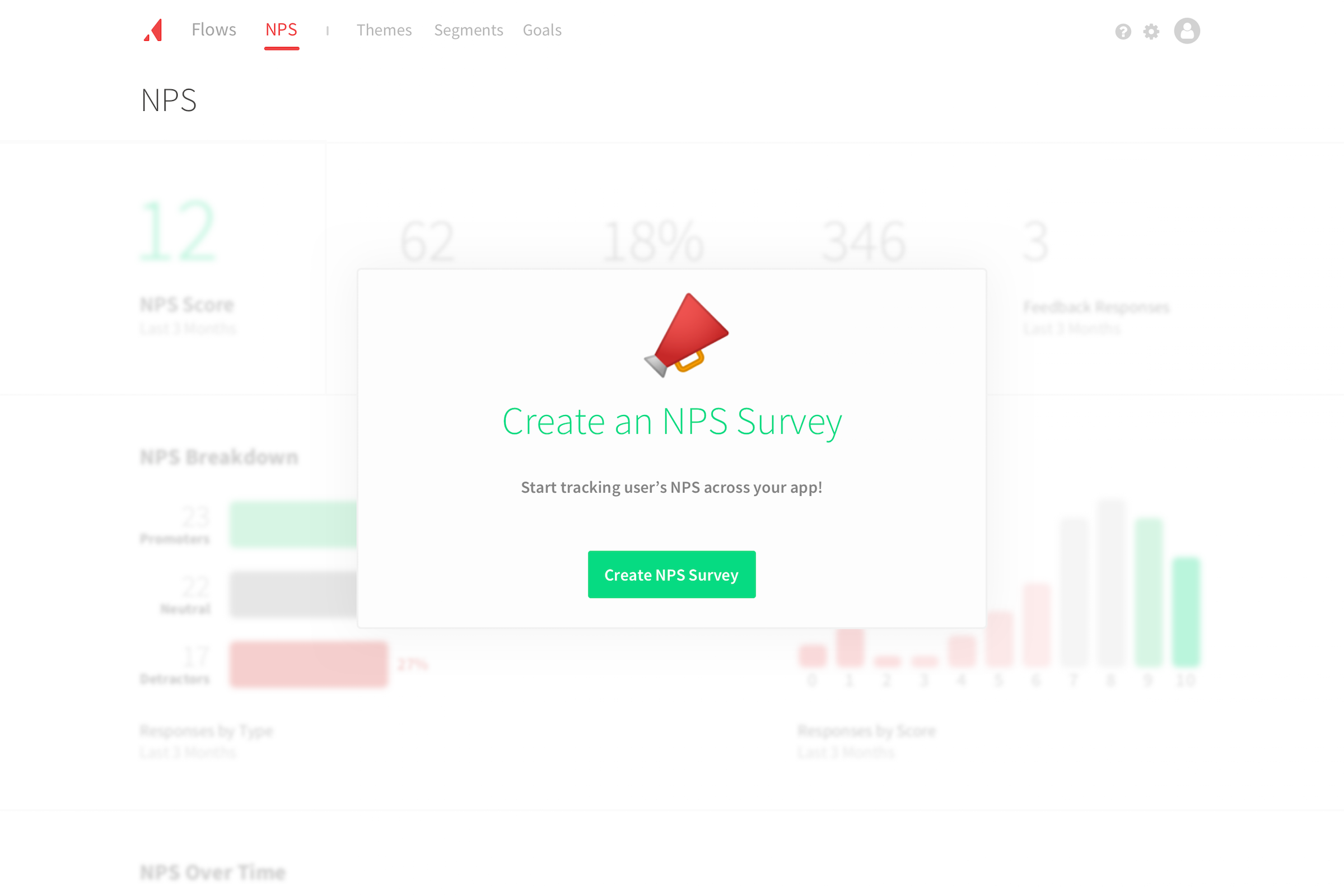
Results
As a contractor, I didn’t get the opportunity to measure performance post-implementation. However, it’s currently still active which is a positive sign. Even without metrics, I remain confident in the solution solely based on our user testing. Here’s some feedback from users towards the end of testing:
This is so much better. Than everything. You guys have done a really, really good job. I’m so excited.
I’m was really impressed with what you all have so far and am excited to the implement the new NPS feature.
and as anecdotal feedback:
The creation flow was splendid in his eyes.
[Redacted Company] was really wowed.
Going forward
The primary takeaway for me was the value of our user testing process. When you’re exploring a new problem, it only takes 1-2 users to point out opportunities for improvement. Continuous user testing early on is a huge lever to reduce risk of shipping new products. This project proved how valuable that tight feedback loop could be.
Another takeaway from this project was the importance of paper/pencil as a design medium. It can be tempting to jump into the visuals, but often using only words helps you think through problems. For this project, listing out all required inputs (and if known or unknown) was instrumental to organizing the flow’s steps. That simple constraint forced me to focus on solving the problem from a high level, which translated to a more effective end result.
P.S.
Appcues is an awesome company. I say that because even though I was contracting two days/week, they treated me as a full-time employee. I was even asked to present my work at their weekly company meeting. A testament to their culture, so definitely check them out!